skip to Main Content

I have a page in which I have an AppBar which in turn has an IconButton as its leading property. The code is as follows:

@override
  Widget build(BuildContext context) {
    return Scaffold(
      appBar: AppBar(
        leading: IconButton(
          onPressed: () {},
          icon: const Icon(Icons.arrow_back_ios_new),
          style: IconButton.styleFrom(
            backgroundColor: primary,
            foregroundColor: white,
            shape: RoundedRectangleBorder(
              borderRadius: BorderRadius.circular(8),
            ),
          ),
        ),
        title: Text(
          'New Note',
          style: Theme.of(context)
              .textTheme
              .headlineMedium!
              .copyWith(color: primary),
        ),
      ),
    );
}

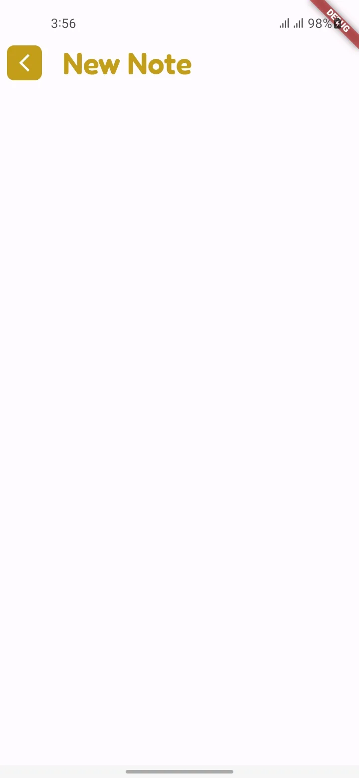
And this is what it looks like (which is normal and the way I want it):

enter image description here

But when I extract the IconButton to a new widget and then use it as the leading, it looks different (larger) than before. The code is as follows:

@override
  Widget build(BuildContext context) {
    return Scaffold(
      appBar: AppBar(
        leading: NoteButton(    // <--------- Here a custom widget is used
          onPressed: () {},
          icon: const Icon(Icons.arrow_back_ios_new),
        ),
        title: Text(
          'New Note',
          style: Theme.of(context)
              .textTheme
              .headlineMedium!
              .copyWith(color: primary),
        ),
      ),
    );
  }

class NoteButton extends StatelessWidget {
  const NoteButton({
    super.key,
    required this.icon,
    required this.onPressed,
  });

  final Widget icon;
  final VoidCallback onPressed;

  @override
  Widget build(BuildContext context) {
    return IconButton(
      onPressed: onPressed,
      icon: icon,
      style: IconButton.styleFrom(
        backgroundColor: primary,
        foregroundColor: white,
        shape: RoundedRectangleBorder(
          borderRadius: BorderRadius.circular(8),
        ),
      ),
    );
  }
}

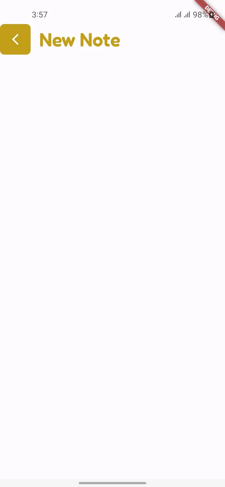
This is what it looks like:

enter image description here

As you can see, the button now looks larger than before.

Could you please tell me how to make this custom button (NoteButton) look normal as before? Thanks in advance.

2

Answers


  1. Try this :

    class MyWidget extends StatelessWidget {
      @override
      Widget build(BuildContext context) {
        return Scaffold(
          appBar: AppBar(
            leading: NoteButton(
              // <--------- Here a custom widget is used
              onPressed: () {},
              icon: const Icon(Icons.arrow_back_ios_new),
            ),
            title: Text(
              'New Note',
              style: Theme.of(context)
                  .textTheme
                  .headlineMedium!
                  .copyWith(color: primary),
            ),
          ),
        );
      }
    }
    
    class NoteButton extends StatelessWidget {
      const NoteButton({
        super.key,
        required this.icon,
        required this.onPressed,
      });
    
      final Widget icon;
      final VoidCallback onPressed;
    
      @override
      Widget build(BuildContext context) {
        return SizedBox(
          height: 10,
          width: 10,
          child: IconButton(
            onPressed: onPressed,
            icon: icon,
            style: IconButton.styleFrom(
              backgroundColor: primary,
              foregroundColor: white,
              shape: RoundedRectangleBorder(
                borderRadius: BorderRadius.circular(8),
              ),
            ),
          ),
        );
      }
    }
    

    Replace the build method with this and you can change the height and width of the sizedbox according to your need.

    Login or Signup to reply.
  2. Wrap your custom widget NoteButton with

    Padding 8 all side

    class NoteButton extends StatelessWidget {
      const NoteButton({
        super.key,
        required this.icon,
        required this.onPressed,
      });
    
      final Widget icon;
      final VoidCallback onPressed;
    
      @override
      Widget build(BuildContext context) {
        return Padding(
          padding: const EdgeInsets.all(8),
          child: IconButton(
            onPressed: onPressed,
            icon: icon,
            style: IconButton.styleFrom(
              backgroundColor: Colors.orangeAccent,
              foregroundColor: Colors.white,
              shape: RoundedRectangleBorder(
                borderRadius: BorderRadius.circular(8),
              ),
            ),
          ),
        );
      }
    }
    

    with above code i could solve the issue you are facing

    Reason can be:

    by default IconButton has 8 padding to all side so when you use it directly as leading that will be applied but when you make it custom widget NoteButton as StatelessWidget widget it might take padding of NoteButton

    Login or Signup to reply.
Please signup or login to give your own answer.
Back To Top
Search