skip to Main Content

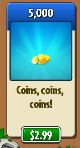
How can I create a card layout like below in Flutter?

See my code below. The card has inner padding I can’t get rid of. This is needed to create the header. Also, I am not sure how to place the button with offset.

Card(
  elevation: 10,
  shape: RoundedRectangleBorder(
    borderRadius: BorderRadius.circular(10),
    //set border radius more than 50% of height and width to make circle
  ),
  child: Column(
    children: <Widget>[
      Container(
          padding: const EdgeInsets.only(
            top: 10,
            bottom: 10,
          ),
          child: Container(
            child: Text(
              CustomFunctions.getProductName(product.title),
              style: const TextStyle(
                fontSize: 18.0,
              ),
            ),
          )),
      const Expanded(
          child: Center(
              child: FaIcon(
        FontAwesomeIcons.coins,
        color: CustomColors.accentColor,
      ))),
      _buildButton("${product.currencyCode}${product.price}", () => {}),
    ],
  ),
);

}

enter image description here

3

Answers


  1. I’m not sure if its the best way to do it, but I would create a Stack for this, instead of a Card. Here are my results:

    import 'package:flutter/material.dart';
    
    void main() {
      runApp(
        const MyApp(),
      );
    }
    
    class MyApp extends StatelessWidget {
      const MyApp({super.key});
    
      @override
      Widget build(BuildContext context) {
        return MaterialApp(
          home: Scaffold(
            body: Center(
              // SizedBox to allow for the button offset
              child: SizedBox(
                // height of the SizedBox needs to be bigger than the Container
                height: 250,
                child: Stack(
                  // start alignment in topCenter so Positioned is easier
                  alignment: Alignment.topCenter,
                  children: [
                    // container for background color, rounded edges, decoration etc.
                    // make sure to adjust the Padding and Container size to be the way you want
                    Container(
                      width: 100,
                      height: 200,
                      color: Colors.blue[200],
                      child: Column(
                        children: const [
                          Padding(
                            padding: EdgeInsets.symmetric(vertical: 20),
                            child: Text('Top text'),
                          ),
                          FlutterLogo(size: 80,
                          ),
                          Padding(
                            padding: EdgeInsets.symmetric(vertical: 20),
                            child: Text('bottom text'),
                          )
                        ],
                      ),
                    ),
                    Positioned(
                      top: 185,
                      child: ElevatedButton(
                        onPressed: () => print('button press!'),
                        child: const Text('Button'),
                      ),
                    ),
                  ],
                ),
              ),
            ),
          ),
        );
      }
    }
    

    ss of the widget

    Login or Signup to reply.
  2. This is build method inside of Card widget in the card.dart. The padding is coming from the margin param inside Container. If margin and cardTheme.margin is null, it will take the default margin of 4 px.

    If you want to change only this instance of Card, set the margin. If you want to change all instances of Card, set the margin in CardTheme.

    From the picture, as the widgets can be placed on top of other widgets. I recommend to use Stack.

    class Card extends StatelessWidget {
        ...
        @override
        Widget build(BuildContext context) {
            final CardTheme cardTheme = CardTheme.of(context);
            final CardTheme defaults = Theme.of(context).useMaterial3 ? _CardDefaultsM3(context) : _CardDefaultsM2(context);
    
            return Semantics(
                container: semanticContainer,
                child: Container(
                margin: margin ?? cardTheme.margin ?? defaults.margin!,
                child: Material(
                  type: MaterialType.card,
                  color: color ?? cardTheme.color ?? defaults.color,
                  shadowColor: shadowColor ?? cardTheme.shadowColor ?? defaults.shadowColor,
                  surfaceTintColor: surfaceTintColor ?? cardTheme.surfaceTintColor ?? defaults.surfaceTintColor,
                  elevation: elevation ?? cardTheme.elevation ?? defaults.elevation!,
                  shape: shape ?? cardTheme.shape ?? defaults.shape,
                  borderOnForeground: borderOnForeground,
                  clipBehavior: clipBehavior ?? cardTheme.clipBehavior ?? defaults.clipBehavior!,
                  child: Semantics(
                    explicitChildNodes: !semanticContainer,
                    child: child,
                  ),
                ),
              ),
            );
          }
        ...
    }
    
    Login or Signup to reply.
    1. First answer actually explains quite everything. You can use Stack with Positioned to get your desired output.

    2. Your unwanted padding is causing due to your use of Column and Expanded inside your card. Column takes infinite height, and Expanded takes infinite width. You can use something like SizedBox or other widgets with height and width properties to wrap around your card that is going constrain the size of the card.

    Here is a Card widget I’ve used with a similar implementation I hope It will help you in your implementation:

    SizedBox(
      height: 250,
      width: 250,
      child: Stack(alignment: Alignment.center, children: [
        Container(
            height: double.infinity,
            width: double.infinity,
            margin: EdgeInsets.only(top: 36),
            padding: EdgeInsets.only(top: 36),
            decoration: BoxDecoration(
                borderRadius: BorderRadius.circular(8),
                color: Colors.white,
                border: Border.all(color: Colors.red, width: 2)),
            child: Column(
              children: [
                Container(
                    padding: EdgeInsets.symmetric(horizontal: 5),
                    child: Text(
                      "5000 Coins",
                      textAlign: TextAlign.center,
                      style: Theme.of(context).textTheme.titleLarge,
                    )),
                Container(
                    margin: EdgeInsets.symmetric(horizontal: 0, vertical: 10),
                    padding: EdgeInsets.symmetric(horizontal: 0, vertical: 2),
                    width: double.infinity,
                    color: Colors.red,
                    child: Center(
                        child: Text(
                      "80% OFF",
                      style: Theme.of(context)
                          .textTheme
                          .headlineLarge
                          ?.copyWith(color: Colors.white),
                    ))),
                Text(
                  "$20",
                  style: Theme.of(context).textTheme.titleLarge,
                )
              ],
            )),
        Positioned(
          top: 0,
          child: Container(
            height: 70,
            width: 70,
            padding: EdgeInsets.all(10),
            decoration: BoxDecoration(
              color: Colors.red,
              borderRadius: BorderRadius.all(Radius.circular(100.0)),
              border: Border.all(
                color: Colors.red,
                width: 2.0,
              ),
            ),
            child: Text("Image Here"),
          ),
        ),
     ]))
    

    SS Widget screenshot:

    SS Widget screenshot

    Login or Signup to reply.
Please signup or login to give your own answer.
Back To Top
Search