skip to Main Content

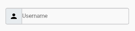
How do i add a padding to the textfield hint text so it has a gap between the icon box?

Currently it is like this:

enter image description here

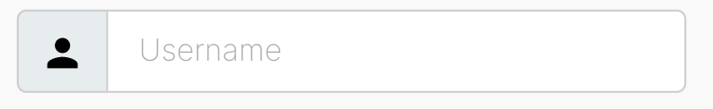
Where the result that I am achieving for:
enter image description here

This is the code snippet:

Padding(
  padding: EdgeInsets.only(top: 56.0),
  child: TextField(
    decoration: InputDecoration(
    prefixIcon: Container(
       padding: EdgeInsets.all(10.0),
       decoration: BoxDecoration(
          color: Color(0xFFE7ECEF), 
          borderRadius: BorderRadius.only(
             topLeft: Radius.circular(5.0),
             topRight: Radius.zero,
             bottomLeft: Radius.circular(5.0),
             bottomRight: Radius.zero,
          ),
          border: Border.all(
             color: Color(0xFFCDCDCF),
             width: 2.0,
          )
       ),
       child: Icon(MdiIcons.account, color: Colors.black),
    ),
    hintText: 'Username',
    focusedBorder: OutlineInputBorder(
    borderRadius: BorderRadius.circular(5.0),
    borderSide: BorderSide(
       color: Color(0xFFCDCDCF),
       width: 2.0,
    ),
  ),
  enabledBorder: OutlineInputBorder(
    borderRadius: BorderRadius.circular(5.0),
    borderSide: BorderSide(
       color: Color(0xFFCDCDCF), // Set your desired border color
       width: 2.0, // Set your desired border thickness
    ),
  ),
  contentPadding: EdgeInsets.all(10.0),
),),),

3

Answers


  1. you can use contentPadding property in textfield widget like this

    —contentPadding: EdgeInsets.all(20.0),

    Login or Signup to reply.
  2. You just have to add margin in Container…

    Here is the Updated Code

    TextField(
        decoration: InputDecoration(
          prefixIcon: Container(
    /*---*/ margin: const EdgeInsets.only(right:15.0),
            padding: const EdgeInsets.all(10.0),
            decoration: BoxDecoration(
              color: const Color(0xFFE7ECEF),
              borderRadius: const BorderRadius.only(
                topLeft: Radius.circular(5.0),
                topRight: Radius.zero,
                bottomLeft: Radius.circular(5.0),
                bottomRight: Radius.zero,
              ),
              border: Border.all(
                color: const Color(0xFFCDCDCF),
                width: 2.0,
              ),
            ),
            child: const Icon(Icons.person, color: Colors.black),
          ),
          hintText: 'Username',
          focusedBorder: OutlineInputBorder(
            borderRadius: BorderRadius.circular(5.0),
            borderSide: const BorderSide(
              color: Color(0xFFCDCDCF),
              width: 2.0,
            ),
          ),
          enabledBorder: OutlineInputBorder(
            borderRadius: BorderRadius.circular(5.0),
            borderSide: const BorderSide(
              color: Color(0xFFCDCDCF), // Set your desired border color
              width: 2.0, // Set your desired border thickness
            ),
          ),
          contentPadding: const EdgeInsets.all(10.0),
        ),
      ),
    

    Result

    enter image description here

    Login or Signup to reply.
  3. You can add the contentPadding property within the InputDecoration and set the vertical and horizontal values to control the padding around the hint text. Adjust these values according to your preferences to achieve the desired gap between the icon box and the hint text.

          // Add contentPadding to create a gap between the icon and hint text
      contentPadding: EdgeInsets.symmetric(vertical: 10.0, horizontal: 15.0),
    
    Login or Signup to reply.
Please signup or login to give your own answer.
Back To Top
Search