 Question posted in


I am using Flutter 3.16.5.
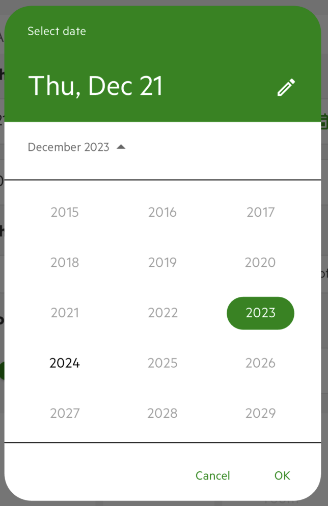
The years section in the showDatePicker has a border top and bottom that cannot be customised and doesn’t respond to any changes applied in the Theme.
I would expect that the dividerColor is also applied to this border, or that any other colours options in the ColorScheme could impact these borders. How can I change change the colours of these borders or if possible remove them altogether?
showDatePicker(
    builder: (BuildContext context, Widget? child) {
      return Theme(
        data: Theme.of(context).copyWith(
          inputDecorationTheme:
              InputDecorationTheme(
                  border: UnderlineInputBorder(
            borderSide: BorderSide(
              width: 0.5,
              color: ColorRes.colorPrimary,
            ),
          )),
          colorScheme: ColorScheme.light(
              onPrimary: ColorRes.white,
              primary: ColorRes.colorPrimary,
              background: ColorRes.white),
          datePickerTheme: DatePickerThemeData(
            headerBackgroundColor:
                ColorRes.colorPrimary,
            backgroundColor: ColorRes.white,
            headerForegroundColor: ColorRes.white,
            surfaceTintColor: ColorRes.white,
            dividerColor: ColorRes.colorPrimary,
          ),
        ),
        child: child!,
      );
    },
    locale: currentDefaultSystemLocale == "nl_NL"
        ? Locale("nl", "NL")
        : Locale("en", "US"),
    context: context,
    initialDate: DateTime.now(),
    firstDate: DateTime.now(),
    lastDate: DateTime.now()
        .add(const Duration(days: 183)))
2
Answers
Fixed by changing the outlineVariant in the colorScheme
I’ve digged more into it and I found this documentation in the Divider class
The date picker uses two Dividers without color argument so, according to the documentation, if you have in your
ThemeDataadividerThemedefined it will use the color in that regardles whether you haveuseMaterial3true or false. If you don’t have adividerThemedefined and you useuseMaterial3: falseit looks at thedividerColor. If you do haveuseMaterial3: true(which is the default in the latest Flutter version) it uses theoutlineVariantof thecolorScheme. Digging further I could see that if yourcolorSchemedoesn’t have aoutlineVariantdefined it defaults to thecolorScheme‘sonBackgroundwhich hasColors.blackas default for theColorScheme.lightconstructor. This is why it was black.