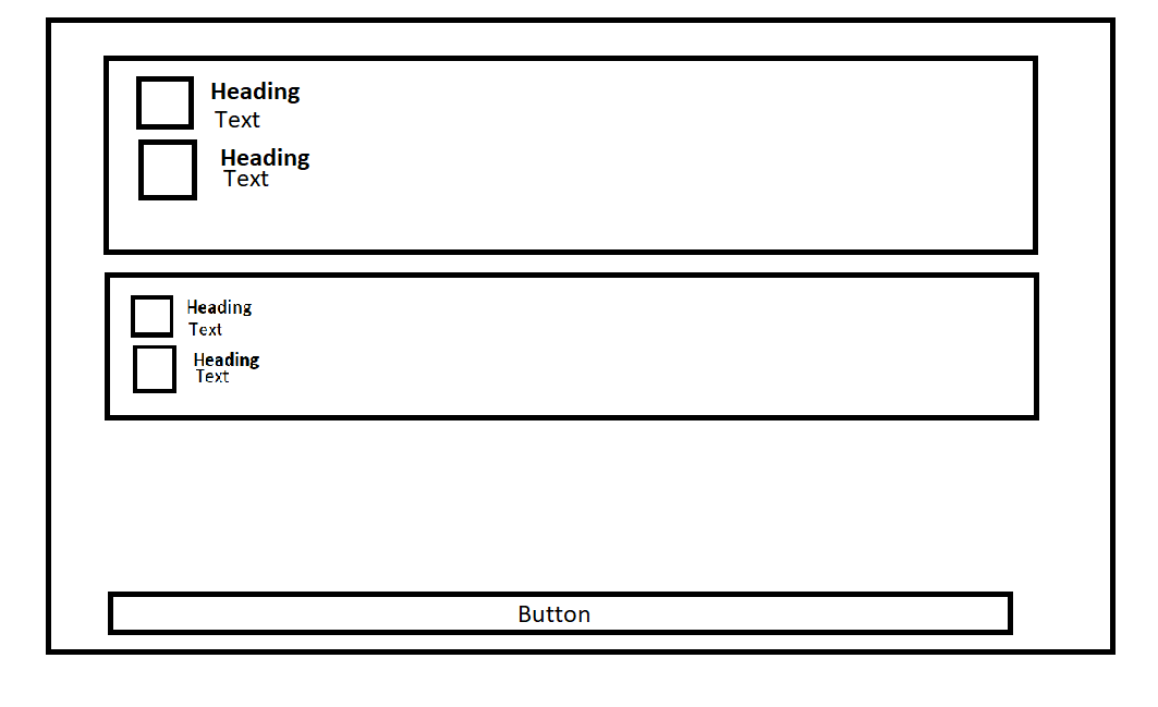
I have a problem. I want to create a setting page (please see the image below what I want).
But unfortunately my design does not look like what I want. If I am looking inside the page, the page is complety white. Nothing shown. Not content. Nothing.
How could I create this kind of design?
My code:
  @override
  Widget build(BuildContext context) {
    //print("called");
    return Scaffold(
      appBar: AppBar(
          centerTitle: true,
          backgroundColor: Colors.black,
          systemOverlayStyle:
              const SystemUiOverlayStyle(statusBarColor: Colors.black),
          leading: IconButton(
            icon: Image.asset('assets/logo.png'),
            onPressed: null,
          ),
          title: const Text("Settings",
              style: TextStyle(color: Colors.white),
              textAlign: TextAlign.center)),
      body: Container(
        margin: const EdgeInsets.all(30.0),
        decoration: BoxDecoration(
          border: Border.all(color: Colors.grey),
          borderRadius: const BorderRadius.all(
              Radius.circular(5.0) //                 <--- border radius here
              ),
          color: Colors.white,
        ),
        child:   Row(
          children: [
            Column(
              children: [
                ListTile(
                  onTap: () {
                    if (kDebugMode) {
                      print("click");
                    }
                  },
                  leading: const Icon(
                    Icons.settings,
                    color: Colors.black,
                    size: 50.0,
                  ),
                  title: Text("Setting Version"),
                  subtitle: Text("$settingVersion"),
                ),
                ListTile(
                  onTap: () {
                    if (kDebugMode) {
                      print("click");
                    }
                  },
                  leading: const Icon(
                    Icons.access_time,
                    color: Colors.black,
                    size: 50.0,
                  ),
                  title: Text("Last change of the tag-version"),
                  subtitle: Text("$lastChanged"),
                ),
              ],

            ),
            Column(
              children: [
                ListTile(
                  onTap: () {
                    if (kDebugMode) {
                      print("click");
                    }
                  },
                  leading: const Icon(
                    Icons.settings,
                    color: Colors.black,
                    size: 50.0,
                  ),
                  title: Text("Version of something"),
                  subtitle: Text("$settingVersion"),
                ),
                ListTile(
                  onTap: () {
                    if (kDebugMode) {
                      print("click");
                    }
                  },
                  leading: const Icon(
                    Icons.access_time,
                    color: Colors.black,
                    size: 50.0,
                  ),
                  title: Text("My name of the user"),
                  subtitle: Text("$lastChanged"),
                ),
              ],
            ),
          ],
        ),
      ),
    );
  }


3
Answers
You just need to the replace the Row Widget with Column which is in the child of the container.
refer this below code:
And will start looking like this:
Well its realy hard to understand what you are asking for. But i would share what would i would do i case of that layout. Hopefully its close enough. I added ListView.seperated in Column in case of you need to button to stay under segments. If thats what you are trying to achive. Simply move button in column. Otherwise Column and Expanded widgets are unnecessary.
This produces this kind of layout

Change your Row to Column and Wrap it with singleChildScrollView