


can anyone tell me how to do this
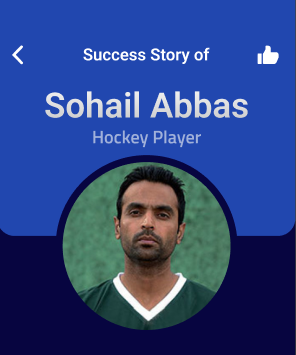
i’ve tried like this but it is not appearing like what i want
Container(
  height: 900,
  width: double.maxFinite,
  color: const Color(0xff070540),
  child: Stack(
    children: [
      Padding(
        padding: EdgeInsets.only(left: 15, right: 15, top: 15),
        child: Container(
          height: 30,
          color: Color(0xff2147AF),
          child: Row(
            mainAxisAlignment: MainAxisAlignment.spaceBetween,
            children: [
              Icon(Icons.arrow_back),
              Text(
                'Details of Athlete',
                style: TextStyle(fontSize: 15),
              ),
              Icon(Icons.thumb_up_sharp),
            ],
          ),
        ),
      ),
      Row(
        children: [
          Container(
            height: 150,
            width: 80,
            decoration: const BoxDecoration(
              color: Color(0xff2147AF),
              borderRadius:
                BorderRadius.only(bottomRight: Radius.circular(20)),
            )
          ),
          Container(
            height: 150,
            width: 80,
            decoration: const BoxDecoration(
              color: Color(0xff2147AF),
              borderRadius:
                BorderRadius.only(bottomLeft: Radius.circular(20)),
            )
          )
        ],
      )
    ],
  )
);
2
Answers
First thing, the order of children inside a Stack (Stack Class) is that the Last Child should come upfront, which means that in your code the last Row with the Containers would cover the first Row with the text.
For the lighter blue box you can use only one container with bottom border radius instead of aligning two container with a corner radius.
I’m no expert, so maybe this isn’t the best approach, but I would use a Stack with one container for the background elements and a column for the foreground elements (text and image).
Some tips:
Here’s a widget I created using your image as reference, I hope it helps you:
Problem solved.
Try using this code snippet; it should be helpful in achieving the desired output.