


Here is my code
 InkWell(
                        onTap: () {
                          Navigator.pop(context);
                        },
                        child: Align(
                          alignment: Alignment(1,-1),
                          child: CircleAvatar(
                            maxRadius: 20,
                            backgroundColor: Colors.transparent,
                            child: Image.asset('assets/cancel.png',height: 30,),
                          ),
                        ),
                      ),
I got this
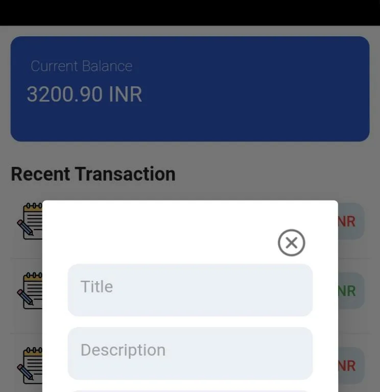
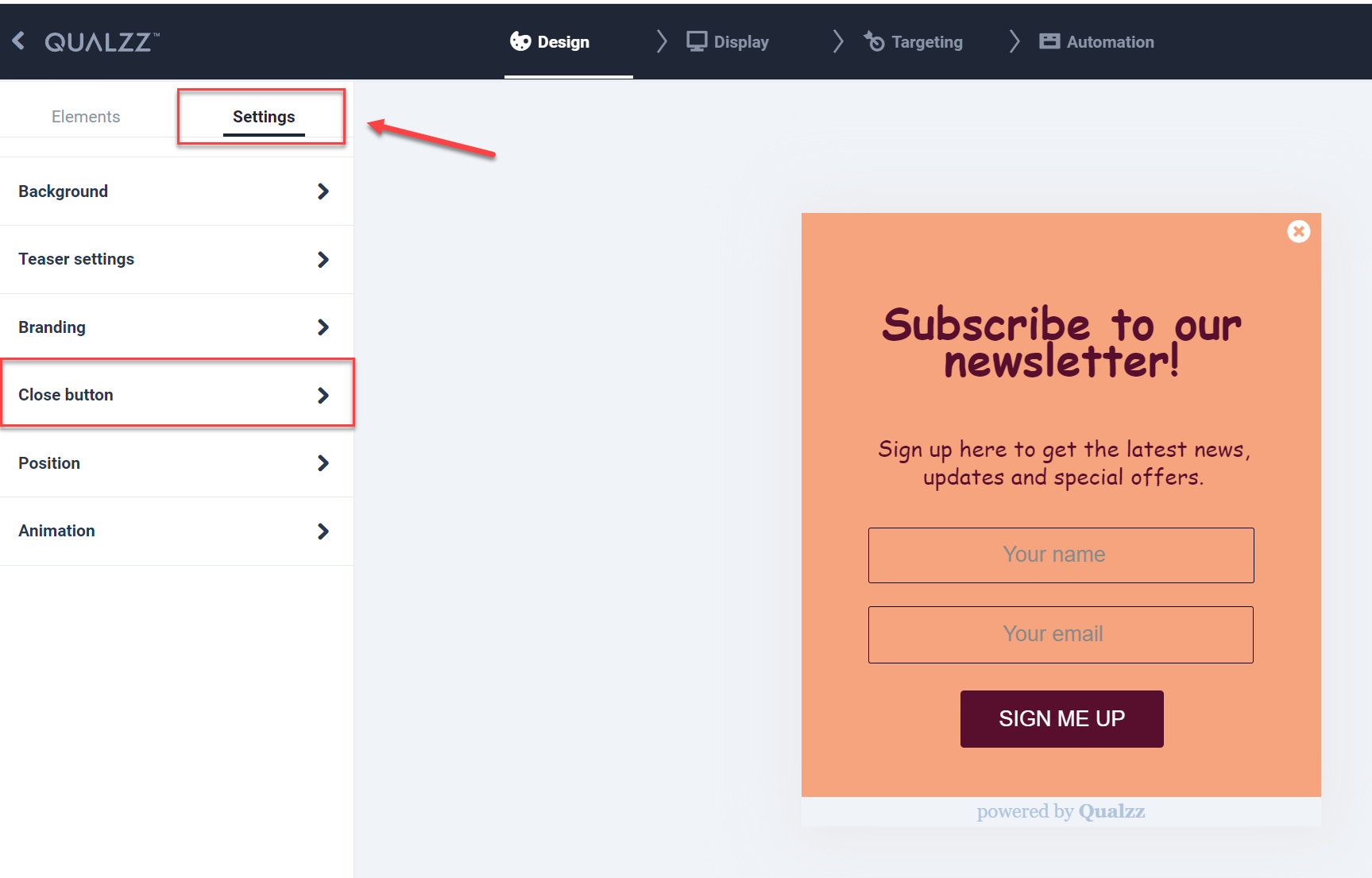
I want like this
3
Answers
you can utilize a Stack widget and modify your code, I wrapped your existing code with a Stack widget to overlay the cancel icon on top of other content. Then, I added a Container inside the InkWell to control the alignment and padding.
Not sure what is your parent widget?
I saw your screenshot looks like using show dialog.
Let’s say if you are using Alertdialog, you can easily achieve the layout using stack + positioned to make your cancel image to the position you want.
below:
example here
If you are using
AlertDialogthen you can useiconandiconPaddingto keep thecloseimage top right.I have removed
CircleAvatarbecause it is used for user Profile Image. This Widget will give extra padding and I was not able to remove the padding.Please check if this solution works.