Okay, so this is a bit of a difficult one to explain.
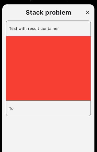
I would like two TextFields right above/below each other. The problem comes when you type in to one of the TextFields and the result should be shown in a variable-sized container above other content WITHOUT pushing other content down.
I could just use a Stack with Positioned, BUT then I get problems with exact positioning because of different screen-sizes, fonts and text-sizes on devices. If I use a Column, the content gets pushed down.
See the screenshots to help understand my problem (code further below)
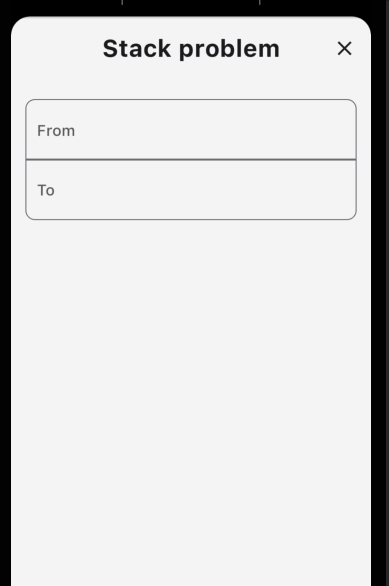
This is what it should look like for all screens / sizes / fonts / etc.
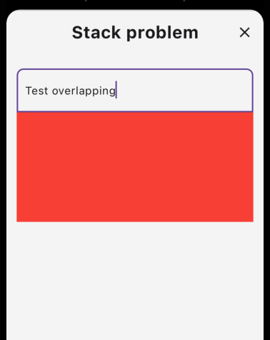
I can get this result with Stack+Positioned, but I get the problem illustrated further down. (the red box is the variable sized result container).
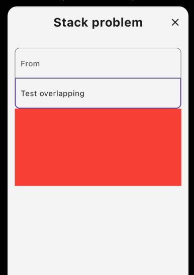
This is what happens when I use Stack+Positioned and the text-size is increased on the phone (or font is different, or something else like that).
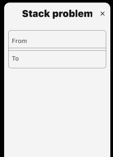
This is what happens when I put the TextFields in a columnn.
Code
This is obviously just example code. In the real app, we have two address searches that calls an API to the the result list.
class StackProblemExample extends StatelessWidget {

  @override
  Widget build(BuildContext context) {
    return Stack(
      children: [
        Positioned(
          top: 82,
          left: 0,
          right: 0,
          child: TextFieldAndResultList(
            hint: 'To',
            isTop: false,
          ),
        ),
        Positioned(
          top: 20,
          left: 0,
          right: 0,
          child: TextFieldAndResultList(
            hint: 'From',
            isTop: true,
          ),
        ),
      ],
    );
  }
}

class TextFieldAndResultList extends StatefulWidget {
  final String hint;
  final bool isTop;

  const TextFieldAndResultList({
    super.key,
    required this.hint,
    required this.isTop,
  });

  @override
  State<TextFieldAndResultList> createState() => _TextFieldAndResultListState();
}

class _TextFieldAndResultListState extends State<TextFieldAndResultList> {
  var controller = TextEditingController();
  var containerHeight = 0;

  @override
  Widget build(BuildContext context) {
    return Column(
      children: [
        TextField(
          decoration: InputDecoration(
            hintText: widget.hint,
            border: OutlineInputBorder(
              borderRadius: widget.isTop
                  ? BorderRadius.only(
                      topLeft: Radius.circular(10),
                      topRight: Radius.circular(10),
                    )
                  : BorderRadius.only(
                      bottomLeft: Radius.circular(10),
                      bottomRight: Radius.circular(10),
                    ),
            ),
          ),
          controller: controller,
          onChanged: (value) {
            setState(() {
              containerHeight = controller.text.length * 10;
            });
          },
        ),
        if (containerHeight > 0)
          Container(
            height: containerHeight.toDouble(),
            color: Colors.red,
          ),
      ],
    );
  }
}
How in the world could I achieve that the tow TextFields (with each their own result container) can be stacked after each other without concrete positions AND not push each other down?

 Question posted in

2
Answers
The Flutter widget Autocomplete, suggested by @user18309290, did not provide good enough flexibility for me, so I solved this problem by using CustomMultiChildLayout to calculate where the widgets should be positioned in relation to each other.
Please see this great explanation on how to use CustomMultiChildLayout if you want more control over you widgets than Autocomplete provides.
Use Autocomplete instead, it is designed to do exactly this.
To style the box of the autocomplete options: see this question