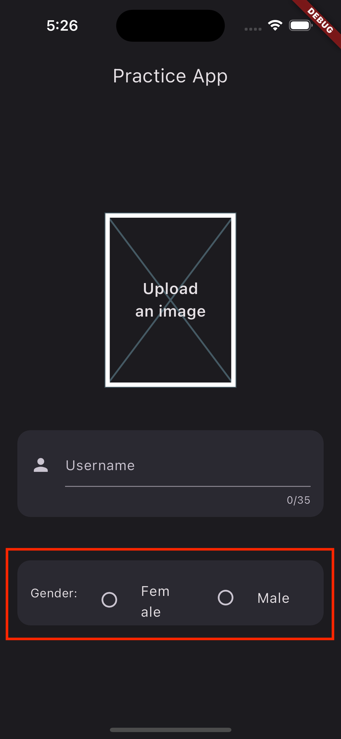
I’m new to learning flutter and am learning about radio list tiles. I have made an app that contains two tiles and a text widget in a row. The problem is that the title of the tile takes up two lines as its a bit longer instead of one. Here’s the problem I’m talking about:
Code to reproduce the problem:
import 'package:flutter/material.dart';

class MyWidget extends StatelessWidget {
  const MyWidget({super.key});

  @override
  Widget build(BuildContext context) {
    return Center(
      child: Column(
        children: [
          Container(
            margin: const EdgeInsets.symmetric(horizontal: 20),
            height: 75,
            decoration: BoxDecoration(
              borderRadius: BorderRadius.circular(15),
              color: const Color.fromARGB(48, 101, 103, 126),
            ),
            child: Padding(
              padding: const EdgeInsets.all(15.0),
              child: Row(
                children: [
                  const Text('Gender:'),
                  Expanded(
                    child: RadioListTile(
                      value: 'Female',
                      title: const Text('Female'),
                      groupValue: 'Female',
                      onChanged: (value) {},
                    ),
                  ),
                  Expanded(
                    child: RadioListTile(
                      value: 'Male',
                      title: const Text('Male'),
                      groupValue: 'Female',
                      onChanged: (value) {},
                    ),
                  ),
                ],
              ),
            ),
          ),
        ],
      ),
    );
  }
}
The parent of this widget is: scaffold -> material app.
Is there any way to fix it without decreasing the fontSize?
I am running the code on simulator.


2
Answers
Solved it by adding contentPadding parameter to the list tile. By default it is set to 16 pixels symmetric horizontally.
To fix the issue of the title in the RadioListTile taking up two lines, you can wrap the Text widget with a Flexible widget and set its overflow property to TextOverflow.ellipsis.