skip to Main Content

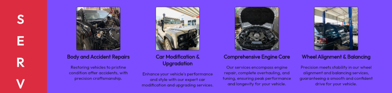
Recently I decided to take a plunge on by trying out responsive design building in flutter, and despite watching quiet a few tutorials, still it seems very complicated to me for some reasons. Let me add the current issue am facing to exaplain my problem further. Here is the image of my screen’s one row:
enter image description here

FUNCTIONALITY I WANT:
When screen size reduces to 1300, it should go from 4 in a row to 3 in a row, and as screen size reduces to 950 it should become 2 and then as screen size reduces i’d like to change text size and image size etc, i also need to change top andleft positions of each row as well. It already sounds very messy. If an experienced person can pls tell me how to sort this responsive thing out, what to do with details like top left etc as screen size reduces.

I would highly appreciate if not only guiding here but also you can recommend me a good tutorial that can teach responsiveness in clear details to an intermediate in flutter.

CODE:

        Positioned(
          top: 20,
          left: screenWidth < 1080 ? 160 : 230,
          child: Row(
            children: [
              ServicePalette(
                title: 'Body and Accident Repairs',
                text: 'Restoring vehicles to pristine condition after accidents, '
                    'with precision craftsmanship.',
                imagePath: 'assets/images/all/25.jpg',
              ),
              ServicePalette(
                title: 'Car Modification & Upgradation',
                text: 'Enhance your vehicle's performance and style with our '
                    'expert car modification and upgrading services.',
                imagePath: 'assets/images/all/6.jpg',
              ),
              ServicePalette(
                title: 'Comprehensive Engine Care',
                text: 'Our services encompass engine repair, complete overhauling, and tuning, '
                    'ensuring peak performance and longevity for your vehicle.',
                imagePath: 'assets/images/all/16.jpg',
              ),
              ServicePalette(
                title: 'Wheel Alignment & Balancing',
                text: 'Precision meets stability in our wheel alignment and balancing services, '
                    'guaranteeing a smooth and confident drive for your vehicle.',
                imagePath: 'assets/images/all/2.jpg',
              ),

            ],
          ),),
        Positioned(
          top: 350,
          left: screenWidth < 1080 ? 160 : 230,
          child: Row(
            children: [
              ServicePalette(
                title: 'Servicing & Lubrication',
                text: 'Restore your vehicle's vitality with our expert servicing '
                    'and careful lubrication. Our skilled team ensures top-tier performance, '
                    'enhancing your car's longevity.',
                imagePath: 'assets/images/all/1.jpg',
              ),
              ServicePalette(
                title: 'Baked Painting',
                text: 'Upgrade your vehicle's '
                    'appearance with our premium Baked Painting. '
                    'process which ensures vibrant, long-lasting '
                    'colors and impeccable finishes.',
                imagePath: 'assets/images/all/41.jpg',
              ),

              ServicePalette(
                title: 'Interior Repairs & Cleaning',
                text: 'Transform your vehicle's interior with our expert repair and '
                    'cleaning services. Our dedicated team revitalizes every detail,'
                    'leaving your cabin in impeccable condition.',
                imagePath: 'assets/images/all/9.jpg',
              ),
              ServicePalette(
                title: 'Arrangements of Parts',
                text: 'Efficiently organized components for peak performance. We ensure your vehicle's '
                    'parts are perfectly placed for top-notch functionality.',
                imagePath: 'assets/images/all/44.jpg',
              ),

            ],
          ),),

2

Answers


  1. You can use Wrap widget instead of Row. Wrap will allow dynamic expanded children. Check the below code

        Positioned(
          top: 350,
          left: screenWidth < 1080 ? 160 : 230,
          child: Wrap(
            children: [
              ServicePalette(
                title: 'Servicing & Lubrication',
                text: 'Restore your vehicle's vitality with our expert servicing '
                    'and careful lubrication. Our skilled team ensures top-tier performance, '
                    'enhancing your car's longevity.',
                imagePath: 'assets/images/all/1.jpg',
              ),
              ServicePalette(
                title: 'Baked Painting',
                text: 'Upgrade your vehicle's '
                    'appearance with our premium Baked Painting. '
                    'process which ensures vibrant, long-lasting '
                    'colors and impeccable finishes.',
                imagePath: 'assets/images/all/41.jpg',
              ),
    
              ServicePalette(
                title: 'Interior Repairs & Cleaning',
                text: 'Transform your vehicle's interior with our expert repair and '
                    'cleaning services. Our dedicated team revitalizes every detail,'
                    'leaving your cabin in impeccable condition.',
                imagePath: 'assets/images/all/9.jpg',
              ),
              ServicePalette(
                title: 'Arrangements of Parts',
                text: 'Efficiently organized components for peak performance. We ensure your vehicle's '
                    'parts are perfectly placed for top-notch functionality.',
                imagePath: 'assets/images/all/44.jpg',
              ),
    
            ],
          ),),
    
    Login or Signup to reply.
  2. You might create any method that verifies what’s the current available screen size, and return the number of columns you want to display.

    Here is a simple example, based on a Flutter Cookbook Grid example, where I created a method that returns X number of columns based on the size I defined for each column.
    I set it as 100 width just for the sake of this example.

    import 'package:flutter/material.dart';
    
    void main() {
      runApp(const MyApp());
    }
    
    class MyApp extends StatelessWidget {
      const MyApp({super.key});
    
      @override
      Widget build(BuildContext context) {
        const title = 'Grid List';
    
        return MaterialApp(
          title: title,
          home: Scaffold(
            appBar: AppBar(
              title: const Text(title),
            ),
            body: GridView.count(
              // Create a grid with 2 columns. If you change the scrollDirection to
              // horizontal, this produces 2 rows.
              crossAxisCount: getWindowSize(context),
              // Generate 100 widgets that display their index in the List.
              children: List.generate(100, (index) {
                return Center(
                  child: Text(
                    'Item $index',
                    style: Theme.of(context).textTheme.headlineSmall,
                  ),
                );
              }),
            ),
          ),
        );
      }
    }
    
    int getWindowSize(BuildContext context){
      // change this value to change the columns that appear in the screen
      double columnWidth = 100.0;
    
      double width = MediaQuery.of(context).size.width;
      if (width < columnWidth){ 
        return 1;
      }else {
        return (width / columnWidth).round();
      }
    }
    

    Notice you might do this in different ways, like saving the number of columns as a required property of your widget, using it on the build method, and call setState to change the number of columns displayed,

    You can also create your own method that creates rows and columns, but the process is quite the same, but you also need a cycle to go through the list of items to be drawn on your screen.

    Login or Signup to reply.
Please signup or login to give your own answer.
Back To Top
Search