skip to Main Content

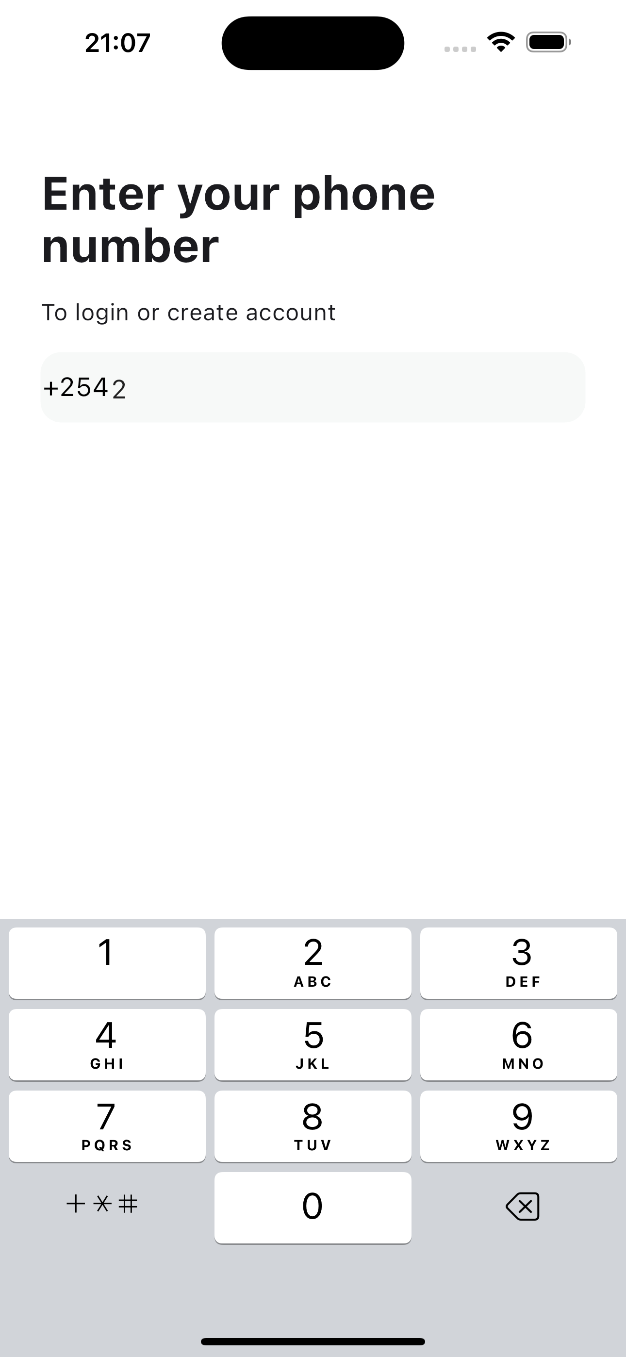
How can I center text in TextFormField?
It seems to me that additional padding is being applied that I have no control over.

My code example:

@override
  Widget build(BuildContext context) {
    return TextFormField(
      maxLines: 1,
      minLines: 1,
      maxLength: 13,
      keyboardType: TextInputType.phone,
      textAlignVertical: TextAlignVertical.center,
      cursorWidth: 1.5,
      decoration: const InputDecoration(
        contentPadding: EdgeInsets.zero,
        counterText: "",
        prefixIcon: Row(
          mainAxisSize: MainAxisSize.min,
          mainAxisAlignment: MainAxisAlignment.center,
          children: [
            Text(
              '+254',
              style: TextStyle(
                color: Colors.black,
                fontWeight: FontWeight.w400,
                fontSize: 18,
              ),
            ),
          ],
        ),
      ),
    );
  }

enter image description here

2

Answers


  1. Before

    enter image description here

    After

    enter image description here

    You need to set isDense to true on the InputDecoration:

    decoration: const InputDecoration(
        isDense: true, // <-- Add this.
        contentPadding: EdgeInsets.zero,
    

    However, the prefixIcon has a default padding of 12 px:

    so you can also do:

    prefixIcon: Padding(
                padding: EdgeInsetsDirectional.only(start: 12.0),
    

    Scaffold(
          body: TextFormField(
            style: const TextStyle(
              color: Colors.black,
              fontWeight: FontWeight.w400,
              fontSize: 18,
            ),
            maxLines: 1,
            minLines: 1,
            maxLength: 13,
            keyboardType: TextInputType.phone,
            cursorWidth: 1.5,
            decoration: const InputDecoration(
              isDense: true,
              counterText: "",
              prefixIcon: Padding(
                padding: EdgeInsetsDirectional.only(start: 12.0),
                child: Row(
                  mainAxisSize: MainAxisSize.min,
                  children: [
                    Text(
                      '+254',
                      style: TextStyle(
                        color: Colors.black,
                        fontWeight: FontWeight.w400,
                        fontSize: 18,
                      ),
                    ),
                  ],
                ),
              ),
            ),
          ),
        )
    
    Login or Signup to reply.
  2. prefixIcon is generally for icons, you should use prefix instead.

    prefix: Row( // change from 'prefixIcon' to 'prefix'
      // ...
    )
    

    Also you can remove the Row if it’s only meant to wrap a child. Just use the Text widget directly as the prefix.

    Result:

    Screenshot 1

    Notice how the prefix and the input text is actually aligned on the baseline. The difference comes from the font size. If you use the same TextStyle, it will look like this:

    Screenshot 2

    Login or Signup to reply.
Please signup or login to give your own answer.
Back To Top
Search