Flutter version: Flutter 3.13.1 • channel stable
This is a pretty small nitpick but it has been bothering me and it has me wondering if I’m doing something wrong or if there is a bug within the framework. Or if this is actually intended UX.
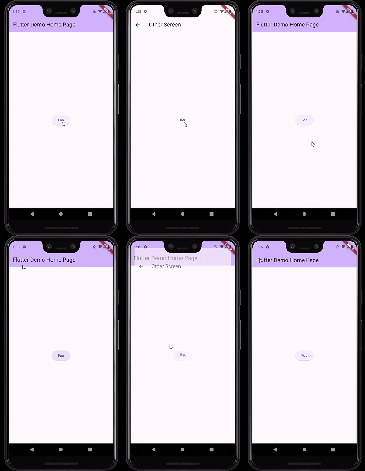
When navigating to another route from any action that involves a ripple (i.e. clicking a material button) upon returning to the original screen the ripple then finishes its animation. In my opinion this gives a jarring experience when returning back to a screen since it looks buggy and as if there was a click you didn’t make. See the below gif for clarification. When pressing back you can see the ripple finish.
class _MyHomePageState extends State<MyHomePage> {
  @override
  Widget build(BuildContext context) {
    return Scaffold(
      appBar: AppBar(
        backgroundColor: Theme.of(context).colorScheme.inversePrimary,
        title: Text(widget.title),
      ),
      body: Center(
        child: Column(
          mainAxisAlignment: MainAxisAlignment.center,
          children: <Widget>[
            ElevatedButton(
              onPressed: () {
                Navigator.push(
                  context,
                  MaterialPageRoute(
                    builder: (context) => const OtherScreen(),
                  ),
                );
              },
              child: const Text('Foo'),
            )
          ],
        ),
      ),
    );
  }
}
I’ve returned to Flutter after a year or so and do not remember this being an issue in the past. Indeed, my apps made around 2021 do not have this happening. I also do not see it present on their documentation for navigation to a new screen
Is there anyway to fix this that does not involve removing the ripple effect all together?
Note that this is happening for me on an emulator and on a real device in release mode.


2
Answers
Fixed it by adding this pageTransitionsTheme to my theme. Looks to be specific to using material3
The second route you are opening is drawn on the top of the first screen, creating this "bad" UX look.
There are several ways you can solve this.
You can delay the opening action, to make it only appear after the first animation ended.
For instance, if your first animation takes 2 seconds, you need to Flutter the opening action by 2 seconds. This can be achieved with a Timer and a Future.
Another option is that instead of opening a new Scaffold, you could only create a method that replaces the content inside your current body, and then the appBar apearence (title, and background color).
This can be achieved using the default build method.