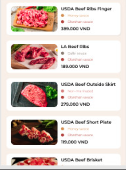
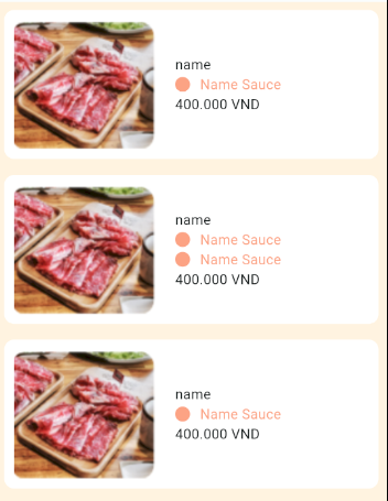
I want to space out the Column on the right side if the image to look the same as the example bur I have tried all 3 of the spaceBetween, spaceEvenly and spaceAround but none seem to work.
This is the code I wrote for the item
Widget foodItemCard(BuildContext context, FoodItem prod) {
  return Padding(
    padding: const EdgeInsets.all(8.0),
    child: Container(
      decoration: BoxDecoration(
          borderRadius: BorderRadius.circular(10), color: Colors.white),
      child: Row(
        crossAxisAlignment: CrossAxisAlignment.center,
        children: [
          Padding(
            padding: const EdgeInsets.only(top: 10, left: 10, bottom: 10),
            child: Image(
              image: AssetImage(prod.imageAddress),
            ),
          ),
          Padding(
            padding: const EdgeInsets.only(left: 20),
            child: Column(
              crossAxisAlignment: CrossAxisAlignment.start,
              children: [
                Text(prod.prodName),
                sauceItemList(context, prod.sauceItems),
                Text('${prod.prodPrice} VND')
              ],
            ),
          ),
        ],
      ),
    ),
  );
}

Widget sauceItemList(BuildContext context, List<SauceItem> items) {
  return Column(
    children: List.generate(
        items.length,
        (index) => Row(
              children: [
                Container(
                  height: 15,
                  width: 15,
                  decoration: BoxDecoration(
                      shape: BoxShape.circle, color: Color(items[index].color)),
                ),
                const SizedBox(
                  width: 10,
                ),
                Text(
                  items[index].prodName,
                  style: TextStyle(color: Color(items[index].color)),
                )
              ],
            )),
  );
}


2
Answers
The Row In Food Item Card change its mainAxisAlignment to adjust accordingly. for example to make it center try code below
}
— output be like

You have to make use of
ExpandedorFlexiblewidget to let widgets take up space according to flex value.Complete Code : –
Output : –