@override
  Widget build(BuildContext context) {
    return Container(
      child: Row(
        mainAxisAlignment: MainAxisAlignment.spaceBetween,
        children: [
          Row(
            children: [
              CircleAvatar(),
              Column(
                crossAxisAlignment: CrossAxisAlignment.start,
                children: [
                  Text(title, overflow: TextOverflow.ellipsis),
                  Text(part),
                ],
              ),
            ],
          ),
          ElevatedButton(onPressed: () {}, child: Text('btn')),
        ],
      ),
    );
  }
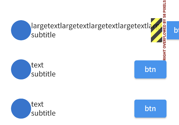
The overflow property of the text widget doesn’t work.
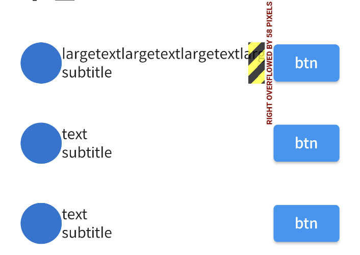
Wrapping the widget with flexible and expanded doesn’t work either.
How should I handle text overflow when there is another row within a row?
What I want is for the text to be longer so that when it encounters a button, …the text is processed in front of the button.
First try
Wrapping a row widget with flexible doesn’t work.
@override
  Widget build(BuildContext context) {
    return Container(
      child: Row(
        mainAxisAlignment: MainAxisAlignment.spaceBetween,
        children: [
          Flexible(
            child: Row(
              children: [
                CircleAvatar(),
                Column(
                  crossAxisAlignment: CrossAxisAlignment.start,
                  children: [
                    Text(title, overflow: TextOverflow.ellipsis),
                    Text(part),
                  ],
                ),
              ],
            ),
          ),
          ElevatedButton(onPressed: () {}, child: Text('btn')),
        ],
      ),
    );
  }
Second try
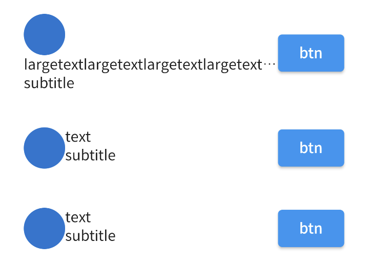
If I replace a Row within a Row with a Wrap widget and then wrap the Wrap widget with Flexible, the text is pushed to the bottom line.
@override
  Widget build(BuildContext context) {
    return Container(
      child: Row(
        mainAxisAlignment: MainAxisAlignment.spaceBetween,
        children: [
          Flexible(
            child: Wrap(
              children: [
                CircleAvatar(),
                Column(
                  crossAxisAlignment: CrossAxisAlignment.start,
                  children: [
                    Text(title, overflow: TextOverflow.ellipsis),
                    Text(part),
                  ],
                ),
              ],
            ),
          ),
          ElevatedButton(onPressed: () {}, child: Text('btn')),
        ],
      ),
    );
  }


2
Answers
You don’t need two rows, use this code:
result:
You need to wrap the inner
RowandColumnwithExpandedto get available space(constrains).More about ayout/constraints.