


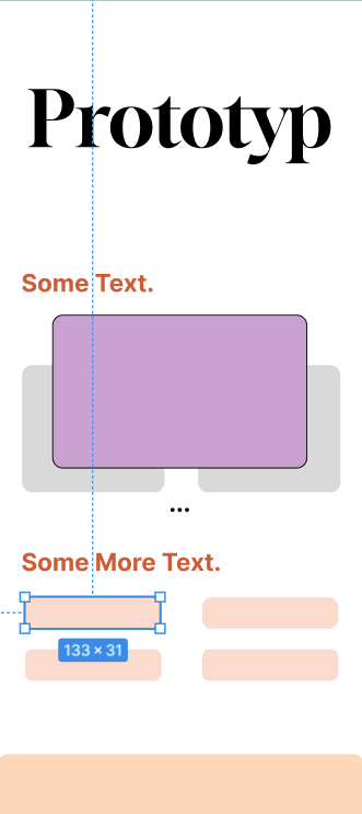
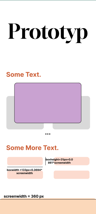
so I was working on a project in Flutter. I had made the prototype designs in Figma, and was trying to recreate it in Flutter. I made the Figma desing inside a 360*800 frame. So now when I’m trying to implement the design, should I just measure the pixel values from the design (as shown in the first image below), or should I make it responsive by querying the width of the screen, and adjusting the proportions of the different widgets based on that (like in the second image)?
I was wondering if taking the time and adjusting for different screen widths like this is worth it. As of writing, I have implemented the code just by taking the measurements from the designs. Does the designs automatically scale up in Flutter, or do they just stay in their hard coded values?
[EDIT 1] I was also wondering this, every element in the screen is represented as a Widget which is inside a Container, or a SizedBox. Would this problem exist even while using a container/box of double.infinity width?
2
Answers
In Flutter, by default, the UI components you create will not automatically scale up or adjust based on different screen sizes. If you have implemented the code by directly taking measurements from the designs, the UI elements will retain those hardcoded values.
However, creating a responsive UI is generally recommended to ensure that your app looks good and functions properly on various screen sizes and orientations.
While it may require some additional effort and time to implement a responsive design, it can greatly enhance the user experience and make your app more accessible across different devices. It’s generally considered good practice to make your UI responsive, especially if you plan to release your app to a wide range of users with varying screen sizes and aspect ratios.
So, if you have the resources and time, it is worth considering making your Flutter UI responsive. It can help you create a more flexible app that performs well across different devices.
When you use a Container with a
double.infinitywidth, it affects the layout behavior of the container itself. It instructs the container to expand horizontally to fill the available space within its parent. This allows the container to take up all the available width, which can be useful in certain cases. However, the child widgets within the container, whether they are direct children or nested within other widgets, are still individual widgets. They can have their own properties, constraints, and behaviors that may or may not be affected by the container’s width.Applying a
double.infinitywidth to a container does not automatically make its child widgets responsive or adjust their sizes. You need to handle the sizing and positioning of the child widgets explicitly by using appropriate techniques and widgets like Expanded, Flexible, MediaQuery, or custom calculations based on the available space.So, while the Container or SizedBox may determine the width of the containing widget, the child widgets are still separate entities within that container, and you need to consider their individual properties to achieve the desired layout and responsiveness.
I think there is no "best practice" if you have to decide building (auto)responsive or scaling it with the width.
You can decide on your own. I always try my app on the average minimal width like 320px then I try it on a largest with possible emulator. If It looks good on both, I am ok with it. Also If I use auto responsive layouts like Row, with MainAixesAlignment.spaceEvenly or Grid view, to avoid mistakes from my side.
Ofcourse, if you catch always the size and resize the Container/SizedBox or Text with it, you are much more flexible. But it could be that the elements in, for example, the smallest are too small and in the largest too large. It really depends on your taste and usecase.
This is all my opinion and for more details I would recommend to read the flutter documentation for responsive design.
Also in your case, I would take the Text size as a fixed size and build everything around it.
For example for the 4 boxes, build 1 column (give the column some horizontal padding), in that column build 2 Rows, in that rows with main axis alignment of space between, and the Container can have a color, border and a padding also.