


Container(
   child: Row(
     children:[
       Container(  //icon in the left side
          height: 50,
          widget: 50,
          color: Colors.green,
          child: Icon...
       ),
       Container( //container text
         //width:200, if I set this width
         child:Text('a long text inside here...',
           textAlign: TextAlign.justify,
         ),//long text here
       ),
     ],
The code above is just a sample to explain my problem.
I call this widget inside a Column. So this column restrict the width of this widget. So far so good. The height of this widget is setted in the icon Container (50). This "long" text will fit inside this area so isn’t so big, just a description.For example if set the height in Icon Container to 80 and width in Container to 280 is enough. enough for fized layouts.
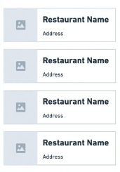
Like in this image:
The problem is that the long text isn’t restricted inside the Container (text). The text is overflowing the container in one single line. If I set the width of this container the text works fine including the justify.
No problem for fixed layouts but I am doing a responsive layout. So this widget need to be flexible to fit in my Column.
I really need to have this width fixed or we can do this work?
Thank you.
2
Answers
you can make use of the Expanded widget to make the text container take up the remaining width within the row, while allowing the text to wrap and be justified
You don’t have to set the fixed width of the container
just set the width according to the size of the screen
for example
this will give you the width of the screen
now using this
widthyou can set the width likewidth * 0.3for the imageand
width * 0.6of the text of the container.I think like this you can also give constraints while keeping the responsiveness.