skip to Main Content

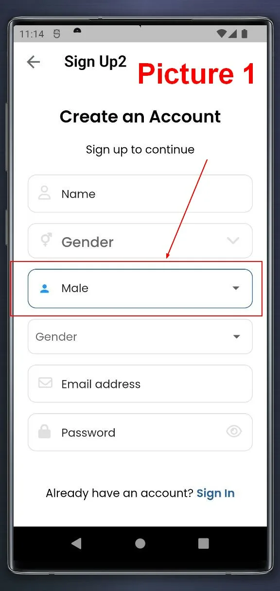
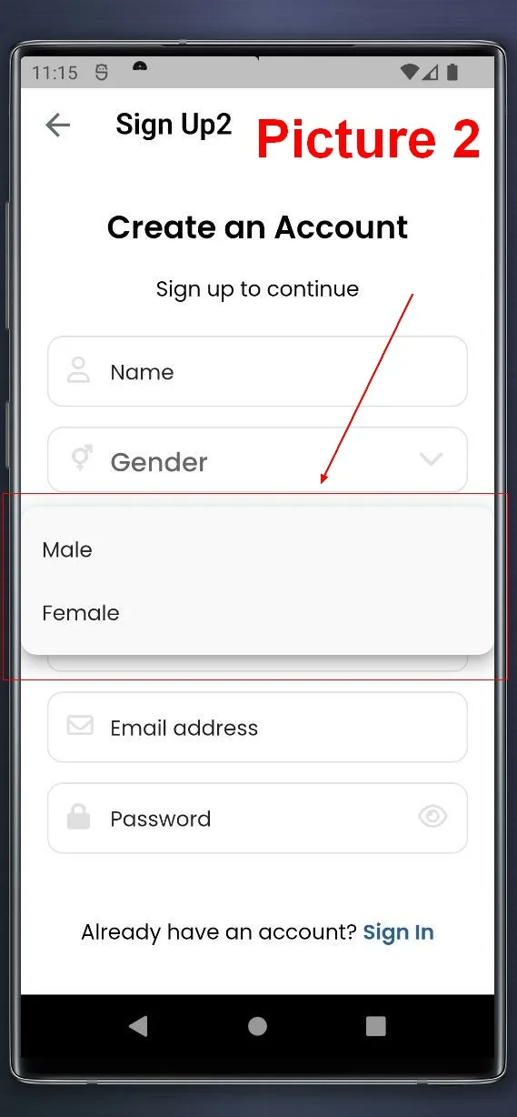
I spent lot of time trying to fix the size of the expanded area (when you open the DropdownButtonFormField), but it always take the full width of the screen

enter image description here

enter image description here

My code is:

        DropdownButtonFormField(
            decoration: InputDecoration(
              prefixIcon: Icon(Icons.person),
              enabledBorder: OutlineInputBorder(
                borderRadius: const BorderRadius.all(Radius.circular(RADIUS),),
                borderSide: BorderSide(color: Theme.of(context).disabledColor),
              ),
              focusedBorder: OutlineInputBorder(
                borderRadius: BorderRadius.all(Radius.circular(RADIUS),),
                borderSide: BorderSide(color: Theme.of(context).primaryColor),
              ),
              isDense: true,
            ),

            hint: Text('gender'),
            isExpanded: true,
            isDense: true,
            items: ['Male', 'Female'].map((String value) {
              return DropdownMenuItem(
                value: value,
                child: Text(value),
              );
            }).toList(),
            onChanged: (_) {
            },
          ),

2

Answers


  1. If you want to specify a specific width for the DropdownMenuItem within a DropdownButtonFormField in Flutter, you can use a combination of Container or SizedBox with a fixed width value. This approach allows you to control the width of each dropdown item individually. Here’s how you can do it:

       DropdownButtonFormField<String>(
      decoration: InputDecoration(
        prefixIcon: Icon(Icons.person),
        enabledBorder: OutlineInputBorder(
          borderRadius: const BorderRadius.all(Radius.circular(RADIUS)),
          borderSide: BorderSide(color: Theme.of(context).disabledColor),
        ),
        focusedBorder: OutlineInputBorder(
          borderRadius: BorderRadius.all(Radius.circular(RADIUS)),
          borderSide: BorderSide(color: Theme.of(context).primaryColor),
        ),
        isDense: true,
      ),
      hint: Text('Gender'),
      isExpanded: true,
      items: ['Male', 'Female'].map((String value) {
        return DropdownMenuItem<String>(
          value: value,
          child: Container(
            width: 200, // Set your desired width here
            child: Text(value),
          ),
        );
      }).toList(),
      onChanged: (String? value) {
        // Handle onChanged event here
      },
    ),
    
    Login or Signup to reply.
  2. By default, dropdown menus have extra padding on both sides, making them wider than the button. You can achieve a consistent width with below approach:

    Set ButtonThemeData.alignedDropdown to true in your button theme. This property specifically adjusts the dropdown menu width to match the button’s width.

    Here’s an example:

    ButtonTheme(
      alignedDropdown: true,
      child: DropdownButtonFormField( ... ),
    )
    

    Here’s a full example as per your requirement:

    ButtonTheme(
                alignedDropdown: true,
                child: DropdownButtonFormField(
                  decoration: InputDecoration(
                    prefixIcon: const Icon(Icons.person),
                    enabledBorder: OutlineInputBorder(
                      borderRadius: const BorderRadius.all(
                        Radius.circular(16),
                      ),
                      borderSide: BorderSide(color: Theme.of(context).disabledColor),
                    ),
                    focusedBorder: OutlineInputBorder(
                      borderRadius: const BorderRadius.all(
                        Radius.circular(16),
                      ),
                      borderSide: BorderSide(color: Theme.of(context).primaryColor),
                    ),
                    isDense: true,
                  ),
                  hint: const Text('gender'),
                  isExpanded: true,
                  isDense: true,
                  items: ['Male', 'Female'].map((String value) {
                    return DropdownMenuItem(
                      value: value,
                      child: Text(value),
                    );
                  }).toList(),
                  onChanged: (_) {},
                ),
              )
    

    Explanation:

    • When alignedDropdown is set to true, the button’s existing start and end padding (typically 16px and 24px) is automatically applied to the dropdown menu. This ensures the content within the button and menu items aligns horizontally.
    Login or Signup to reply.
Please signup or login to give your own answer.
Back To Top
Search