skip to Main Content

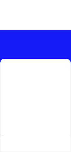
What would be the best approach to create this kind of UI:

enter image description here

Both containers are stretched to device width. Container 1 has a solid background and Container 2 has rounded corners on top and touches the safe area at the bottom. Both containers have fixed height.

Is the best method to use a Stack widget and position both containers? Or is there any another way to achieve it without stack?

3

Answers


  1. This code would be helpful for following design:

     Scaffold(
        backgroundColor: Colors.blue,
        body: Column(
          children: [
            const Expanded(child: SizedBox.shrink()),
            Expanded(
                flex: 3,
                child: Container(
                  decoration: const BoxDecoration(
                    borderRadius: BorderRadius.only(
                        topRight: Radius.circular(40),
                        topLeft: Radius.circular(40)),
                    color: Colors.white,
                  ),
                ))
          ],
        ),
    )
    
    Login or Signup to reply.
  2. you could use bottomCenter alignment in the parent container like this:

    Container(
              height: double.infinity,
              width: double.infinity,
              color: Colors.blue,
              alignment: Alignment.bottomCenter, //<--- Like this
              child: Container(
                height: MediaQuery.of(context).size.height / 1.4,
                width: double.infinity,
                decoration: const BoxDecoration(
                    color: Colors.white,
                    borderRadius: BorderRadius.only(
                        topLeft: Radius.circular(20),
                        topRight: Radius.circular(20))),
              ),
            ),
    

    but i think the best approach would be the stack approach if you want to add content to the blue part and is more flexible

     Stack(
              children: [
                Container(
                  height: double.infinity,
                  width: double.infinity,
                  color: Colors.blue,
                ),
                Align(
                  alignment: Alignment.bottomCenter,
                  child: Container(
                    height: MediaQuery.of(context).size.height / 1.4,
                    width: double.infinity,
                    decoration: const BoxDecoration(
                        color: Colors.white,
                        borderRadius: BorderRadius.only(
                            topLeft: Radius.circular(20),
                            topRight: Radius.circular(20))),
                  ),
                ),
              ],
            ),
    
    Login or Signup to reply.
  3. Two containers, making use of the margin property:

        Container(
              color: Colors.indigo,
              child: Container(
                decoration: const BoxDecoration(
                  color: Colors.white,
                  borderRadius: BorderRadius.vertical(top: Radius.circular(20)),
                ),
                margin: EdgeInsets.only(top: MediaQuery.sizeOf(context).height * 0.40),
              ),
            )
    
    Login or Signup to reply.
Please signup or login to give your own answer.
Back To Top
Search