I have been trying to make my app’s fontsize responsive so that it can vary based on device size.
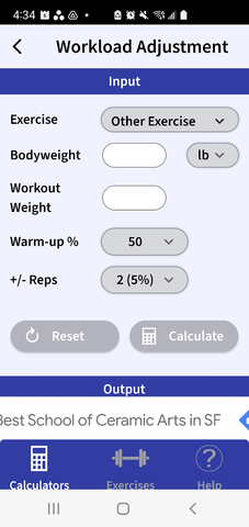
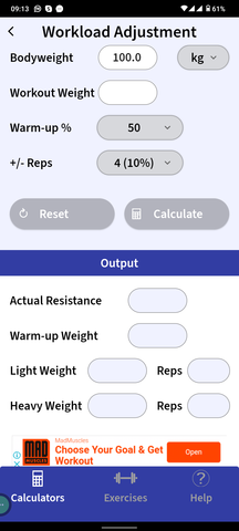
I tried to use Media Query to do that, specifically these lines of code below but they do not seem work based on the screenshots below where on one screen the text is lined up on one line and the other, the text is on 2 lines.
The lines of code:
MediaQueryData mediaQueryData = MediaQuery.of(context);
screenWidth = _mediaQueryData.size.width;
screenHeight = _mediaQueryData.size.height;
double safeAreaWidth = _mediaQueryData.padding.left + _mediaQueryData.padding.right;
double safeAreaHeight = _mediaQueryData.padding.top + _mediaQueryData.padding.bottom;
safeWidth = (screenWidth - safeAreaWidth);
safeHeight = (screenHeight - safeAreaHeight);

//Scale factor for responsive UI
scaleFactorHeight = (safeHeight / 820);
if (scaleFactorHeight < 1) {
   double diff = (1 - scaleFactorHeight) * (1 - scaleFactorHeight);
   scaleFactorHeight += diff;
}
scaleFactorWidth = safeWidth / 392;
if (scaleFactorWidth < 1) {
   double diff = (1 - scaleFactorWidth) * (1 - scaleFactorWidth);
   scaleFactorWidth += diff;
}
The screenshots of the 2 images:


3
Answers
Generally, any scaling that is driven by device width is wrong. TL;DR: use LayoutBuilder (not MediaQuery) to determine breakpoints only (side nav vs bottom nav, two columns vs three). Then use Flex widgets (Row, Column, Expanded, Spacer, etc) to lay out your text. Do not change the font size.
The way to remember this is to think back to the last time you made a web page or a desktop app wider. Did the characters get bigger? No? 🙂 Then stop making your apps "scale" font sizes. Use width to re-layout, not re-size.
Just wrap the desired widget (if you want it to work in the whole app – do it at the top of the widget tree) in a
MediaQuerywidget and overwrite thetextScaleFactorin accordance with your desired logic.