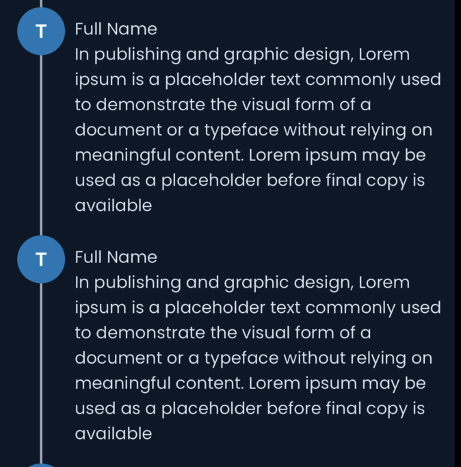
How can I adjust the code to make the container inside the ListViewItem take up the remaining available height, similar to the connecting lines in a Twitter thread? Here’s my current implementation:
Widget _buildListViewItem(BuildContext context) {
  return Column(
    children: [
      Row(
        crossAxisAlignment: CrossAxisAlignment.start,
        children: [
          IntrinsicHeight(
            child: Column(
              children: [
                const Padding(
                  padding: EdgeInsets.only(left: 8.0),
                  child: CircledLetterAvatar(
                    text: "T",
                    size: 40,
                  ),
                ),
                Expanded(
                  child: Padding(
                    padding: const EdgeInsets.only(left: 8.0),
                    child: Container(
                      width: 2,
                      color: Colors.white,
                    ),
                  ),
                )
              ],
            ),
          ),
          Expanded(
            child: Padding(
              padding: const EdgeInsets.all(8.0),
              child: Column(
                crossAxisAlignment: CrossAxisAlignment.start,
                children: [
                  Text("Full Name"),
                  Text(
                    "In publishing and graphic design, "
                    "Lorem ipsum is a placeholder text commonly used to demonstrate "
                    "the visual form of a document or a typeface without relying on meaningful content. "
                    "Lorem ipsum may be used as a placeholder before final copy is available",
                  ),
                ],
              ),
            ),
          ),
        ],
      ),
    ],
  );
}
The issue I’m facing is that the container inside the ListViewItem is not taking up the remaining height available. I want it to stretch vertically to the same height as the right column (the one with "Full Name" and the paragraph).
Below is the expected result:
Any ideas on this will be really appreciated.
Thanks


2
Answers
you can try this :
You can try this. Wrap the whole ‘Row’ widget inside an ‘Expanded’ widget. This will ensure the ‘Row’ widget takes up all the available vertical space within the column. Then you can you ‘Expanded’ widgets inside the ‘Row’ to achieve your desired layout.
Code: