skip to Main Content

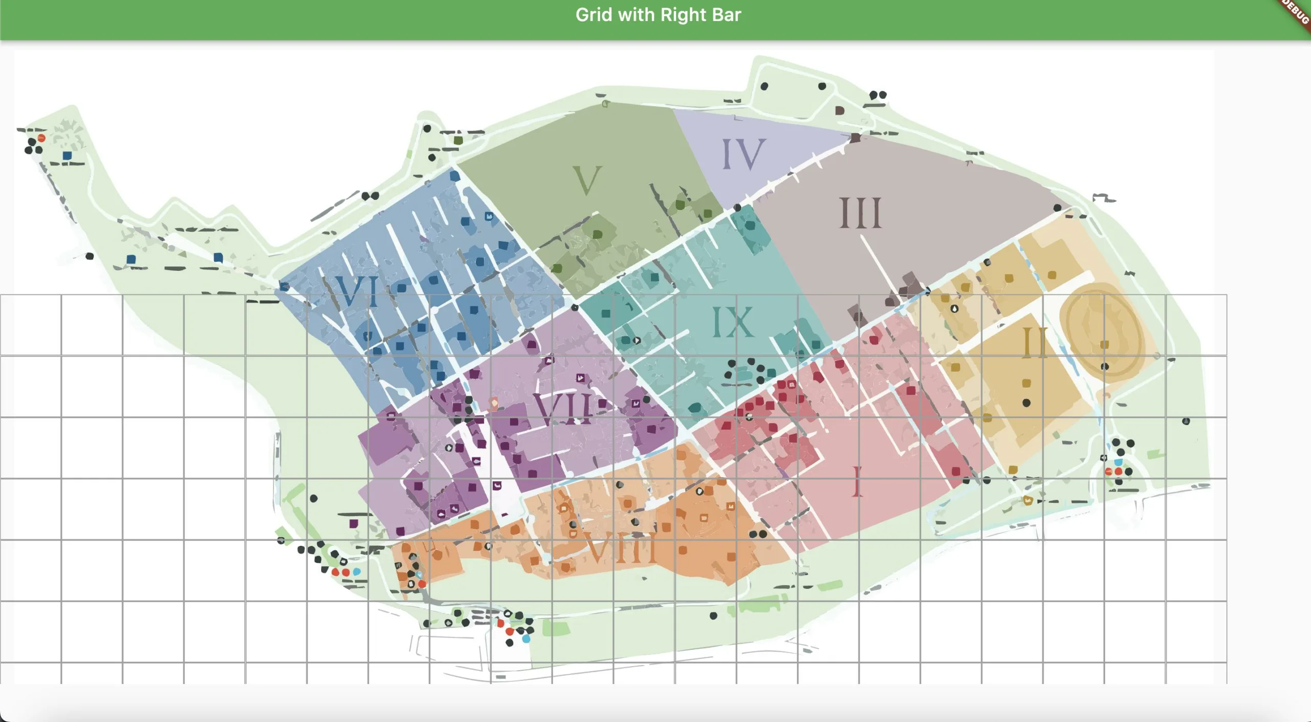
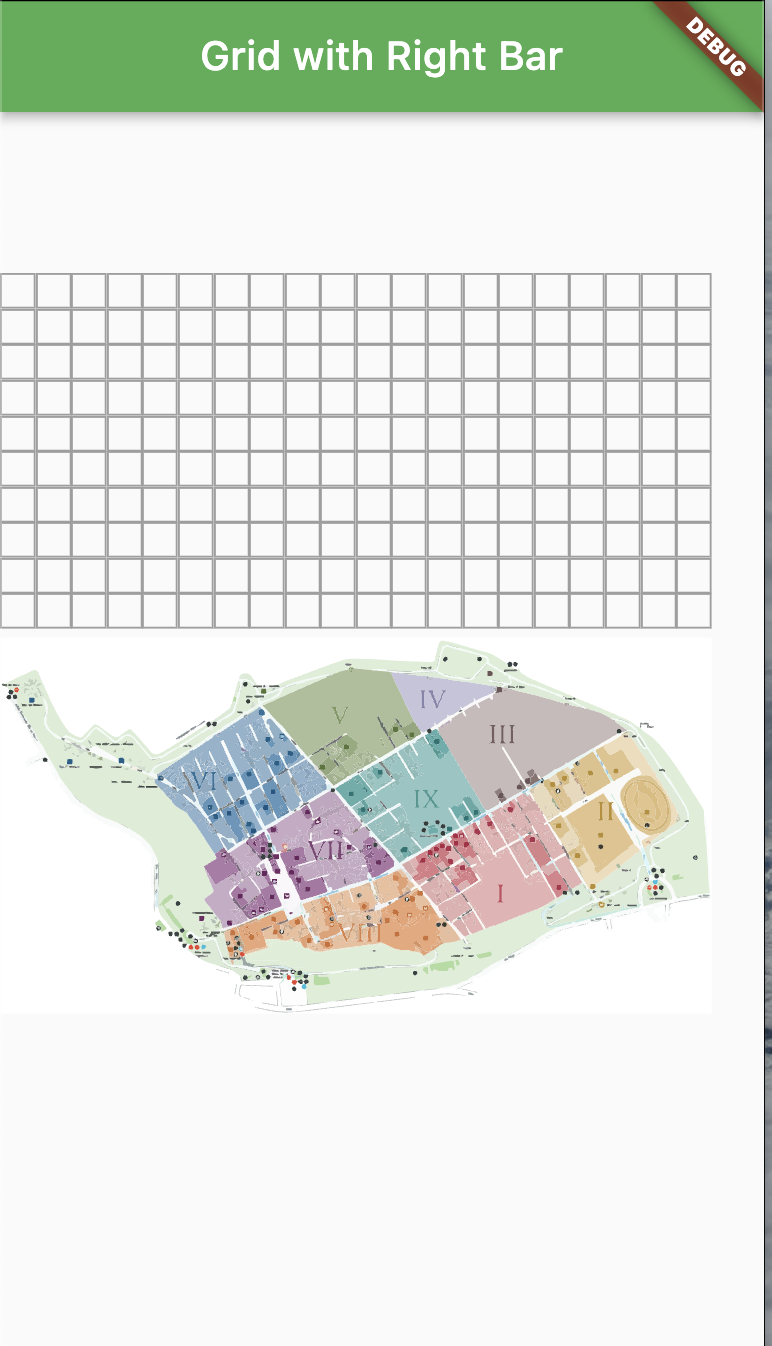
i want to put a grid over an svg but when the dimensions of the screen change my image go to the bottom and my grid to the top how can i do to maintain the grid inside the svg when the screen change and how can i fix the grid vertically and horizontally

that’s the code

void main() {
  runApp(RunMyApp());
}

class RunMyApp extends StatelessWidget {
  const RunMyApp({Key? key});

  @override
  Widget build(BuildContext context) {
    return MaterialApp(
      theme: ThemeData(primarySwatch: Colors.green),
      home: Scaffold(
      appBar: AppBar(title: Text('Grid with Right Bar')),
      body: Row(
        children: [
          Expanded(
            child: InteractiveViewer(
              boundaryMargin: EdgeInsets.all(50.0),
              minScale: 0.1,
              maxScale: 6.0,
              child: Stack(
                alignment: Alignment.center,       
                children: [
                  SvgPicture.asset(
                    'assets/scavi.svg',
                    semanticsLabel: 'My SVG Image',
                  ),
                  Positioned.fill(
                    child: bigGrid(),
                  ),
                ],
              ),
            ),
          ),
        ],
      ),
    ),
    );
  }
}

GridView bigGrid() {
  return GridView.count(
    physics: NeverScrollableScrollPhysics(),
    crossAxisCount: 20,
    children: List.generate(
      20,
      (index) {
        return Container(
            decoration: BoxDecoration(
              border: Border.all(color: Colors.grey),
            ),
          );
      },
    ),
  );
}

full screen
screen of the phone
sandbox

2

Answers


  1. Positioned widget has some other properties. Such as top, right, left, bottom, etc. Use MediaQuery to set the right position of your widget based on screen size.

    Positioned.fill(
      top: MediaQuery.of(context).size.width * 0.2, //example - customize it yourself
      child: bigGrid(),
    ),
    

    //Updated new answer. use AspectRatio widget to maintain the aspect ratio of its child to fit it within the available space.

        Scaffold(
          appBar: AppBar(title: const Text('Grid with Right Bar')),
          body: Row(
            children: [
              Expanded(
                child: InteractiveViewer(
                  boundaryMargin: const EdgeInsets.all(50.0),
                  minScale: 0.1,
                  maxScale: 6.0,
                  child: AspectRatio(
                    aspectRatio:
                        16 / 9, // You can adjust the aspect ratio as needed
                    child: Stack(
                      alignment: Alignment.center,
                      children: [
                        SvgPicture.asset(
                           'assets/scavi.svg',
                           semanticsLabel: 'My SVG Image',
                        ),
                        Positioned.fill(
                          child: bigGrid(),
                        ),
                      ],
                    ),
                  ),
                ),
              ),
            ],
          ),
        );
    
    Login or Signup to reply.
  2. Have you considered changing the crossAxisCount and the count values of Grid.count and List.generate respectively using MediaQuery? Try the following:

        GridView bigGrid() {
      return GridView.count(
        physics: const NeverScrollableScrollPhysics(),
        crossAxisCount: MediaQuery.of(context).size.width > 55 ? 100 : 10,//Change this to your screen size's preference
        children: List.generate(
          MediaQuery.of(context).size.height > 55 ? 9000 : 900, //Change this to your screen size's preference
          (index) {
            return Container(
              decoration: BoxDecoration(
                border: Border.all(color: Colors.grey),
              ),
            );
          },
        ),
      );
    
    Login or Signup to reply.
Please signup or login to give your own answer.
Back To Top
Search