skip to Main Content

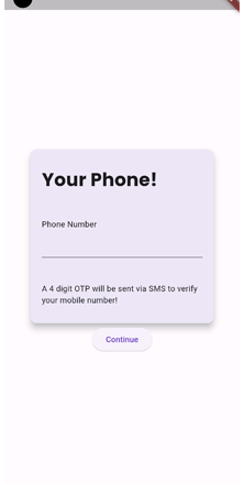
I have a screen and it has 2 (top-level) widgets, a Card() and a Button()

The Card() has to be placed at the center of the screen and the button at the end.

Now, I’ve centered the MainAxisAlignment() of the Column() where both the above widgets are parts of its children[].

Now, this obviously puts both the widgets at the center of the screen and I’ve tried the following approaches to put the Button() at the end.

  1. Use Expanded() for the Card(). But this alters the height of the Card() and assigns the remaining space to it and trumps the height that I’ve specified to it.

  2. Use SizedBox() between the two widgets. But this push both the widgets in the opposite direction.

  3. Use Align() around the Button(). But assigning Alignment.bottomCenter() to its alignment makes no difference.

  4. Use Expanded() for the Button(). But this produces the same visual result as #1, only thing is now the Button() is taking the entire space.

  5. Use Spacer() between both the widgets. But this pushes both the widgets to the extreme ends.

Here’s my code (without any of the above approaches implemented)

Center(
          child: Column(
            mainAxisAlignment: MainAxisAlignment.center,
            children: [
              SizedBox(
                width: MediaQuery.of(context).size.width * 0.8,
                height: MediaQuery.of(context).size.height * 0.35,
                child: Card(
                  elevation: 10.0,
                  color: Colors.white,
                  child: Container(
                    margin: const EdgeInsets.symmetric(
                      vertical: 30,
                      horizontal: 20,
                    ),
                    child: Column(
                      crossAxisAlignment: CrossAxisAlignment.start,
                      children: [
                        Text(
                          'Your Phone!',
                          style: GoogleFonts.poppins(
                            fontSize: 32,
                            fontWeight: FontWeight.bold,
                          ),
                        ),
                        SizedBox(
                          height: MediaQuery.of(context).size.height * 0.05,
                        ),
                        const Column(
                          crossAxisAlignment: CrossAxisAlignment.start,
                          children: [
                            Text('Phone Number'),
                            TextField(),
                          ],
                        ),
                        SizedBox(
                          height: MediaQuery.of(context).size.height * 0.05,
                        ),
                        const Text(
                            'A 4 digit OTP will be sent via SMS to verify your mobile number!'),
                      ],
                    ),
                  ),
                ),
              ),
              ElevatedButton(
                  onPressed: () {},
                  child: const Text('Continue'),
              ),
            ],
          ),
        )

What should I do to achieve the desired UI?

enter image description here

2

Answers


  1. Try filling the gaps with Spacer.

    import 'package:flutter/material.dart';
    
    class _CardView extends StatelessWidget {
      @override
      Widget build(BuildContext context) {
        return Center(
          child: Column(
            mainAxisAlignment: MainAxisAlignment.center,
            children: [
              const Spacer(),
              SizedBox(
                width: MediaQuery.of(context).size.width * 0.8,
                height: MediaQuery.of(context).size.height * 0.35,
                child: Card(
                  elevation: 10.0,
                  color: Colors.white,
                  child: Container(
                    margin: const EdgeInsets.symmetric(
                      vertical: 30,
                      horizontal: 20,
                    ),
                    child: Column(
                      crossAxisAlignment: CrossAxisAlignment.start,
                      children: [
                        const Text(
                          'Your Phone!',
                          style: GoogleFonts.poppins(
                            fontSize: 32,
                            fontWeight: FontWeight.bold,
                          ),
                        ),
                        SizedBox(
                          height: MediaQuery.of(context).size.height * 0.05,
                        ),
                        const Column(
                          crossAxisAlignment: CrossAxisAlignment.start,
                          children: [
                            Text('Phone Number'),
                            TextField(),
                          ],
                        ),
                        SizedBox(
                          height: MediaQuery.of(context).size.height * 0.05,
                        ),
                        const Text(
                            'A 4 digit OTP will be sent via SMS to verify your mobile number!'),
                      ],
                    ),
                  ),
                ),
              ),
              const Spacer(),
              ElevatedButton(
                onPressed: () {},
                child: const Text('Continue'),
              ),
              const Spacer(),
            ],
          ),
        );
      }
    }


    enter image description here

    Login or Signup to reply.
  2. Put an Spacer before the card and an Expanded after it so it will be symmetrical, then you can position the button inside the second expanded as you want with Align.

    Scaffold(
      body: Column(
        children: [
          const Spacer(),
          SizedBox(
            width: MediaQuery.of(context).size.width * 0.8,
            height: MediaQuery.of(context).size.height * 0.35,
            child: Card(
              elevation: 10.0,
              color: Colors.white,
              child: Container(
                margin: const EdgeInsets.symmetric(
                  vertical: 30,
                  horizontal: 20,
                ),
                child: Column(
                  crossAxisAlignment: CrossAxisAlignment.start,
                  children: [
                    Text(
                      'Your Phone!',
                      style: GoogleFonts.poppins(
                        fontSize: 32,
                        fontWeight: FontWeight.bold,
                      ),
                    ),
                    SizedBox(
                      height: MediaQuery.of(context).size.height * 0.05,
                    ),
                    const Column(
                      crossAxisAlignment: CrossAxisAlignment.start,
                      children: [
                        Text('Phone Number'),
                        TextField(),
                      ],
                    ),
                    SizedBox(
                      height: MediaQuery.of(context).size.height * 0.05,
                    ),
                    const Text(
                        'A 4 digit OTP will be sent via SMS to verify your mobile number!'),
                  ],
                ),
              ),
            ),
          ),
          Expanded(
            child: Align(
              alignment: Alignment.center,
              child: ElevatedButton(
                onPressed: () {},
                child: const Text('Continue'),
              ),
            ),
          ),
        ],
      ),
    );
    
    Login or Signup to reply.
Please signup or login to give your own answer.
Back To Top
Search