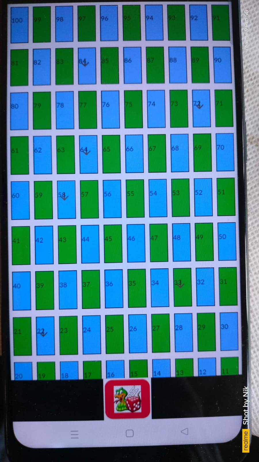
I am a android developer i am learning flutter but here i am fighting with a commom but important issue.
In my below code last some rows is hiding. Here i divided the screen size into 10 part first 9 for gridView and the last one part for card. card is working fine but the rows is not fitting. I have giving the image here
i want to fit the UI for every screen size without any ui change. I have tried many thing but could not find any solution.
Thanks in advance
  @override
Widget build(BuildContext context) {
  final screenWidth = MediaQuery.of(context).size.width;
  final screenHeight = MediaQuery.of(context).size.height;
  final double topPosition1 = screenHeight * 0.5;
  final double leftPosition1 = screenWidth * 0.61;
  final double topPosition2 = screenHeight * 0.56;
  final double leftPosition2 = screenWidth * 0.05;

  // Calculate the height of each part
  final double partHeight = screenHeight / 10;

  // Calculate the aspect ratio dynamically based on screen size
  final double aspectRatio = screenWidth / 10 / partHeight ;

  return Scaffold(
    appBar: AppBar(
      title: const Text('Snake and Ladder'),
    ),
    body: Center(
      child: Stack(
        children: [
          Column(
            children: [
              // First 9 parts
              Expanded(
                flex: 9,
                child: Container(
                  color: Colors.white,
                  child: GridView.builder(
                    padding: const EdgeInsets.all(5.0),
                    gridDelegate: SliverGridDelegateWithFixedCrossAxisCount(
                      crossAxisCount: 10,
                      mainAxisSpacing: 10.0,
                      crossAxisSpacing: 7,
                      childAspectRatio: aspectRatio,
                    ),
                    itemCount: totalCells,
                    physics: const NeverScrollableScrollPhysics(),
                    itemBuilder: (context, index) {
                      final cellNumber = totalCells - index;
                      int row = ((cellNumber - 1) ~/ 10);
                      int col = (cellNumber - 1) % 10;
                      int newCellNumber;
                      if (row % 2 == 0) {
                        newCellNumber = (row + 1) * 10 - col;
                      } else {
                        newCellNumber = (row + 1) * 10 - (9 - col);
                      }
                      return _buildCell(newCellNumber, newCellNumber == _playerLocation, newCellNumber == _playerLocation2);
                    },
                  ),
                ),
              ),
              // Last part
              Expanded(
                flex: 1,
                child: Container(
                  color: Colors.white,
                  child: GestureDetector(
                    onTap: () {
                      setState(() {
                        if (!_firstTap) {
                          _diceNumber = 6;
                          _firstTap = true;
                        } else {
                          _diceNumber = Random().nextInt(6) + 1;
                        }
                        if (_buildCell1) {
                          _playerLocation += _diceNumber;
                          if (_playerLocation > totalCells) {
                            _playerLocation = totalCells;
                          }
                          if (snakes.containsKey(_playerLocation)) {
                            _playerLocation = snakes[_playerLocation]!;
                          }
                        } else {
                          _playerLocation2 += _diceNumber;
                          if (_playerLocation2 > totalCells) {
                            _playerLocation2 = totalCells;
                          }
                          if (snakes.containsKey(_playerLocation2)) {
                            _playerLocation2 = snakes[_playerLocation2]!;
                          }
                        }
                        _buildCell1 = !_buildCell1;
                      });
                    },
                    child: Card(
                      margin: const EdgeInsets.symmetric(vertical: 2.0, horizontal: 2.0),
                      color: _getPlayerColor(_buildCell1),
                      child: Padding(
                        padding: const EdgeInsets.all(10.0),
                        child: Image.asset(
                          'assets/images/dice-$_diceNumber.png',
                          width: 50,
                        ),
                      ),
                    ),
                  ),
                ),
              ),
            ],
          ),

        ],
      ),
    ),
  );
}


2
Answers
Don’t size your widget using
MediaQuerymanually (if you want to know why, see this). To get all your column and row items to fit into any device screen, simply wrap every child withExpanded.The calculation for aspect ratio is wrong. You need to subtract the status bar height, app bar height and spacings mentioned in to calculate the ratio dynamically.
You can implement similar logic for your use case