skip to Main Content

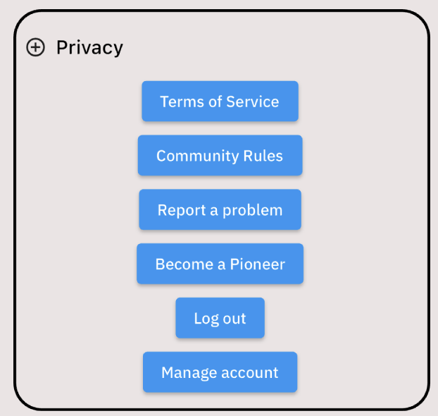
I’m trying to make my buttons look like this:

enter image description here

Currently, it’s looking like this (I’m just focusing on implementing one icon and text button which are side by side correctly and then I can just copy and paste for the others):

enter image description here

I’m trying to center-align the profile and icon buttons, I used TextButton and IconButton to do these, but I haven’t been able to. I’ve also tried wrapping them in a Center widget but that didn’t work. I’m assuming I organized my code and widgets wrong, here’s my code:

Container( // container holding the main setting buttons
            child: Padding(
              padding: const EdgeInsets.only(top: 20, bottom: 0, left: 30, right: 30),
              child: Container(
                width: double.infinity,
                decoration: BoxDecoration(
                  border: Border.all(color: Colors.black, width: 2.5),
                  borderRadius: BorderRadius.circular(25)
                ),
                padding: const EdgeInsets.only(left: 7, top: 7, right: 10, bottom: 8),
                child: Column(
                  children: [
                    Container(
                      alignment: Alignment.center,
                      child: Material(
                        color: Colors.transparent,
                        child: Row(
                          children: [
                            IconButton( // TODO: CHANGE ICON TO EXACT FROM FIGMA
                              iconSize: 20,
                              padding: EdgeInsets.zero,
                              constraints: BoxConstraints(),
                              icon: const Icon(Icons.add_circle_outline),
                              onPressed: () {
                                // TODO: NO FUNCTIONALITY FOR BUTTON
                              },
                            ),
                            
                            TextButton(
                              
                              style: TextButton.styleFrom(
                                foregroundColor: Colors.black, // color of text
                                textStyle: const TextStyle(fontSize: 17, fontWeight: FontWeight.w500),
                              ),
                              onPressed: () {
                                
                              },
                              child: const Text("Privacy"), // TODO: CHANGE FONT
                            ),
                          ],
                        ),
                      ),
                    ),
                    
                    ElevatedButton(onPressed: () => {}, child: const Text("Terms of Service")),
                    ElevatedButton(onPressed: () => {}, child: const Text("Community Rules")),
                    ElevatedButton(onPressed: () => {}, child: const Text("Report a problem")),
                    ElevatedButton(onPressed: () => {}, child: const Text("Become a Pioneer")),
                    ElevatedButton(onPressed: () => {}, child: const Text("Log out")),
                    ElevatedButton(onPressed: () => {}, child: const Text("Manage account"))
                  ]
                ),
              ),
            ),
          ),

2

Answers


  1. That’s because your Row widget takes all remaining space. Simply add:

    Row(
      mainAxisSize: MainAxisSize.min, // This way your Row widget won't take all the space
      children: [
       YourIconButtonWidget(),
       YourTextButtonWidget(),
      ],
    ),
    

    enter image description here

    I’m always using Container with GestureDetector -or InkWell- to customize my buttons like this.

    class MyWidget extends StatelessWidget {
      @override
      Widget build(BuildContext context) {
        return GestureDetector(
          onTap: () {},
          child: Container(
            padding: EdgeInsets.all(8),
            // Style your container here
            decoration: BoxDecoration(
              color: Colors.blue,
              borderRadius: BorderRadius.circular(8),
            ),
            child: Row(
              mainAxisSize: MainAxisSize.min, // Don't forget to add MainAxisSize
              children: [
                Icon(Icons.add),
                Text('Privacy'),
              ],
            ),
          ),
        );
      }
    }
    

    enter image description here

    Login or Signup to reply.
  2. You can just replace the ElevatedButtons by a ListTile

    Example: remove the

    ElevatedButton(onPressed: () => {}, child: const Text("Terms of Service")),
    

    then add

    ListTile(onTap:(){},title:Text("Terms of Service"),leading: Icon(Icons.add))
    ListTile(onTap:(){},title:Text("Community Rules" ),leading: Icon(Icons.add))
    

    and if you wrap the ListTiles on a SizedBox you can set the width as you wish.


    but if you just want to center those widgets:

    then the Column should have a

    mainAxisAlignment: MainAxisAlignment.center

    and the row you put the first button should have :

    mainAxisAlignment: MainAxisAlignment.center

    Login or Signup to reply.
Please signup or login to give your own answer.
Back To Top
Search