


I am trying to make this two buttons horizontally into same level using bootstrap.
<!DOCTYPE html>
<html>
<head>
<link
rel="stylesheet"
href="https://cdn.jsdelivr.net/npm/[email protected]/dist/css/bootstrap.min.css"
integrity="sha384-Gn5384xqQ1aoWXA+058RXPxPg6fy4IWvTNh0E263XmFcJlSAwiGgFAW/dAiS6JXm"
crossorigin="anonymous"
/>
</head>
<body>
<div class="container">
<div class="row">
<div class="col mb-0">
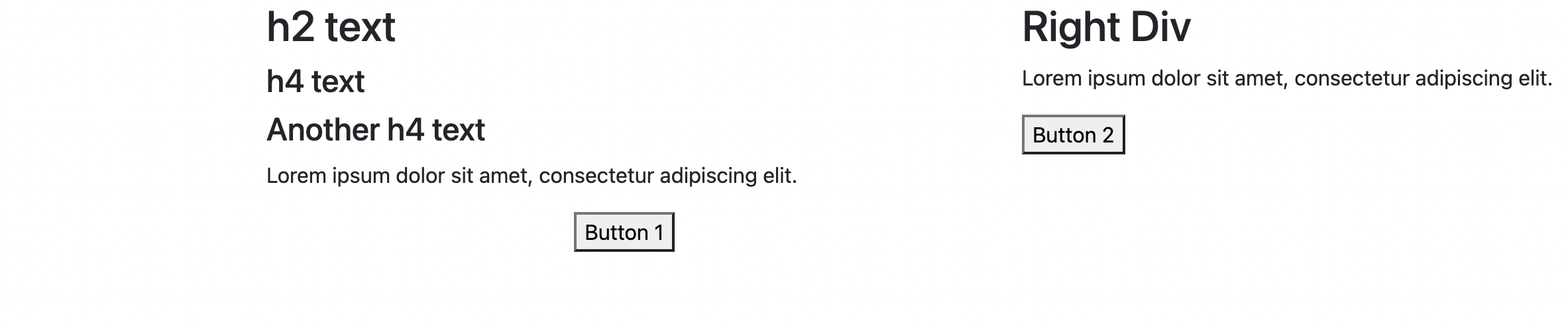
<h2>h2 text</h2>
<h4>h4 text</h4>
<h4>Another h4 text</h4>
<p>Lorem ipsum dolor sit amet, consectetur adipiscing elit.</p>
<div class="text-center"><button>Button 1</button></div>
</div>
<div class="col mb-0">
<h2>Right Div</h2>
<p>Lorem ipsum dolor sit amet, consectetur adipiscing elit.</p>
<button>Button 2</button>
</div>
</div>
</div>
</body>
</html>
Current the output is something like this.
But I want to align the two buttons horizontally as below.

Any help would be much appreciated.
Edit : I would prefer a solution without adding any new elements. Using bootstrap only, if possible .Or otherwise using css.
3
Answers
EDIT: a solution without adding a new row div (though frankly I think this is a clear, simple solution). You could use absolute positioning. But be careful, in the example below it only works because I know the right column is smaller than the left column. To have it work in all cases requires some fiddling. Honestly I would just go with the row solution.
Just put the buttons in a new row, and you’re laughing
You can solve it using the d-flex class to make the columns flex containers and flex-column class to set their flex-direction to column. Also, added the justify-content-between class to distribute the remaining space between the top and bottom of the column.
if you wanna use pure CSS, then you should add
position: relativeto the parent div of that button element, & applyposition: absolute, bottom: 0, to that button