


I don’t ask questions so I don’t know if I marked the codes correctly.
I am making a pseudo chat client, and it is for display purposes only. I have been trying to add a fake "typing area" and a "send button", together I’ve labeled as the "typing bar". While testing, I have noticed that when the "screen"/viewport is too narrow, the "send button" breaks out of the div container.
.typebar {
    min-width: 0;
    max-width: 620px;
    max-height: 40px;
    margin-left: auto;
    margin-right: auto;
    border: 5px solid red;
    display: flex;
    position: relative;
    }

.typebar:before {
    content: '';
    border: 5px solid #566573;
    padding: 26px 85% 0 0;
    background: #eeeeee;
    position: relative;
    float: left;
    cursor: text;
    }

.typebar:after {
    content: 'PESTER';
    font-weight: 600;
    border: 5px solid #566573;
    padding: 5px;
    margin-left: 1%;
    color: #eeeeee;
    background: #2C3E50;
    position: relative;
    float: right;
    cursor: pointer;
    }
<div class="typebar"></div>
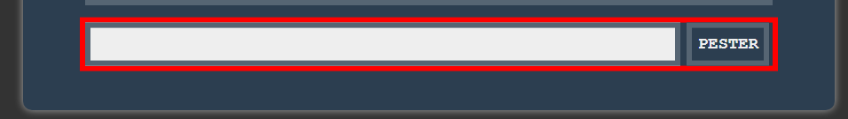
Here is what the problem looks like. I’ve added a red border for the purpose of seeing where the div container should end.
Here’s what it looks like in "full view".
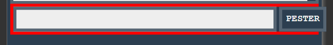
Here’s what happens when the screen is too narrow. (I know for sure that the people who interact with this project will mostly be on mobile, which is why this is important to me.)
If possible, I need a way to make it so the "before" element can "minimize" (if that makes sense) faster to prevent the "after" element from being booted out of the div. (AKA, keeping it at the desired width%)
Adding the overflow: hidden; does keep it inside the div, but at the cost of how some of the letters in the "send" element become, well…hidden! Can’t use that on the "typing area" because there is no content, just padding.
Tried to give the "before" element a max-height and max-padding, but when the screen gets too narrow, it simply doesn’t want to stay at the right percentage.
Tried using the "vw" units (and it seems a max width is not applicable here) and that just causes both elements to get out of the div.
I have also tried making the before and after elements into their own, separate classes (the reason why I didn’t do it in the first place was to try to make it more streamlined on the HTML portion), hoping that maybe as their own classes they would behave differently. Nope! Granted I used the same code, aside from one tiny change in the "after" class (content: ''; to content: "";).
If all else fails, I can resort to just throwing in the towel and simply adding a .png for the "typing bar", (or remove this area altogether and just have the chat client display the messages by itself) but I really don’t want to do that.
2
Answers
You can give position: absolute to ::before and ::after pseudo elements with left: 0 for ::before and right: 0 for ::after, instead of float property. Here is the updated code:-
Use relative units for lengths like percentages, vw, vh, etc. instead of absolute units like px. In both Example A and Example B the widths are in vw — for every 1vw = 1% of viewport width.
BTW, it’s a bad idea to use pseudo-elements (ie
::beforeand::after) for actual interactions with the user because they don’t exist as far as HTML and JavaScript are concerned — they are purely a manifestation of style. Only by targeting the actual element or styles can you indirectly affect a pseudo-element. In Example B, I have added some additional CSS, HTML attributes, and a JavaScript "keyup" event handler to show how the::beforearea can mimic a[contenteditable]element. The::afterarea to interact as a button isn’t included (much more would be involved). Keep in mind Example B is extra and not required as a part of the solution to the question.In short, you’d be better off using either an
<input>or a[contenteditable]and a<button>or<input type="button">and then wrap them into a block element like a<div>or<section>.Example A
Example B