skip to Main Content

So, I am trying to achieve this effect in a grid:

enter image description here

And here’s the code I have:

HTML:

<div className='container'>
    <div className='options-containers'>
        <div className='landingcard'>
            <div className='buttons-container color-venue'> </div>
            <img className='background-image' src={VenueBackground} alt="" />
        </div>
        <div className='landingcard'>
            <div className='buttons-container color-artists'></div>
            <img src={BackgroundImage1} alt="Artists Picture" />
        </div>
        <div className='landingcard'>
            <div className='buttons-container color-fans'></div>
            <img src={FansBackground} alt="" />
        </div>
    </div>
</div>

CSS:

.landingcard{
    position: relative;
}

.landingcard img {
    width: 100%;
    height: 100%; 
    object-fit: cover; 
    border-radius: 25px;
}


.landingcard .color-fans{
    background-color: #549FE5F2;
    opacity: 0.8;
}

.landingcard .color-venue{
    background-color: #FABF4D;
    opacity: 0.8;
}

.landingcard .color-artists{
    background-color: #FFB08B;
    opacity: 0.8;
}

.landingcard .buttons-container {
    position: absolute;
    bottom: 0;
    width: 100%;
    height: 15%;
    display: flex;
    border-radius: 25px;

    align-items: center;
    justify-content: center;
    transition: height 0.3s, opacity 0.3s; 
}

.landingcard:hover .buttons-container {
    height: 70%; 
    opacity: 1;
}

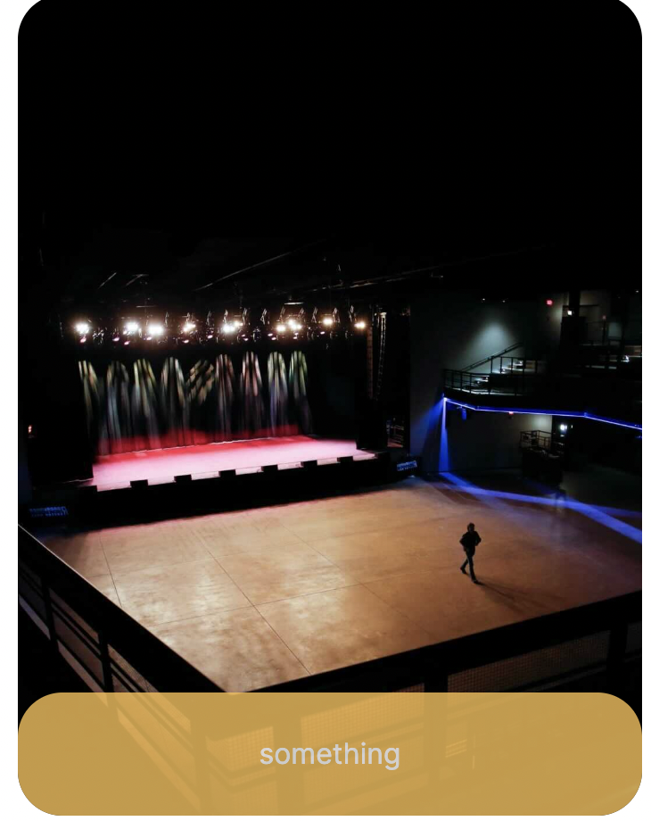
And when compiles, each grid it turns into (I put some text in div to make it clearer):
enter image description here

and when hovers,

enter image description here

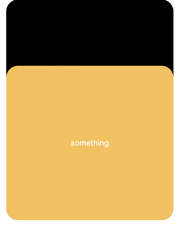
Currently, when I hover on it, the entire colored section grows, so when I write text on the div, the text also transforms up as I hovered on it. How to make it fixed so I could write new contents on the expanded yellow section? (the effect as shown in the picture above?)

2

Answers


  1. Try this:
    I layered a separate button-container above an expand-container

    <div className='container'>
        <div className='options-containers'>
            <div className='landingcard'>
                <div className='expand-container color-venue'>Content Expanded</div>
                <div className='buttons-container color-venue'>Buttons...</div>
                <img className='background-image' src={VenueBackground} alt="" />
            </div>
            <div className='landingcard'>
                <div className='expand-container color-venue'>Content Expanded</div>
                <div className='buttons-container color-venue'>Buttons...</div>
                <img src={BackgroundImage1} alt="Artists Picture" />
            </div>
            <div className='landingcard'>
                <div className='expand-container color-venue'>Content Expanded</div>
                <div className='buttons-container color-venue'>Buttons...</div>
                <img src={FansBackground} alt="" />
            </div>
        </div>
    </div>
    
    .landingcard{
        position: relative;
    }
    
    .landingcard img {
        width: 100%;
        height: 100%; 
        object-fit: cover; 
        border-radius: 25px;
    }
    
    
    .landingcard .color-fans{
        background-color: #549FE5F2;
        opacity: 0.8;
    }
    
    .landingcard .color-venue{
        background-color: #FABF4D;
        opacity: 0.8;
    }
    
    .landingcard .color-artists{
        background-color: #FFB08B;
        opacity: 0.8;
    }
    
    .landingcard .expand-container {
        z-index:0;
        position: absolute;
        bottom: 0;
        width: 100%;
        height: 15%;
        display: flex;
        border-radius: 25px;
    
        align-items: center;
        justify-content: center;
        transition: height 0.3s, opacity 0.3s; 
    }
    
    .landingcard:hover .expand-container {
        height: 70%; 
        opacity: 1;
    }
    
    .landingcard .button-container {
        z-index:1;
        position:absolute;
        bottom:0;
        left:0;
        right:0;
        height:30px;
    }
    
    Login or Signup to reply.
  2. For this sort of element, I’ve used grid with grid-template-rows using a fixed value for the button height. I’ve then used the overflow: hidden property so that when the panel shrinks in size, the text is hidden behind it. Unfortunately padding seems to screw it up so I’ve also had to transition that too. Anyway have a look and see what you think. I’ve used custom properties so you can hopefully see what it does. Annotated code below:

    .container {
      --border-rad: 1rem;
      --custom-colour: #61A1D6;
      --button-height: 2rem;
      --transition-time: 500ms;
      position: relative;
      display: inline-block; /* make the container fit the image */
      border: 1px solid var(--custom-colour);
      border-radius: var(--border-rad);
      overflow: hidden; /* clip the image and any child divs inside the border radius */
    }
    
    .container > img {
      display: block; /* get rid of the space for descenders */
      object-fit: cover;
    }
    
    .panel {
      position: absolute;
      bottom: 0;
      width: 100%;
      height: var(--button-height);
      display: grid; /* we're making 2 rows, the top one fits the container, the bottom is the button height */
      grid-template-rows: 1fr var(--button-height);
      align-items: stretch;
      border-radius: var(--border-rad);
      background-color: var(--custom-colour);
      color: white;
      font-weight: bold;
      opacity: 0.8;
      transition-property: height, opacity;
      transition-duration: var(--transition-time);
    }
    
    .text {
      overflow: hidden; /* make this hide the contents when we shrink the height */
      padding: 0 1rem; /*set the top and bottom padding of the text div to 0 when it's hidden so it doesn't try to move the buttons down */
      transition: padding var(--transition-time);
    }
    
    .buttons {
      /* Use a simple 2 column grid layout to make the buttons */
      display: grid;
      grid-template-columns: 1fr 1fr;
      align-items: center;
      text-align: center;
    }
    .buttons :first-child {
      border-right: 1px solid white; /*put the dividing line in */
    }
    
    .container:hover .panel {
      height: 70%;
      opacity: 1;
    }
    
    .container:hover .text {
      padding: 1rem;
    }
    <div class="container">
      <img src='https://picsum.photos/id/28/300/300'>
      <div class='panel'>
        <div class='text'>Talk about how great TuneHatch is for fans who want new experiences here.</div>
        <div class='buttons'>
          <div>Shows</div>
          <div>Sign Up</div>
        </div>
      </div>
    </div>
    Login or Signup to reply.
Please signup or login to give your own answer.
Back To Top
Search