skip to Main Content

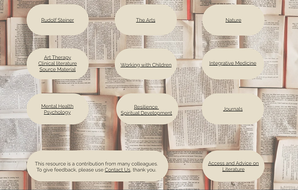
I am trying to recreate the layout below:

enter image description here

The buttons sizes are the same (except one) regardless of the amount of text (including line breaks) inside the button. I am using Bootstrap 5 and have got close to this layout. I have made the buttons all the same width but the height differs. CSS below and fiddle here: https://jsfiddle.net/mfen723/g94tr1k7/9/

.btn-warning {
    background: #e6deca;
    color: #000;
    border: #e6deca;
    padding: 2rem;
    border-radius: 50px;
    width: 280px;
}

When I add a specific height to the button the link text is thrown off centre, so I don’t know how I can achieve the uniform button size as per the above image while keeping the layout responsive.

Any help much appreciated.

2

Answers


  1. Add height to make them same size and use flexbox to center horizontally and vertically with align-items and justify-content.

    Like this:

    .btn-warning {
      background: #e6deca;
      color: #000;
      border: #e6deca;
      padding: 2rem;
      border-radius: 90px;
      width: 280px;
      height: 160px;
      
      display: flex;
      align-items: center;
      justify-content: center;
    }
    
    Login or Signup to reply.
  2. Responsive design doesn’t mean that each button having same size regardless of the text. Definitely for different text, the button size change. What are the possiblities?

    1. If you know somehow the maximum height of any button, then set that fixed height for all buttons with min-height css property. So, that all buttons have same size.
    2. If you don’t know, you have to give space to the text. And definitely, you can’t use overflow: hidden to hide the text.
    3. The good approach is to give fixed width to buttons. And for height, use min-height with some value that at least cover most of the buttons. Now, design the page, let say taking your image example, give display:flex to the container, and set 3 buttons on each row for desktop. Now in this way, even if the text increase, definitely height will increase but each row will contain 3 buttons that make your page layout good. Now for tablet screens, set 2 buttons on each row. And for mobile screens, set single button on each row.

    Obviously you can adjust your page as you wish. But the point is that, you have to give space to your text but you still maintain your page responsiveness. Hope it would be helpful.

    Login or Signup to reply.
Please signup or login to give your own answer.
Back To Top
Search