skip to Main Content

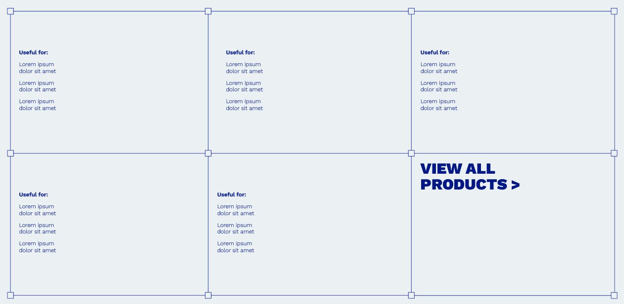
I’m working on a project for a client using nextjs, and the design requires me to have a component with a custom border on a responsive CSS grid. I’ve made the CSS grid with all the content inside, however I’m having a lot of trouble adding the border that the design calls for.

So far I’ve tried making the border part of the background, but that gets screwy when I move between devices, I’ve also tried using an aftter pseudo element but I didn’t get anywhere with that.

I need the border on the CSS grid to look like the image below:

enter image description here

Can someone please help me with this? The help is much appreciated.

2

Answers


  1. You can achieve it more quickly using border-image property. Take a square image shape and put in the border of the div. The attached linked above has a relatable example of it. Have a look at it.

    OR

    You can try this which doesn’t require image:-

    .container{
       display: flex;
    }
    
    .container > .box{
       padding: 2rem 1rem;
       border: 1px solid black;
       position: relative;
    }
    
    .container > .box:nth-child(odd):before,
    .container > .box:after
    {
       content: '';
       display: block;
       width: 10px;
       height: 10px;
       border: 1px solid black;
       background-color: pink;
       position: absolute;
       z-index: 1;
    }
    
    .container > .box:before{
       top: -5px;
       left: -5px;
    }
    
    .container > .box:after{
       top: -5px;
       right: -5px;
    }
    
    .container > .box:nth-child(odd) > span:before,
    .container > .box > span:after
    {
    content: '';
       display: block;
       width: 10px;
       height: 10px;
       border: 1px solid black;
       background-color: pink;
       position: absolute;
       z-index: 1;
    }
    
    .container > .box > span:before{
       bottom: -5px;
       left: -5px;
    }
    
    .container > .box > span:after{
       bottom: -5px;
       right: -5px;
    }
    <div class="container">
      <div class="box">
         <span>Lorem Ipsum</span>
      </div>
      <div class="box">
         <span>Ipsum Lorem</span>
      </div>
    </div>
    Login or Signup to reply.
  2. If transparency is not needed you can try to use gradients combined with border-image

    .box {
      display: grid;
      grid-template-columns: repeat(3,1fr);
      height: 300px;
      margin: 30px;
      /* simulate the border using a grid made with conic-gradient*/
      background: 
       conic-gradient(from 90deg at 1px 1px,#0000 25%,#7a97fb 0)
       0 0/calc((100% - 1px)/3) calc((100% - 1px)/2)
    }
    .box div {
      position: relative;
    }
    .box div:before,
    .box div:after {
      content:"";
      position: absolute;
      inset: 0;
      pointer-events: none;
      /* create 4 squares on the corners with 14px size */
      border-image: 
       linear-gradient(#7a97fb 0 0) 50%/
        14px/7px; /* width / (width/2) */
    }
    .box div:after {
      /* create 4 squares on the corners above the previous ones with 12px size
         leaving 1px on each side for the border you need 
      */
      border-image: 
       /* the color here must match the background color */
       linear-gradient(#ebf0f3 0 0) 50%/
        12px/6px; 
    }


    body {
     background: #ebf0f3;
    }
    <div class="box">
      <div></div>
      <div></div>
      <div></div>
      <div></div>
      <div></div>
      <div></div>
    </div>
    Login or Signup to reply.
Please signup or login to give your own answer.
Back To Top
Search