skip to Main Content

I would like to use colspan to generate multiple half-columns.
To illustrate that with:

enter image description here

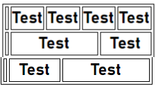
I tried with this code, I was able to do one of the two half-columns but not the other…

table, th, td {
  border: 1px solid black;
}
  <table>
    <tr>
      <th></th>
      <th colspan="1">Test</th>
      <th colspan="2">Test</th>
      <th colspan="2">Test</th>
      <th colspan="1">Test</th>
    </tr>
    <tr>
      <td></td>
      <th colspan="4">Test</th>
      <th colspan="2">Test</th>
    </tr>
    <tr>
      <td></td>
      <th colspan="2">Test</th>
      <th colspan="4">Test</th>
    </tr>
  </table>

Is it possible to achieve this, and also with a higher number of half-columns?

2

Answers


  1. Yes can do that as long as you calculate the number of columns/cells CORRECTLY in each row. And each row has the same number of columns/cells.

    I looked at the photo at the top and translated that as having 8 columns, not the 6 that you did.

    And that would give this:

    th {
      background: pink;
      margin: 3px;
    }
    <table>
      <tr>
        <th colspan="2">Test</th>
        <th colspan="2">Test</th>
        <th colspan="2">Test</th>
        <th colspan="2">Test</th>
      </tr>
      <tr>
        <th colspan="5">Test</th>
        <th colspan="3">Test</th>
      </tr>
      <tr>
        <th colspan="3">Test</th>
        <th colspan="5">Test</th>
      </tr>
    </table>

    Also theres no point inhaving empty columns/cells clutter your table.

    UPDATE
    That’s strange, I wonder if its a peculiarity of the browser rendering.

    Once add the initial individual cells, then it works. This makes me wonder if the browser recalculates the number of columns before rendering…

    .onepixelrow {
      height: 1px;
      overflow: hidden;
    }
    
    th {
      height: 1px;
      border: none;
    }
    <table>
      <tbody>
        <tr class="onepixelrow">
          <th>&nbsp;</th>
          <th>&nbsp;</th>
          <th>&nbsp;</th>
          <th>&nbsp;</th>
          <th>&nbsp;</th>
          <th>&nbsp;</th>
          <th>&nbsp;</th>
          <th>&nbsp;</th>
        </tr>
        <tr>
          <td colspan="2">Test</td>
          <td colspan="2">Test</td>
          <td colspan="2">Test</td>
          <td colspan="2">Test</td>
        </tr>
        <tr>
          <td colspan="5">Test</td>
          <td colspan="3">Test</td>
        </tr>
        <tr>
          <td colspan="3">Test</td>
          <td colspan="5">Test</td>
        </tr>
      </tbody>
    </table>
    Login or Signup to reply.
  2. While you’ve already accepted an answer for this question, it’s worth reiterating the comments to your question: tables should not be used for layout purposes. There are much better tools for that.

    To that end, I want to offer two further solutions; one using flex layout, and the other using grid:

    *,::before,::after {
      box-sizing: border-box;
      margin: 0;
      padding: 0;
    }
    
    section {
      border: 2px solid hsl(300deg 85% 70% / 1);
      /* setting the inline-size of the element, the size of the
         element on the inline-axis (the axis upon which inline
         content is placed), using the clamp() function to
         set a minimum size of 30rem, a maximum size of 900px and
         a preferred size of 60%: */
      inline-size: clamp(30rem, 60%, 900px);
      /* setting a margin after the element, on the block axis (the
         axis perpendicular to the inline, on which blocks are laid
         out): */
      margin-block-end: 1rem;
      /* centering the element on the inline axis: */
      margin-inline: auto;
      /* setting all padding on the element: */
      padding: 0.25rem;
    }
    
    .grid {
      display: grid;
      /* defining eight columns, each of which is one
         fraction of the available space: */
      grid-template-columns: repeat(8, 1fr);
    }
    
    .flex {
      display: flex;
      /* setting both:
           flex-direction: row;
           flex-wrap: wrap;
         using the shorthand 'flex-flow' property */
      flex-flow: row wrap;
    }
    
    span {
      background-color: hsl(200deg 80% 70% / 1);
      block-size: 2rem;
      border: 1px solid #000;
      /* defining the base size of the <span> elements to be
         25% of the size of their parent: */
      flex-basis: 25%;
      /* allowing the <span> elements to grow to fill available
         space: */
      flex-grow: 1;
      /* setting all <span> elements to span two grid-columns: */
      grid-column: span 2;
      text-align: center;
    }
    
    span:nth-child(odd) {
      background-color: hsl(200deg 80% 70% / 0.5);
    }
    
    .hero {
      background-color: hsl(300deg 80% 70% / 0.5);
      /* preventing the .hero elements from expanding, forcing
         them to take their assigned size, and allowing sibling
         elements to expand to fill any space leftover (this
         is only for elements inside of a flex layout): */
      flex-grow: 0;
    }
    
    /* within the .grid parent, the .heroAdjacent elements
       will span 3 grid-columns: */
    .grid .heroAdjacent {
      grid-column: span 3;
    }
    
    /* within the .grid parent the .hero elements will
       span 5 columns: */
    .grid .hero {
      grid-column: span 5;
    }
    
    .flex .hero {
       /* within the .flex parent the .hero items will have a base
          size of 62.5%: */
      flex-basis: 62.5%;
    }
    <section class="grid">
      <span>01</span>
      <span>02</span>
      <span>03</span>
      <span>04</span>
      <span class="hero">05</span>
      <!-- unfortunately, I couldn't find a selector to reliably select
           the elements that are immediately before a ".hero" element,
           so I chose to use the ".heroAdjacent" class-name (though this
           is no more work than specifying colspan in the event of
           using a <table> -->
      <span class="heroAdjacent">06</span>
      <span class="heroAdjacent">07</span>
      <span class="hero">08</span>
    </section>
    
    <section class="flex">
      <span>01</span>
      <span>02</span>
      <span>03</span>
      <span>04</span>
      <span class="hero">05</span>
      <span>06</span>
      <span>07</span>
      <span class="hero">08</span>
    </section>

    JS Fiddle demo.

    References:

    Login or Signup to reply.
Please signup or login to give your own answer.
Back To Top
Search