skip to Main Content

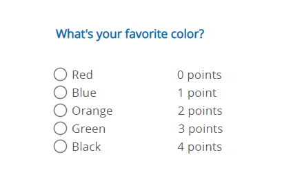
I want to have box next to the fields input that’s in line with the answers itself. Depending also on the lenght of the answer itself the box should be always next to it also accordingly to the screen size. I made this manually for now and trying to figure out the best approach to resolve this issue with css.

<fieldset id="question1" class="current">
   <p class="header">What's your favorite color?</p>
   <label><input type="radio" name="q1" id="q1a1">Red</label><span style="margin-left: 11%;">0 points</span><br>
   <label><input type="radio" name="q1" id="q1a2">Blue</label><span style="margin-left: 10.6%;">1 point</span><br>
   <label><input type="radio" name="q1" id="q1a3">Orange</label><span style="margin-left: 8.5%;">2 points</span><br>
   <label><input type="radio" name="q1" id="q1a4">Green</label><span style="margin-left: 9.5%;">3 points</span><br>
   <label><input type="radio" name="q1" id="q1a5">Black</label><span style="margin-left:10%;">4 points</span><br>
</fieldset>

How I expect this to look and work

enter image description here

I tried so far to wrap everything in div and put it in inline block. How can I make those points to be on the right side in line accordingly to the box on the left and the input.

2

Answers


  1. use flexBox

    gap:5% sets a 5% spacing between the flex items, which means that there will be a space of 5% of the container’s width between each of the items.

    flex:0 0 100px sets the flex properties of the label and span elements to have a fixed width of 100 pixels, so they won’t be affected by the flex layout.

    .item{
          display:flex;
          flex-direction:row;
          justify-content:flex-start;
          align-item:center;
          gap:5%;
        }
    .item label,span{
          flex: 0 0 100px;
    }
    <fieldset id="question1" class="current">
       <p class="header">What's your favorite color?</p>
       <div class="item">
          <label><input type="radio" name="q1" id="q1a1">Red</label>
          <span>0 points</span>
       </div>
       <div class="item">
            <label><input type="radio" name="q1" id="q1a2">Blue</label>
            <span>1 point</span>
        </div>
        <div class="item">
            <label><input type="radio" name="q1" id="q1a3">Orange</label>
            <span>2 points</span>
        </div>
        <div class="item">
           <label><input type="radio" name="q1" id="q1a4">Green</label>
           <span>3 points</span>
        </div>
        <div class="item">
           <label><input type="radio" name="q1" id="q1a5">Black</label>
           <span>4 points</span>
        </div>
    </fieldset>
    Login or Signup to reply.
  2. It’s oke to just wrap things in containers, this way things like flex are easier to use. Your semantics seem a bit off also, take a look how to use a input with a label: https://developer.mozilla.org/en-US/docs/Web/HTML/Element/input/radio

    .option {
      display: flex;
      justify-content: space-between;
    }
    <fieldset id="question1" class="current">
    <p class="header">What's your favorite color?</p>
       <div class="option">
         <div>
           <input type="radio" name="q1" id="q1a1">
           <label for="q1a1">Red</label>
         </div>
         <span>0 points</span>
       </div>
       <div class="option">
         <div>
           <input type="radio" name="q1" id="q1a2">
           <label for="q1a3">Blue</label>
         </div>
         <span>1 points</span>
       </div>
       <div class="option">
         <div>
           <input type="radio" name="q1" id="q1a3">
           <label for="q1a2">Orange</label>    
         </div>
         <span>2 points</span>
       </div> 
    </fieldset>
    Login or Signup to reply.
Please signup or login to give your own answer.
Back To Top
Search