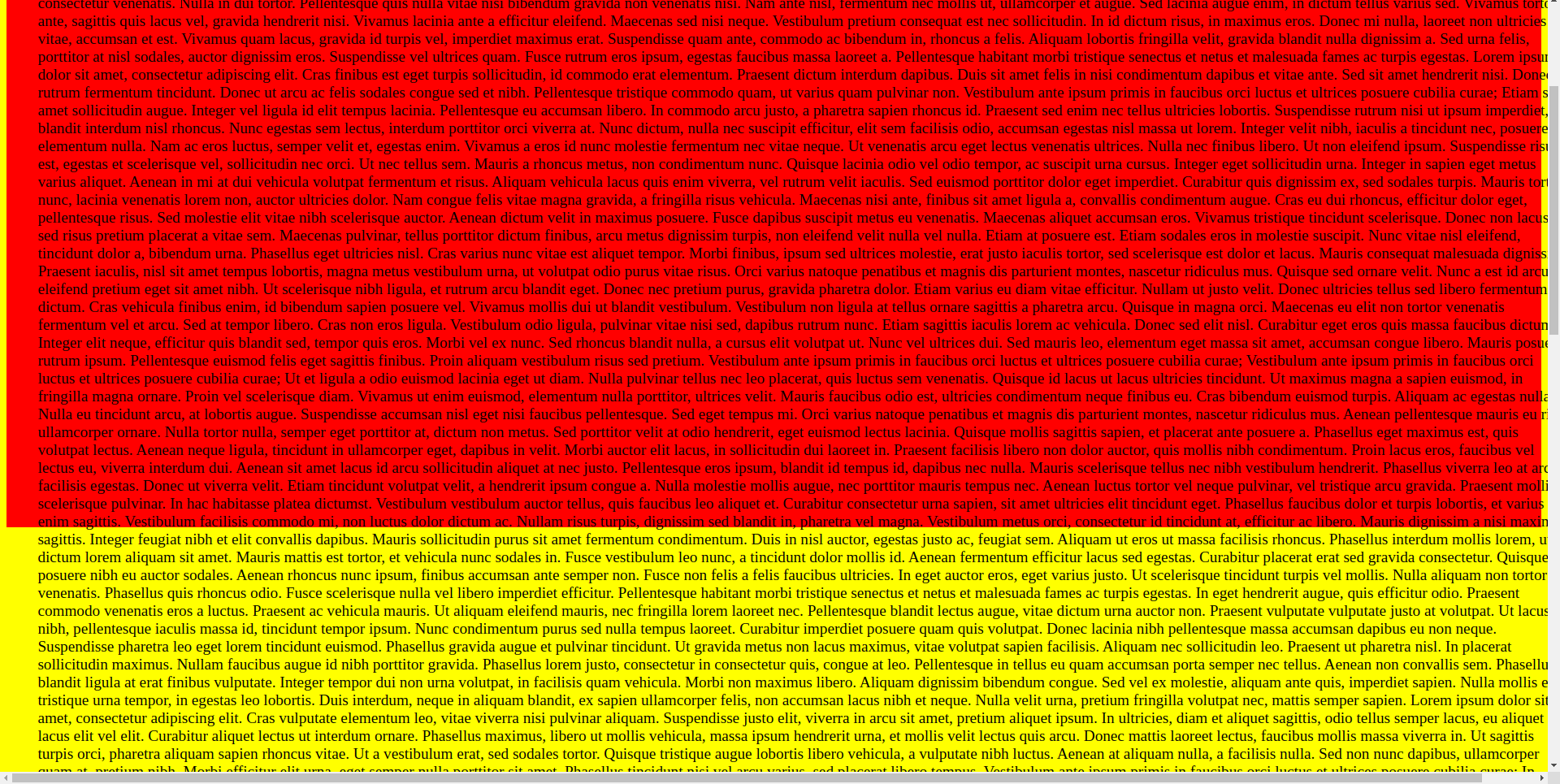
Codepen: https://codepen.io/sabeser/pen/ZEqpyjm
I have this simple layout with a single <div> inside a <body> element:
HTML:
<body>

<div id="app" data-v-app="">
    <div id="content-component">
         <div>a lot of text</div>
    </div>
</div>
</body>
CSS:
        html, body {
            height: 100%;
        }

        body {
            background-color: yellow;
        }

        #app {
            width: 100%;
            height: 100%;
            min-height: 100%;
            background-color: red;

            display: flex;
            flex-direction: column;
        }

        #content-component {
            display: flex;
            flex-direction: column;
            justify-content: start;
            align-items: center;

            width: 100%;
            flex: 1 0 auto;

            font-size: 1.2em;


            padding: 2em;

/*
            background-color: blue;
*/
        }
Gives the following output:
The body is yellow, the #app div is red. Despite height: 100% the #app div doesn’t take up the whole body.
I also don’t understand why the horizontal scrollbar is visible…
If I uncomment the blue background style on the content div, I get this output:
So despite the parent app div (red) not taking up the whole body (yellow), the child content div (blue) takes up the whole body div.


2
Answers
What you are seeing here, which is especially visible when applying a blue background to the
#content-componentdiv, is overflow. The#appdiv is 100% of the body, which is the size of the view panel. The body only appears extended because it is accommodating the overflow. In the screenshot below, you see that the body ends where the original viewport ended.In this second screenshot, you can see that the
#appdiv ends in the same spot but there is special shading in Chrome Dev Tools to indicate that the content is overflowing.You have 100% width/height applied to divs. That will take the full width of the parent and apply that to the child (which has additional padding). To resolve this issue, you can add
box-sizing: border-boxto the div with bothwidth: 100%/height: 100%andpadding.To make it even more simple, you can remove the 100% properties if that is an option.
I would reduce the CSS to the following to keep the children contained within the body. In other words, no additional CSS is needed to accomplish this layout!
You should move this
background-color: red;in your#content-componentto fill the div with red color. And remove thiswidth: 100%;in your#content-componentas it is unnecessary.Codepen