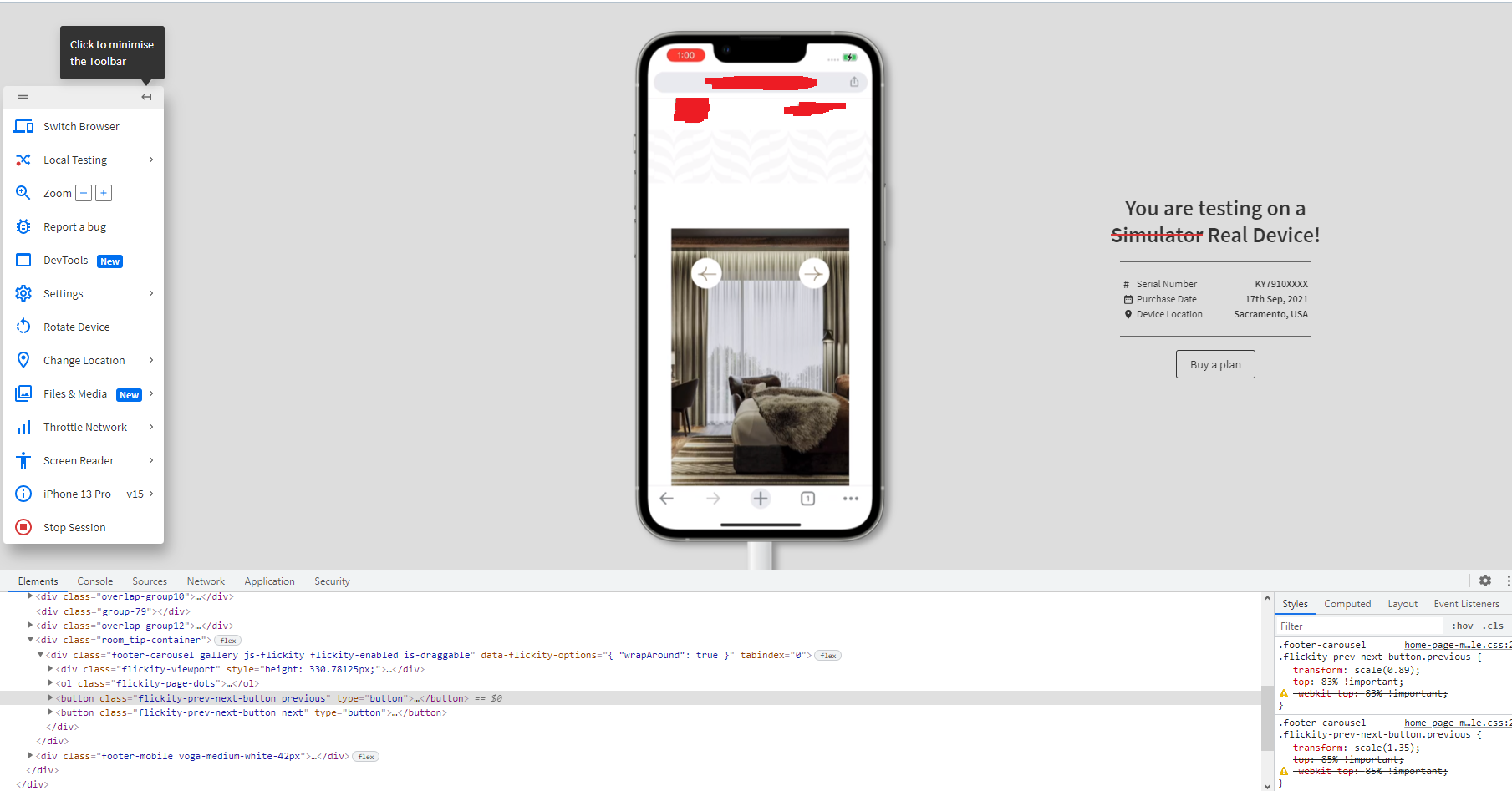
So i am making a website. In it, i am using carousel, but in one of the, the buttons are not rendered in the correct place. I want to render them on the bottom of carousel:
.footer-carousel .flickity-prev-next-button.next{

  transform: scale(1.35);

  top: 85% !important;
}
Everything works fine on desktop version and on my phone.
However, my buttons are rendered at the top of carousel on some other devices, like iphone:
In the picture above, you can see that my class and properties are active but buttons are rendered on top of carousel.
After clicking on button, the button goes down but the image does not change. After that, everything works properly.
If i try to disable this property:
top: 85% !important;
my button goes all the way down:
As you can see the property is disabled and my button is down but when i activate it again it goes where it should have been rendered in the first place:
Can someone please help?


2
Answers
I think the issue is that the .flickity-prev-next-button.next need’s to have the css prop position: absolute; and the parent component .footer-carousel need’s to have the prop position: relative; Just out of convention if something is closer to the bottom I like to use the bottom prob instead of the top property.
That is pretty strange and it seems like a rendering bug to me. Try rotating the device to see if that triggers a resize event that might also correct the rendering issue. If so this just confirms that it might be a rendering bug.
Something that has worked for me in the past to get around odd rendering bugs (if that’s what this is) is to add
transform: translateZ(0)which does nothing visually, but in the background it forces the browser to put this into a new compositing layer and sometimes corrects weird issues I’ve run into.You can confirm this in the Chrome devtools by going to the "rendering" tab and checking the "Layer borders" box
Once you do this you should see an orange box around any elements that are in their own compositing layers.