skip to Main Content

I am ready in a website with bootstrap, and when I am making the screen smaller, the logo and navigation are stacking on each other instead of lined up.

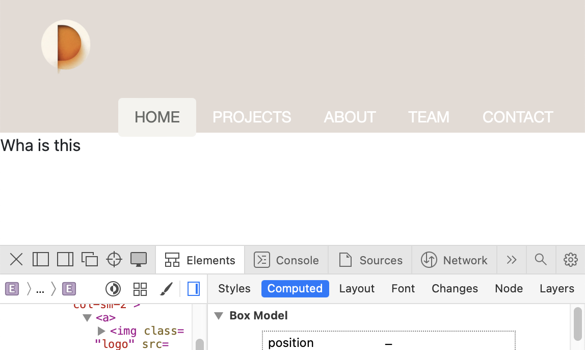
When the screen is in the regular, medium or large size, the logo and navigation are lined up perfectly see the photo below.

enter image description here

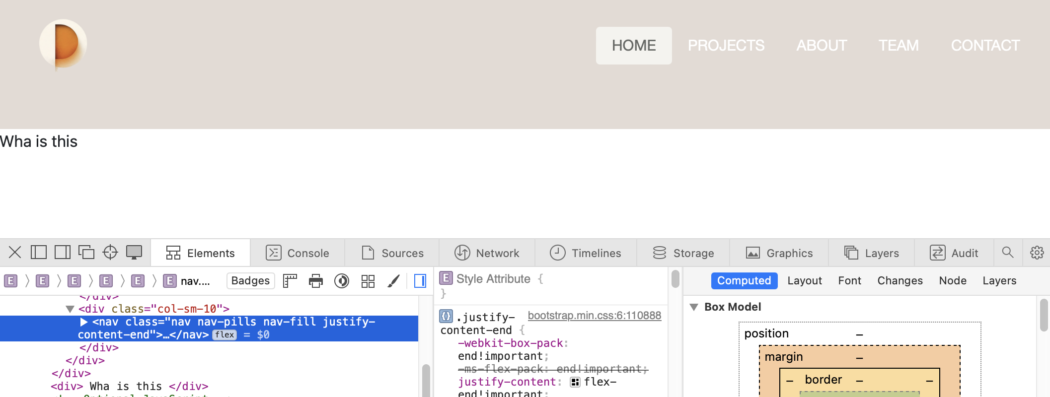
But when I make the screen smaller, they stacked on top of each other see the photo below as well.
enter image description here

    <div class="container-fluid hero-section">
      <div class="row align-items-center">
        <div class="col-sm-2">
          <a><img class="logo" src="assets/logo.png" alt="Pangu Logo"></a>
        </div>
        <div class="col-sm-10">
          <nav class="nav nav-pills nav-fill justify-content-end">
            <a class="nav-link active" aria-current="page" href="#">HOME</a>
            <a class="nav-link" href="#">PROJECTS</a>
            <a class="nav-link" href="#">ABOUT</a>
            <a class="nav-link" href="#">TEAM</a>
            <a class="nav-link" href="#">CONTACT</a>
          </nav>
        </div>
      </div>
    </div>

Many thanks to the help!

2

Answers


  1. You are using the Small breakpoint which requires a minimum viewport width of 576px. Try using the Extra small (none) breakpoint.

    <div class="col-sm-2"> <div class="col-sm-10">

    <div class="col-2"> <div class="col-10">

    Login or Signup to reply.
  2. It is becouse in small screens you must use xs classes (I assume you are using bootstrap)

    But remember that bootstrap is mobile first, so I recommend to you to use classes without sm, so they are applied to all screen sizes

    Reference: https://getbootstrap.com/docs/5.3/layout/grid/#grid-options

       <div class="container-fluid hero-section">
          <div class="row align-items-center">
            <div class="col-2"> <!-- without sm -->
              <a><img class="logo" src="assets/logo.png" alt="Pangu Logo"></a>
            </div>
            <div class="col-10"> <!-- without sm -->
              <nav class="nav nav-pills nav-fill justify-content-end">
                <a class="nav-link active" aria-current="page" href="#">HOME</a>
                <a class="nav-link" href="#">PROJECTS</a>
                <a class="nav-link" href="#">ABOUT</a>
                <a class="nav-link" href="#">TEAM</a>
                <a class="nav-link" href="#">CONTACT</a>
              </nav>
            </div>
          </div>
        </div>
    

    But, far from that, for the layout that you are using, I would recommend to use a flex layout, like this:

    Reference: https://getbootstrap.com/docs/5.3/utilities/flex/

    <link href="https://cdn.jsdelivr.net/npm/[email protected]/dist/css/bootstrap.min.css" rel="stylesheet"/>
    
    <div class="container-fluid hero-section d-flex justify-content-between align-items-center gap-4">
              <a><img class="logo" src="data:image/png;base64,iVBORw0KGgoAAAANSUhEUgAAACgAAAAoCAYAAACM/rhtAAAAAXNSR0IArs4c6QAAAoBJREFUWEftlelqIlEQhctdNO4KLlFJFBeUBPT938AFt7giRANRxAVx1+hwCrpJz5gwThOYH7dA6O7bt+rUV+e2mkKhcKH/ODRCoMrpCIIqAZIgKAiqJaB2v/CgIKiWgNr9woM/RlCj0ZDJZKLdbifX0Ol0dLlc6Hw+/3NdvV5PyH08HuUcBoNBcf85+ZcjTqfTZDQaqVKpcELpHtf7/Z6azSaLvSW0Wi09Pz/TarWibrdLbrebotEofXx8EJp/fX2l2WymSHlVYDAYJJ/Pxy9CoNfrpXA4TOVymZ/lcjkaDoc0mUz43uFw0OPjI4tGA6lUitrtNm02G0UxPMdU8BwCIXY8HtNoNKL7+3vyeDxc71uCd3d3FIvF6P39nQKBAG+IRCJks9mo0Wjw3qenJ1osFjQYDORc2WyWiULg6XSiVqulKBQKhTgHaCEgEI2ikfV6TS6Xi5ssFotfCwRmFO/3+wRfICkEYqPZbKaXlxfeDDHL5VIhEOuZTIZFVqtVFikFhMXjcarVavTw8CALzOfznHO73RLAJBIJKpVKXwv0+/0sCocAJPDDIcEosYbCEsG3tzeFXzA6iSKakkjh/WQyyQKQFz5ETKdTcjqd3CR8Bz9izFINSaXCgzhhFouF1+x2O/sQI0AxFAcBCEGnuD4cDnK3oIdADhDpdDryGujiwCHgbzSOKWEyIN3r9di3aAD1vvWgtAjDoiPJtEhgtVp5eT6fcwEpcIhwGuv1OgtBA/AYbPB7YNQQiHWMHu8iYA14HF+IvxL4R2Yi9iFofv6GXXvvlmcQi6nhoFwL8Vd3C01BUC0tQVAQ/AkCanOK76AgqJaA2v3Cg4KgWgJq9/8C1kmYsDH/6DEAAAAASUVORK5CYII=" alt="Pangu Logo"></a>
              <nav class="nav nav-pills nav-fill">
                <a class="nav-link active" aria-current="page" href="#">HOME</a>
                <a class="nav-link" href="#">PROJECTS</a>
                <a class="nav-link" href="#">ABOUT</a>
                <a class="nav-link" href="#">TEAM</a>
                <a class="nav-link" href="#">CONTACT</a>
              </nav>
          </div>

    Good luck!

    Login or Signup to reply.
Please signup or login to give your own answer.
Back To Top
Search