skip to Main Content

I have the following code:

.parent {
  /* This has a dynamic height */
  display: flex;
  gap: 1em;
  padding: 1em;
  background-color: lightblue;
}

.wrapper {
  width: 150px;
  /* This is a dynamic fixed width */
  display: flex;
  justify-content: center;
  padding: 1em;
  flex-direction: column;
  overflow: hidden;
  background-color: lightcoral;
}

.image-div {
  height: 100%;
  display: flex;
  padding: 10px;
  gap: 5px;
  overflow: hidden;
  background-color: lightgreen;
}

.image {
  height: 100%;
  max-height: 50px; /* Remove this so green box stays the same size and images grow to fill it */

}
<div class='parent'>
  <div class='wrapper'>
    <div class='image-div'>
      <img class='image' src="https://picsum.photos/50/200" />
      <img class='image' src="https://picsum.photos/50/150" />
      <img class='image' src="https://picsum.photos/50/100" />
    </div>
  </div>
  <div class='wrapper'>
    <span> This </span>
    <span> text </span>
    <span> should </span>
    <span> dictate </span>
    <span> dictate </span>
    <span> max </span>
    <span> height </span>
  </div>
  <div class='wrapper'>
    <span> Small text </span>
    <span> doesn't matter </span>
  </div>
</div>

My objective is making the images fit the green box height (width doesn’t matter as they will overflow in order to mantain the aspect ratios, this is an intended and important behaviour). However, if you delete commented the max-size from the image, it grows to its real size making the parent red div grow to fit it:

Notice red div growing

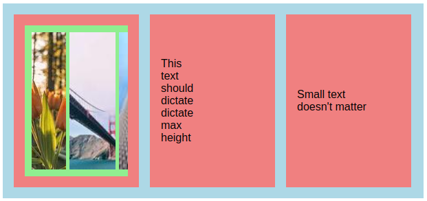
Is there any simple way to end up with something like this, where the image just grows to fit the available size :

Image just grows until it reaches the current red div height

This is important because the blue rectangle height is variable depending on the content of all other red rectangles, the green one is the only one that shouldn’t expand it. Also, given the nature of the problem and the context in which it’s used, I would prefer to do this without JS, just plain CSS.

3

Answers


  1. The images in this example are dictated by the height of the content; however, it might not be exactly what you’re looking for stylistically.

    <div class="image-div">
      <div><img class="image" src="https://picsum.photos/50/200"></div>
      <div><img class="image" src="https://picsum.photos/50/150"></div>
      <div><img class="image" src="https://picsum.photos/50/100"></div>
    </div>
    
    .image-div > div {
      flex: 1 auto;
      position: relative;
    }
    
    .image {
      height: 100%;
      width: 100%;
      position: absolute;
      left: 0;
      top: 0;
    }
    
    Login or Signup to reply.
  2. After messing around with your code for a little bit, I think your issue is that you are not limiting the height of .image-div. Therefore, when you remove max-height from .image, it causes everything to grow to 100% height. If you want to prevent that div from growing, you’ll want to add a max-height property to your .image-div class to limit the height of the green box to a specific size.

    In the code snippet you provided I have removed the max-height property from the .image class and added max-height: 110px; to the .image-div class. I have also added some example text in your second red box so you can see the layout more clearly.

    .parent {
      /* This has a dynamic height */
      display: flex;
      gap: 1em;
      padding: 1em;
      background-color: lightblue;
    }
    
    .wrapper {
      width: 150px;
      /* This is a dynamic fixed width */
      display: flex;
      justify-content: center;
      padding: 1em;
      flex-direction: column;
      overflow: hidden;
      background-color: lightcoral;
    }
    
    .image-div {
      max-height: 110px;
      /* Added a max-height to prevent the div from growing */
      display: flex;
      padding: 10px;
      gap: 5px;
      overflow: hidden;
      background-color: lightgreen;
    }
    
    .image {
      height: 100%;
    }
    <div class='parent'>
      <div class='wrapper'>
        <div class='image-div'>
          <img class='image' src="https://picsum.photos/50/200" />
          <img class='image' src="https://picsum.photos/50/150" />
          <img class='image' src="https://picsum.photos/50/100" />
        </div>
      </div>
      <div class='wrapper'>
        <span> This </span>
        <span> text </span>
        <span> should </span>
        <span> dictate </span>
        <span> dictate </span>
        <span> max </span>
        <span> height </span>
        <span></span>
        <span> Here </span>
        <span> is </span>
        <span> some </span>
        <span> example </span>
        <span> text </span>
      </div>
      <div class='wrapper'>
        <span> Small text </span>
        <span> doesn't matter </span>
      </div>
    </div>
    Login or Signup to reply.
  3. Instead of using height: 100% on the images, use height: 0;min-height: 100%. This will disable the size contribution of the images and at the same time force them to fill all the height.

    .parent {
      display: flex;
      gap: 1em;
      padding: 1em;
      background-color: lightblue;
    }
    
    .wrapper {
      width: 150px;
      display: flex;
      justify-content: center;
      padding: 1em;
      flex-direction: column;
      overflow: hidden;
      background-color: lightcoral;
    }
    
    .image-div {
      height: 100%;
      display: flex;
      padding: 10px;
      gap: 5px;
      overflow: hidden;
      background-color: lightgreen;
    }
    
    .image {
      height: 0;
      min-height: 100%
    }
    <div class='parent'>
      <div class='wrapper'>
        <div class='image-div'>
          <img class='image' src="https://picsum.photos/50/200" />
          <img class='image' src="https://picsum.photos/50/150" />
          <img class='image' src="https://picsum.photos/50/100" />
        </div>
      </div>
      <div class='wrapper'>
        <span> This </span>
        <span> text </span>
        <span> should </span>
        <span> dictate </span>
        <span> dictate </span>
        <span> max </span>
        <span> height </span>
      </div>
      <div class='wrapper'>
        <span> Small text </span>
        <span> doesn't matter </span>
      </div>
    </div>
    Login or Signup to reply.
Please signup or login to give your own answer.
Back To Top
Search