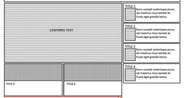
I have a problem with creating the grid shown in the mock. How to do it using only flexbox?
2
You could use this one, or I suggest you use the grid-template feature
.main-container {
  width: 100%;
  height: 100%;
  display: flexbox;
}

.centered-div {
  background-color: #191919;
  height: 50vh;
  width: 100vw;
  display: flex;
  align-items: center;
  justify-content: center;
}

.bottom-section {
  display: inline-flex
  width: 100%
  height: 50vh;
}

.small-left {
  background-color: #191fff;
  height: 50%;
  width: 50%;
  display: flex;
  align-items: center;
  justify-content: center;
  position: absolute;
  left: 0px;
}

.small-right {
  background-color: #aa4444;
  height: 50%;
  width: 50%;
  display: flex;
  align-items: center;
  justify-content: center;
  position: absolute;
  right: 0px
}
<div class="main-container">

  <div class="centered-div">
    <h1>Centered Div</h1>
  </div>

  <section class="bottom-section">
    <div class="small-left">
      <h1>Small Left</h1>
    </div>

    <div class="small-right">
      <h1>Small Right</h1>
    </div>
  </section>

</div>
<!DOCTYPE html>
<html lang="en">
<head>
    <meta charset="UTF-8">
    <meta name="viewport" content="width=device-width, initial-scale=1.0">
    <title>Document</title>
    <style>
        .abcdef{
            display: flex;
        }
        .leftside-up{
            background-color: aliceblue;
            height: 120px;
            width: 80%;
        }
        .leftside-down1{
            background-color: aqua;
            height: 30px;
            width: 80%;
        }
        .leftside-down2{
            background-color:darkcyan;
            height: 30px;
            width: 80%;
        }
        .right1, .right2, .right3, .right4{
            height: 40px;
            width: 100px;
        }
        .right1{
            background-color: azure;
        }
        .right2{
            background-color: bisque;
        }
        .right3{
            background-color: blanchedalmond;
        }
        .right4{
            background-color: brown;
        }
    </style>
</head>
<body>
    <div class="abcdef" style="width: 400px;">
        <div class="leftside" style="width: 300px;">
            <div class="leftside-up" style="width: 300px;"></div>
            <div class="leftside-down" style="width: 300px; height: 60px;">
                <div class="leftside-down1" style="width: 300px;"></div>
                <div class="leftside-down2" style="width: 300px;"></div>
            </div>
        </div>
        <div class="righside" style="width: 100px;">
            <div class="right1"></div>
            <div class="right2"></div>
            <div class="right3"></div>
            <div class="right4"></div>
        </div>
    </div>
</body>
</html>
You can adjust heights and widths according to your need
Click here to cancel reply.
 Question posted in


2
Answers
You could use this one, or I suggest you use the grid-template feature
You can adjust heights and widths according to your need