skip to Main Content

I need to create an HTML table that contains the following information

Paper image paper image Paper Image
Authors Authors Authors
Conference Conference Conference
Link to Download Link to Download Link to Download

I wrote the following code snippet:

<link href="https://cdn.jsdelivr.net/npm/[email protected]/dist/css/bootstrap.min.css" rel="stylesheet" integrity="sha384-KK94CHFLLe+nY2dmCWGMq91rCGa5gtU4mk92HdvYe+M/SXH301p5ILy+dN9+nJOZ" crossorigin="anonymous">
<script src="https://cdn.jsdelivr.net/npm/[email protected]/dist/js/bootstrap.bundle.min.js" integrity="sha384-ENjdO4Dr2bkBIFxQpeoTz1HIcje39Wm4jDKdf19U8gI4ddQ3GYNS7NTKfAdVQSZe" crossorigin="anonymous"></script>
<div class="filters-content" style="width: 800px; height: 500px; overflow: auto;">
            <div class="scrollingDiv">
                <div class="container">
                    <table class="table" style="table-layout: fixed; width: 100%;">
                        <tbody>
                            <tr>
                                <td style="width: 33.33%; padding: 10px;">
                                    <div class="d-flex flex-column align-items-center">
                                        <img src="images/25599.jpg" alt="Paper 1" class="img-fluid" style="max-width: 100%; height: auto;">
                                        <div class="mt-2 text-center" style="font-size: 16px;">Authors: long long long long long long long long long long long long long long long long longlist of Authors</div>
                                        <div class="text-center" style="font-size: 16px;">Conference: conference name</div>
                                        <div class="mt-2"><a href="papers/C1.pdf" class="btn btn-primary" style="font-size: 16px;">Download paper</a></div>
                                    </div>
                                </td>
                                <td style="width: 33.33%; padding: 10px;">
                                    <div class="d-flex flex-column align-items-center">
                                        <img src="images/25599.jpg" alt="Paper 2" class="img-fluid" style="max-width: 100%; height: auto;">
                                        <div class="mt-2 text-center" style="font-size: 16px;">Authors:  Author1, Author 2</div>
                                        <div class="text-center" style="font-size: 16px;">Conference: conference 2</div>
                                        <div class="mt-2"><a href="papers/C2.pdf" class="btn btn-primary" style="font-size: 16px;">Download paper</a></div>
                                    </div>
                                </td>
                                <td style="width: 33.33%; padding: 10px;">
                                    <div class="d-flex flex-column align-items-center">
                                        <img src="images/25599.jpg" alt="Paper 3" class="img-fluid" style="max-width: 100%; height: auto;">
                                        <div class="mt-2 text-center" style="font-size: 16px;">Authors: long list of Authors</div>
                                        <div class="text-center" style="font-size: 16px;">Conference: Conference 3</div>
                                        <div class="mt-2"><a href="papers/c3.pdf" class="btn btn-primary" style="font-size: 16px;">Download paper</a></div>
                                    </div>
                                </td>
                            </tr>
                        </tbody>
                    </table>
                </div>
            </div>
        </div>

However, the elements inside the table are not correctly aligned (especially the buttons)
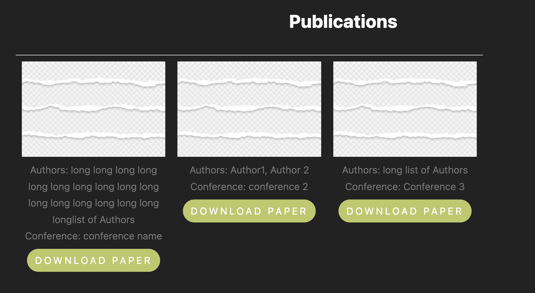
image

How can I fix it?

4

Answers


  1. try

      <style>
                div{
                    height : 70px;
                }
         </style>
    
    Login or Signup to reply.
  2. Put the details in separate row i.e tr like how the image is rendering here.To have borders remove the border:none inside style tag

    <!doctype html>
    <html lang="en">
    <head>
      <meta charset="utf-8">
      <base href="/">
      <meta name="viewport" content="width=device-width, initial-scale=1">
      <link rel="icon" type="image/x-icon" href="favicon.ico">    
      <link href="https://cdn.jsdelivr.net/npm/[email protected]/dist/css/bootstrap.min.css" rel="stylesheet" integrity="sha384-KK94CHFLLe+nY2dmCWGMq91rCGa5gtU4mk92HdvYe+M/SXH301p5ILy+dN9+nJOZ" crossorigin="anonymous">
      <script src="https://cdn.jsdelivr.net/npm/[email protected]/dist/js/bootstrap.bundle.min.js" integrity="sha384-ENjdO4Dr2bkBIFxQpeoTz1HIcje39Wm4jDKdf19U8gI4ddQ3GYNS7NTKfAdVQSZe" crossorigin="anonymous"></script>
      <style>
        table tr td {
            border: none;
        }
      </style>
    </head>
    <body class="mat-typography factory-theme">
        <div class="filters-content" style="width: 800px; height: 500px; overflow: auto;">
            <div class="scrollingDiv">
                <div class="container">
                    <table class="table" style="table-layout: fixed; width: 100%;">
                        <tbody>
                            <tr>
                                <td style="width: 33.33%; padding: 10px;">
                                    <div class="d-flex flex-column align-items-center">
                                        <img src="images/25599.jpg" alt="Paper 1" class="img-fluid" style="max-width: 100%; height: auto;">
                                        <div class="mt-2 text-center" style="font-size: 16px;">Authors: long long long long long long long long long long long long long long long long longlist of Authors</div>
                                        <div class="text-center" style="font-size: 16px;">Conference: conference name</div>
                                    </div>
                                </td>
                                <td style="width: 33.33%; padding: 10px;">
                                    <div class="d-flex flex-column align-items-center">
                                        <img src="images/25599.jpg" alt="Paper 2" class="img-fluid" style="max-width: 100%; height: auto;">
                                        <div class="mt-2 text-center" style="font-size: 16px;">Authors:  Author1, Author 2</div>
                                        <div class="text-center" style="font-size: 16px;">Conference: conference 2</div>
                                    </div>
                                </td>
                                <td style="width: 33.33%; padding: 10px;">
                                    <div class="d-flex flex-column align-items-center">
                                        <img src="images/25599.jpg" alt="Paper 3" class="img-fluid" style="max-width: 100%; height: auto;">
                                        <div class="mt-2 text-center" style="font-size: 16px;">Authors: long list of Authors</div>
                                        <div class="text-center" style="font-size: 16px;">Conference: Conference 3</div>
                                    </div>
                                </td>
                            </tr>
                            <tr>
                                <td>
                                    <div class="mt-2"><a href="papers/C1.pdf" class="btn btn-primary" style="font-size: 16px;">Download paper</a></div>
    
                                </td>
                                <td>
                                    <div class="mt-2"><a href="papers/C2.pdf" class="btn btn-primary" style="font-size: 16px;">Download paper</a></div>
    
                                </td>
                                <td>
                                    <div class="mt-2"><a href="papers/c3.pdf" class="btn btn-primary" style="font-size: 16px;">Download paper</a></div>
    
                                </td>
                            </tr>
                        </tbody>
                    </table>
                </div>
            </div>
        </div>
    </body>
    </html>
    Login or Signup to reply.
  3. you have added some line of css code to solve your problem

        table tr td {
            border: none;
        }
        .paper-img {
            max-width: 100%;
            height: auto;
        }
        .paper-title {
            font-size: 16px;
        }
        .download-btn {
            font-size: 16px;
        }
    <!doctype html>
    <html lang="en">
    <head>
      <meta charset="utf-8">
      <base href="/">
      <meta name="viewport" content="width=device-width, initial-scale=1">
      <link rel="icon" type="image/x-icon" href="favicon.ico">    
      <link href="https://cdn.jsdelivr.net/npm/[email protected]/dist/css/bootstrap.min.css" rel="stylesheet" integrity="sha384-KK94CHFLLe+nY2dmCWGMq91rCGa5gtU4mk92HdvYe+M/SXH301p5ILy+dN9+nJOZ" crossorigin="anonymous">
    </head>
    <body class="mat-typography factory-theme">
        <div class="filters-content" style="width: 800px; height: 500px; overflow: auto;">
            <div class="scrollingDiv">
                <div class="container">
                    <table class="table" style="table-layout: fixed; width: 100%;">
                        <tbody>
                            <tr>
                                <td style="width: 33.33%; padding: 10px;">
                                    <div class="d-flex flex-column align-items-center">
                                        <img src="images/25599.jpg" alt="Paper 1" class="paper-img">
                                        <div class="mt-2 text-center paper-title">Authors: long long long long long long long long long long long long long long long long longlist of Authors</div>
                                        <div class="text-center paper-title">Conference: conference name</div>
                                    </div>
                                </td>
                                <td style="width: 33.33%; padding: 10px;">
                                    <div class="d-flex flex-column align-items-center">
                                        <img src="images/25599.jpg" alt="Paper 2" class="paper-img">
                                        <div class="mt-2 text-center paper-title">Authors: Author1, Author 2</div>
                                        <div class="text-center paper-title">Conference: conference 2</div>
                                    </div>
                                </td>
                                <td style="width: 33.33%; padding: 10px;">
                                    <div class="d-flex flex-column align-items-center">
                                        <img src="images/25599.jpg" alt="Paper 3" class="paper-img">
                                        <div class="mt-2 text-center paper-title">Authors: long list of Authors</div>
                                        <div class="text-center paper-title">Conference: Conference 3</div>
                                    </div>
                                </td>
                            </tr>
                            <tr>
                                <td>
                                    <div class="mt-2"><a href="papers/C1.pdf" class="btn btn-primary download-btn">Download paper</a></div>
    
                                </td>
                                <td>
                                    <div class="mt-2"><a href="papers/C2.pdf" class="btn btn-primary download-btn">Download paper</a></div>
    
                                </td>
                                <td>
                                    <div class="mt-2"><a href="papers/c3.pdf" class="btn btn-primary download-btn">Download paper</a></div>
    
                                </td>
                            </tr>
                        </tbody>
                    </table>
                </div>
            </div>
        </div>
    </
    Login or Signup to reply.
  4. You don’t have to create new row, just use height:100%; and justify-content:space-between or boostrap classname justify-content-between.

    The reason for the alignment is all the three card does not have equal height, so if we set the height equal and some flex property we can achieve easily.Below i added height:100% for some elements.

    <link href="https://cdn.jsdelivr.net/npm/[email protected]/dist/css/bootstrap.min.css" rel="stylesheet" integrity="sha384-KK94CHFLLe+nY2dmCWGMq91rCGa5gtU4mk92HdvYe+M/SXH301p5ILy+dN9+nJOZ" crossorigin="anonymous">
    <script src="https://cdn.jsdelivr.net/npm/[email protected]/dist/js/bootstrap.bundle.min.js" integrity="sha384-ENjdO4Dr2bkBIFxQpeoTz1HIcje39Wm4jDKdf19U8gI4ddQ3GYNS7NTKfAdVQSZe" crossorigin="anonymous"></script>
    <div class="filters-content" style="width: 800px; height: 500px; overflow: auto;">
                <div class="scrollingDiv">
                    <div class="container">
                        
                        <table class="table" style="table-layout: fixed; width: 100%;">
                            <tbody style="height: 100%;">
                                <tr>
                                    <td style="width: 33.33%; padding: 10px;height: 100%;">
                                        <div class="d-flex flex-column align-items-center justify-content-between" style='height:100%;'>
                                            <img src="https://img.freepik.com/free-photo/book-composition-with-open-book_23-2147690555.jpg?size=626&ext=jpg" alt="Paper 1" class="img-fluid" style="max-width: 100%; height: auto;">
                                            <div class="mt-2 text-center" style="font-size: 16px;">Authors: long long long long long long long long long long long long long long long long longlist of Authors</div>
                                            <div class="text-center" style="font-size: 16px;">Conference: conference name</div>
                                            <div class="mt-2"><a href="papers/C1.pdf" class="btn btn-primary" style="font-size: 16px;">Download paper</a></div>
                                        </div>
                                    </td>
                                    <td style="width: 33.33%; padding: 10px;height: 100%;">
                                        <div class="d-flex flex-column align-items-center justify-content-between" style='height:100%;'>
                                            <img src="https://img.freepik.com/free-photo/book-composition-with-open-book_23-2147690555.jpg?size=626&ext=jpg" alt="Paper 2" class="img-fluid" style="max-width: 100%; height: auto;">
                                            <div class="mt-2 text-center" style="font-size: 16px;">Authors:  Author1, Author 2</div>
                                            <div class="text-center" style="font-size: 16px;">Conference: conference 2</div>
                                            <div class="mt-2"><a href="papers/C2.pdf" class="btn btn-primary" style="font-size: 16px;">Download paper</a></div>
                                        </div>
                                    </td>
                                    <td style="width: 33.33%; padding: 10px;height: 100%;">
                                        <div class="d-flex flex-column align-items-center justify-content-between" style='height:100%;'>
                                            <img src="https://img.freepik.com/free-photo/book-composition-with-open-book_23-2147690555.jpg?size=626&ext=jpg" alt="Paper 3" class="img-fluid" style="max-width: 100%; height: auto;">
                                            <div class="mt-2 text-center" style="font-size: 16px;">Authors: long list of Authors</div>
                                            <div class="text-center" style="font-size: 16px;">Conference: Conference 3</div>
                                            <div class="mt-2"><a href="papers/c3.pdf" class="btn btn-primary" style="font-size: 16px;">Download paper</a></div>
                                        </div>
                                    </td>
                                </tr>
                            </tbody>
                        </table>
                    </div>
                </div>
            </div>
    Login or Signup to reply.
Please signup or login to give your own answer.
Back To Top
Search