skip to Main Content

I have a card with an image and next to it is a banner. I use col-lg-8 and col-lg-4. The problem is that there is too much empty space between the card (which also has padding-right: 20px) and the banner, like in this
screenshot:ss

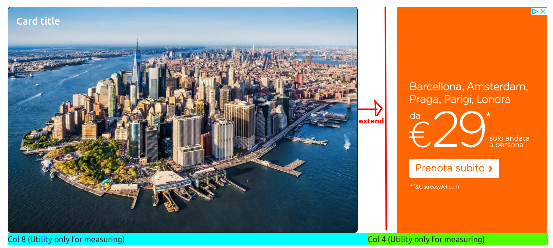
I’d like to remove all that white space and just leave padding-right: 20px (or margin-right) between the card and the banner. So I want to extend the width of the image like in the picture (up to the example red line),because the size of the orange banner is fixed and I don’t want to resize it. So I would like the enlarged card, some white space (20 px) between card and banner, and then the fixed banner. Consequently the only "empty whitespace" must be that of 20px between the card and the banner, to adhere to the bootstrap grid in col-lg-8 and col-lg-4, and to have no other whitespace.

How can I enlarge the card leaving col-lg-8 and col-lg-4 the same? (I also tried col-lg-9, but I don’t prefer it because the card is too big).

My attempts at solutions were:

  • WIDHT IMAGE 105%: I tried applying a 105% widht to the card and the problem seemed to be solved, but when i make the window smaller then the card joins the banner (or overlaps) leaving no padding-right.

  • WIDHT COLUMNS 75% and 25%: I tried changing the width of the columns. I changed .col-lg-8 from width: 66.66666667% to 75%. Then I changed .col-lg-4 from width: 25%, so the total was 100%. Here too the problem seemed to be solved, but several people advised me against changing the column width of Bootstrap and told me that it is not very professional.

  • REMOVE TEXT-ALIGN: RIGHT: I tried removing .banner {text-align: right;}. In this way the banner approaches the card, but creates an empty space to its right (to the right of the banner). I don’t know if this is correct. You observe another screenshot

This is the code on CodePen. What is the best solution to what I ask above? Thank you all in advance!

@media (min-width: 992px) {
  .container-pc {
    display: flex;
    max-width: 1080px;
    margin-left: auto;
    margin-right: auto;
  }
}

@media (min-width: 992px) {
  .container-primapagina {
    padding-right: 20px;
  }
}

.banner {
  text-align: right;
}

.height1 {
  height: 450px;
}
<!doctype html>
<html lang="en">

<head>
  <meta charset="utf-8">
  <meta name="viewport" content="width=device-width, initial-scale=1">
  <link href="https://cdn.jsdelivr.net/npm/[email protected]/dist/css/bootstrap.min.css" rel="stylesheet">
  <link href="https://getbootstrap.com/docs/5.3/assets/css/docs.css" rel="stylesheet">
  <title>Bootstrap Example</title>
  <script src="https://cdn.jsdelivr.net/npm/[email protected]/dist/js/bootstrap.bundle.min.js"></script>

  <link href="style.css" rel="stylesheet">

</head>

<body>

  <div class="container-pc">

    <div class="container-primapagina col-12 col-md-8 col-lg-8">
      <div class="card text-bg-dark">
        <img src="https://siviaggia.it/wp-content/uploads/sites/2/2021/02/grattacieli-new-york.jpg" class="card-img height1" alt="...">
        <div class="card-img-overlay">
          <h5 class="card-title">Card title</h5>
        </div>
      </div>
    </div>

    <div class="banner col-lg-4">
      <img src="https://i.ibb.co/tmCY8gW/ffffffffffff.png" alt="provabanner">
    </div>
  </div>

  <div class="container-pc">
    <div class="col-lg-8" style="background-color: aqua;" ;>Col 8 (Utility only for measuring)</div>
    <div class="col-lg-4" style="background-color: rgb(81, 255, 0);" ;>Col 4 (Utility only for measuring)</div>
  </div>

</body>

</html>

2

Answers


  1. From the code, screenshot, and comments, it seems like this is what you’re looking for. Since the image is set to cover and in the background of the card, it’s a bit cleaner matching the columns of your grid.

    @media (min-width: 992px) {
      .container-pc {
        display: flex;
        max-width: 1080px;
        margin-left: auto;
        margin-right: auto;
      }
    }
    
    .image-bground {
      background-image: url("https://siviaggia.it/wp-content/uploads/sites/2/2021/02/grattacieli-new-york.jpg");
      background-attachment: fixed;
      margin-right:20px;
    <link href="https://cdn.jsdelivr.net/npm/[email protected]/dist/css/bootstrap.min.css" rel="stylesheet" />
    <div class="container-pc">
    
      <div class="container-primapagina col-12 col-md-8 col-lg-8 image-bground">
        <div class="card text-bg-dark">
          <div class="card-img-overlay">
            <h5 class="card-title">Card title</h5>
          </div>
        </div>
      </div>
    
      <div class="banner col-lg-4">
        <img src="https://i.ibb.co/tmCY8gW/ffffffffffff.png" alt="provabanner">
      </div>
    </div>
    
    <div class="container-pc">
      <div class="col-lg-8" style="background-color: aqua;" ;>Col 8 (Utility only for measuring)</div>
      <div class="col-lg-4" style="background-color: rgb(81, 255, 0);" ;>Col 4 (Utility only for measuring)</div>
    </div>
    Login or Signup to reply.
  2. Okay, I realized what you’re intentions are. You want the banner on the right side to remain a fixed width while the left card fills the remaining space. You should not be using columns. You should be using flex. The container container-pc is already a flex container, so simply remove the column classes. The columns are intended to not flex but maintain proportional width. The columns can’t overlap. You are using the wrong tool.

    If you were to change the proportions from 8:4 to 9:3, the banner overflows because it is the wrong size for the column.

    I recommend reading through the Bootstrap documentation to learn how to use Bootstrap while avoiding redundancy and linking unnecessary stylesheets and JavaScript files. A hindrance to your layout being responsive on narrow screens is that your images are using fixed sizes.

    The following examples show:

    • columns at 9:3 ratio
    • removing the column classes to use the container flexbox
    • applying Bootstrap’s d-flex class to the container
    • applying d-flex to the container and object-fit-cover to the card background image
    @media (min-width: 992px) {
      .container-pc {
        display: flex;
        max-width: 1080px;
        margin-left: auto;
        margin-right: auto;
      }
    }
    
    @media (min-width: 992px) {
      .container-primapagina {
        padding-right: 20px;
      }
    }
    
    .banner {
      text-align: right;
    }
    
    .height1 {
      height: 450px;
    }
    <!doctype html>
    <html lang="en">
    
    <head>
      <meta charset="utf-8">
      <meta name="viewport" content="width=device-width, initial-scale=1">
      <link href="https://cdn.jsdelivr.net/npm/[email protected]/dist/css/bootstrap.min.css" rel="stylesheet">
      <title>Bootstrap Example</title>
    
    
    </head>
    
    <body>
    
    <p class="text-center mt-4 mb-1">d-flex &amp; object-fit-cover classes</p>
      <div class="container-pc d-flex">
        <div class="container-primapagina">
          <div class="card text-bg-dark">
            <img src="https://siviaggia.it/wp-content/uploads/sites/2/2021/02/grattacieli-new-york.jpg" class="card-img height1 object-fit-cover" alt="...">
            <div class="card-img-overlay">
              <h5 class="card-title">Card title</h5>
            </div>
          </div>
        </div>
        <div class="banner">
          <img src="https://i.ibb.co/tmCY8gW/ffffffffffff.png" alt="provabanner">
        </div>
      </div>
    
    <p class="text-center mt-4 mb-1">d-flex class</p>
      <div class="container-pc d-flex">
        <div class="container-primapagina">
          <div class="card text-bg-dark">
            <img src="https://siviaggia.it/wp-content/uploads/sites/2/2021/02/grattacieli-new-york.jpg" class="card-img height1" alt="...">
            <div class="card-img-overlay">
              <h5 class="card-title">Card title</h5>
            </div>
          </div>
        </div>
        <div class="banner">
          <img src="https://i.ibb.co/tmCY8gW/ffffffffffff.png" alt="provabanner">
        </div>
      </div>
    
    <p class="text-center mt-4 mb-1">Without column classes</p>
      <div class="container-pc">
        <div class="container-primapagina">
          <div class="card text-bg-dark">
            <img src="https://siviaggia.it/wp-content/uploads/sites/2/2021/02/grattacieli-new-york.jpg" class="card-img height1" alt="...">
            <div class="card-img-overlay">
              <h5 class="card-title">Card title</h5>
            </div>
          </div>
        </div>
        <div class="banner">
          <img src="https://i.ibb.co/tmCY8gW/ffffffffffff.png" alt="provabanner">
        </div>
      </div>
    
      <div class="container-pc">
        <div class="col-lg-8" style="background-color: aqua;" ;>Col 8 (Utility only for measuring)</div>
        <div class="col-lg-4" style="background-color: rgb(81, 255, 0);" ;>Col 4 (Utility only for measuring)</div>
      </div>
    
    
    <p class="text-center mt-4 mb-1">Columns 9:3</p>
      <div class="container-pc">
        <div class="container-primapagina col-12 col-md-9 col-lg-9">
          <div class="card text-bg-dark">
            <img src="https://siviaggia.it/wp-content/uploads/sites/2/2021/02/grattacieli-new-york.jpg" class="card-img height1" alt="...">
            <div class="card-img-overlay">
              <h5 class="card-title">Card title</h5>
            </div>
          </div>
        </div>
        <div class="banner col-lg-3">
          <img src="https://i.ibb.co/tmCY8gW/ffffffffffff.png" alt="provabanner">
        </div>
      </div>
    
      <div class="container-pc">
        <div class="col-lg-8" style="background-color: aqua;" ;>Col 8 (Utility only for measuring)</div>
        <div class="col-lg-4" style="background-color: rgb(81, 255, 0);" ;>Col 4 (Utility only for measuring)</div>
      </div>
    
    </body>
    
    </html>
    Login or Signup to reply.
Please signup or login to give your own answer.
Back To Top
Search