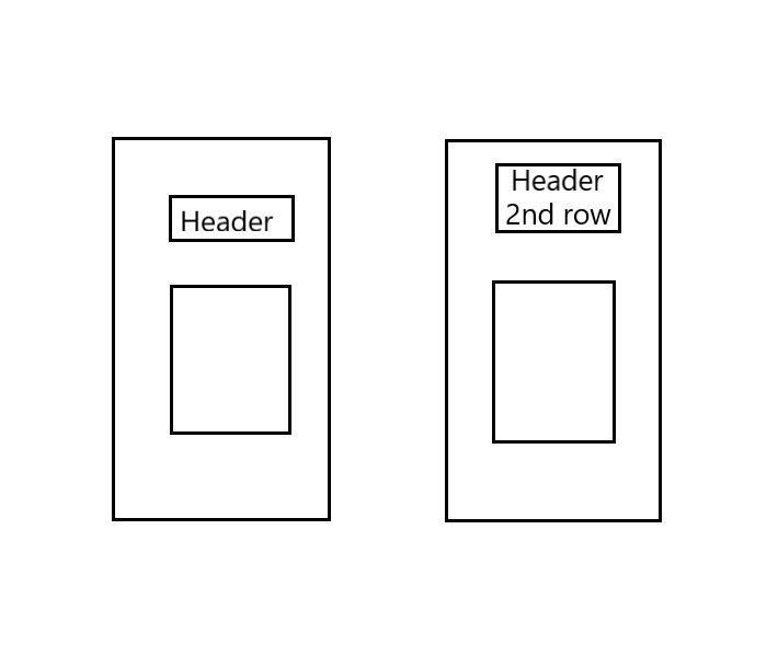
I have a page with a header and some content in it. The header is a dynamic value and can be many different things depending on the content. The problem occurs when the header is longer and requires two or more rows. Since I want the content to stay on the same vertical and horizontal position I want the last row of a longer header to be in the same vertical position as the first row if the header was shorter.
I hope I make myself understood.
Please try editing the header by adding a second word and you will see what I mean.
I assume this could be fixed with flex-box but I am not sure how to, I have tried many different things with flex-end and so on.
This is an example of my code:
.main {
  display: flex;
  justify-content: center;
  min-height: 200px;
  border: 1px solid black;
}

.wrapper {
  display: flex;
  flex-direction: column;
  align-items: center;
  border: 1px solid red;
  width: 200px;
  height: 300px;
  padding-top: 20px;
  gap: 20px;
}

.header-div {
  display: flex;
  border: 1px solid blue;
  align-items: center;
  text-align: center;
  max-width: 100px;
}

.header {
  border: 1px solid green;
}

.content {
  border: 1px solid green;
}
<!DOCTYPE html>
<html>
<head>
<title>Parcel Sandbox</title>
<meta charset="UTF-8" />
<link rel="stylesheet" href="style.css">
</head>
<body>
<div class="main">
<div class="wrapper">
<div class="header-div">
<h1 className="header">Header</h1>
</div>
<div class="content">Test</div>
</div>
</div>
</body>
</html>Thanks in advance!
Edit
Here’s a poorly made image that illustrates what I’m aiming for.
The left image is when the header takes up one row and the second image is when the header takes up two rows:


2
Answers
change your CSS for the .wrapper class:
Here, we’re using display: grid to create a grid layout. The grid-template-rows property defines two rows: one for the header and one for the content. The auto value will make the header row adjust to the content height, while the 1fr value will make the content row take up the remaining space. The align-items and justify-items properties center the content in their respective rows.
Now, update your HTML to have the class attribute instead of the className attribute for the h1 element:
With these changes, the header will remain at the top of the wrapper, and the content will stay at the same vertical and horizontal position, regardless of the header’s length. You can test it by changing the header text to see how it behaves with different lengths.
One way to achieve is by setting the height of header text to double through javascript. And use CSS properties display:flex and align-items:end on header element to align the text to bottom. Here is the sample code:-
Now as you go to the next line, the previous text will move up.