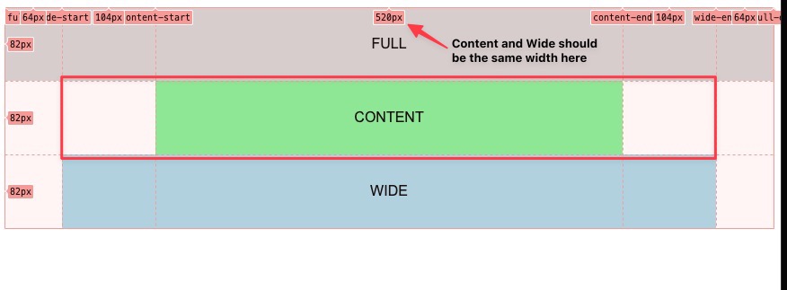
I got a CSS grid that looks like this,
full-start | wide-start | content-start | content-end | wide-end | full-end
What I want it to do:
- I’m trying to make it so the content area would always have it’s max-width, it has a maximium width of 77rem (1232px). While the screen shrinks wide should also shrink accordingly and eventually wide and content will catch up to each other if that make sense? So Wide should shrink "first" because again they will eventually catch up.
What’s happening now:
- "wide" is always at it’s "max" and does not shrink at all. I would like for "content" to keep its max-width all times and "wide" to shrink first.
SUMMARY:
I would it like that "content" keep its max-width and "wide" shrink first.
.my-grid {
  --const-content: 77rem;
  --const-max-inline-size: 90rem;

  --gutter: 4rem;
  --content: minmax(0, var(--const-content));
  --wide: minmax(0, calc((var(--const-max-inline-size) - var(--const-content)) / 2));
  --max-inline-size: calc(var(--const-max-inline-size) + (var(--gutter) * 2));

  display: grid;
  grid-template-columns: [full-start] var(--gutter)
                         [wide-start] var(--wide)
                         [content-start] var(--content) [content-end]
                         var(--wide) [wide-end]
                         var(--gutter) [full-end];
  max-inline-size: var(--max-inline-size);
}

.block {
  padding: 2rem;
  text-align: center;
  font-family: arial;
  text-transform: uppercase;
}

.block--content {
  grid-column: content;
  background-color: lightgreen;
}

.block--wide {
  grid-column: wide;
  background-color: lightblue;
}

.block--full {
  grid-column: full;
  background-color: lightgray;
}
<div class="my-grid">
<div class="block block--full">full</div>
<div class="block block--content">content</div>
<div class="block block--wide">wide</div>
</div>


2
Answers
Not a very clear question, but if you want the
.block--contentto have a minimum width, addplace-selfto.block--content:I think you don’t need CSS grid to do this. Check this link to understand how the
margin-inlineis working: https://css-tip.com/center-max-width/