skip to Main Content

This is my code:

.gallery {
  display: flex;
  overflow-x: auto;
  resize: both;
  background-color: rgb(200, 200, 200);
  padding: 10px;
  height: 200px;
}

.item {
  display: flex;
  flex: 0 0 auto;
  max-width: 100%;
}

.item img,
.item video {
  max-width: 100%;
  max-height: 100%;
  object-fit: contain;
  min-width: 0;
}

.description {
  margin-right: 30px;
  margin-left: 5px;
  writing-mode: vertical-rl;
  transform: rotate(180deg);
  text-align: center;
}
<div class="gallery">
  <div class="item">
    <video controls>
      <source src="https://www.w3schools.com/html/mov_bbb.mp4" type="video/mp4">
    </video>
    <div class="description">Video</div>
  </div>
  <div class="item">
    <img src="https://upload.wikimedia.org/wikipedia/commons/thumb/1/1e/Wald018.jpg/256px-Wald018.jpg">
    <div class="description">One</div>
  </div>
  <div class="item">
    <img src="https://upload.wikimedia.org/wikipedia/commons/thumb/2/2d/Ung_norsk_furuskog_og_morgent%C3%A5ke.jpg/256px-Ung_norsk_furuskog_og_morgent%C3%A5ke.jpg">
    <div class="description">Two</div>
  </div>
  <div class="item">
    <img src="https://upload.wikimedia.org/wikipedia/commons/thumb/f/fa/Swedish_Spruce_Forest.jpg/297px-Swedish_Spruce_Forest.jpg">
    <div class="description">Three</div>
  </div>
</div>

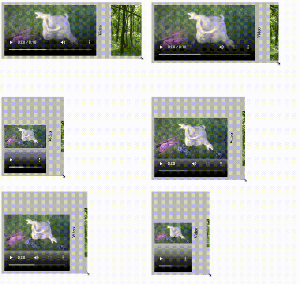
My question is based on this article. It works well with images, and also seems to work well with videos. But if for example the ratio of the browser window changes, then the container of a HTML video is bigger than the actual video. You can see it here in an abstract way:
enter image description here

How can we let the video container always keep the size of the actual video?

2

Answers


  1. i think the only way you can fix this is by setting the object-fit property in the css to cover. This won’t change the size of the audio controls, instead will make the video adjust its size accordingly.

    I will put the code snippet below for what I just said

    .gallery {
      display: flex;
      overflow-x: auto;
      resize: both;
      background-color: rgb(200, 200, 200);
      padding: 10px;
      height: 200px;
    }
    
    .item {
      display: flex;
      flex: 0 0 auto;
      max-width: 100%;
    }
    
    .item img,
    .item video {
      max-width: 100%;
      max-height: 100%;
      object-fit: cover;
      min-width: 0;
    }
    
    .description {
      margin-right: 30px;
      margin-left: 5px;
      writing-mode: vertical-rl;
      transform: rotate(180deg);
      text-align: center;
    }
    <div class="gallery">
            <div class="item">
              <video controls>
                <source src="https://www.w3schools.com/html/mov_bbb.mp4" type="video/mp4">
              </video>
              <div class="description">Video</div>
            </div>
            <div class="item">
              <img src="https://upload.wikimedia.org/wikipedia/commons/thumb/1/1e/Wald018.jpg/256px-Wald018.jpg">
              <div class="description">One</div>
            </div>
            <div class="item">
              <img src="https://upload.wikimedia.org/wikipedia/commons/thumb/2/2d/Ung_norsk_furuskog_og_morgent%C3%A5ke.jpg/256px-Ung_norsk_furuskog_og_morgent%C3%A5ke.jpg">
              <div class="description">Two</div>
            </div>
            <div class="item">
              <img src="https://upload.wikimedia.org/wikipedia/commons/thumb/f/fa/Swedish_Spruce_Forest.jpg/297px-Swedish_Spruce_Forest.jpg">
              <div class="description">Three</div>
            </div>
          </div>

    Since we can’t change the size of the audio controls, this is the only way.

    Login or Signup to reply.
  2. We can use align-items: center to the .items class so that they aren’t stretched, and then we can stretch it by adding height: 100% to the image and video selector then also add max-width: none to both .items and image and video selector, like this:

    .gallery {
      display: flex;
      overflow-x: auto;
      resize: both;
      background-color: rgb(200, 200, 200);
      padding: 10px;
      height: 200px;
    }
    
    .item {
      display: flex;
      flex: 0 0 auto;
      max-width: none;
      align-items: center;
    }
    
    .item img,
    .item video {
      max-height: 100%;
      object-fit: contain;
      min-width: 0;
      height: 100%;
      max-width: none;
    }
    
    .description {
      margin-right: 30px;
      margin-left: 5px;
      writing-mode: vertical-rl;
      transform: rotate(180deg);
      text-align: center;
    }
    <div class="gallery">
      <div class="item">
        <video controls>
          <source src="https://www.w3schools.com/html/mov_bbb.mp4" type="video/mp4">
        </video>
        <div class="description">Video</div>
      </div>
      <div class="item">
        <img src="https://upload.wikimedia.org/wikipedia/commons/thumb/1/1e/Wald018.jpg/256px-Wald018.jpg">
        <div class="description">One</div>
      </div>
      <div class="item">
        <img src="https://upload.wikimedia.org/wikipedia/commons/thumb/2/2d/Ung_norsk_furuskog_og_morgent%C3%A5ke.jpg/256px-Ung_norsk_furuskog_og_morgent%C3%A5ke.jpg">
        <div class="description">Two</div>
      </div>
      <div class="item">
        <img src="https://upload.wikimedia.org/wikipedia/commons/thumb/f/fa/Swedish_Spruce_Forest.jpg/297px-Swedish_Spruce_Forest.jpg">
        <div class="description">Three</div>
      </div>
    </div>
    Login or Signup to reply.
Please signup or login to give your own answer.
Back To Top
Search