skip to Main Content

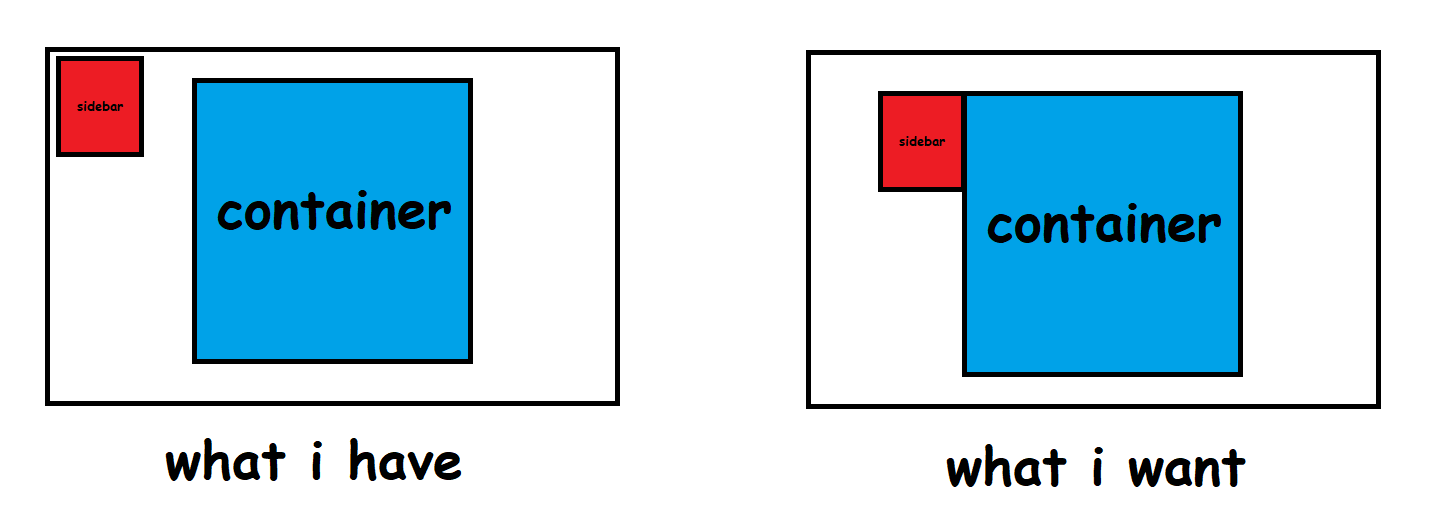
Making a website. It consists of one main container in the center and a sidebar. I only know how to make the sidebar be on the far left or right of the screen. What I want to do though is make the sidebar stick to the left of my main container. Is there a way of doing this?

The sidebar is just a flexbox with a few links and images in it.

#container {
  background-color: deepskyblue;
  width: 500px;
  margin: auto;
  padding: 100px;
}

#sidebar {
  background-color: red;
  width: 200px;
  padding: 10px
}
<div id="sidebar" style="float: left">
  <p>Sidebar</p>
</div>
<div id="container">
  <p>Container</p>
</div>

I tried using float:left but that just makes the sidebar go to the very edge of the page. What I need is the sidebar to sort of stick to the container.

enter image description here

Diagram of what I have vs what I want

4

Answers


  1. enter code here

    .main{
    height:300px;
    width:300px;
    border:1px solid black;
    }
    
    .sidebar{
    height:100px;
    width:100px;
    border:1px solid red;
    margin: 10px auto;
    position:relative;
    }
    
    .content{
    height:50px;
    width:50px;
    border:1px solid green;
    position:absolute;
    top:0;
    right:100%;
    }
    <div class="main">Main Div
    <div class="sidebar">Content
    <div class="content">Side box div</div>
    </div>
    </div>
    Login or Signup to reply.
  2. If you want the container to be centered then you can use css grid to create 3 columns. We make the two side columns 1fr so they’re equal width then the middle column to be fit-content. We can then use align-self to push the side bar to the edge of the container. CSS tricks has a great primer on grid and Kevin Powell has a useful video on youtube

    Example below:

    body {
      font-family: "Comic Sans MS", "Comic Sans", cursive;
    }
    
    /* we've enclosed the two divs in to wrapper so we can use CSS grid */
    .wrapper {
      display: grid;
      grid-template-columns: 1fr fit-content(0) 1fr;
      align-items: start; /* place items to the top of the container */
    }
    
    #container {
      aspect-ratio: 1/1;
      background-color: deepskyblue;
      width: 150px;
      margin-right: auto;
      padding: 100px;
    }
    
    #sidebar {
      justify-self: end; /* push the sidebar to the right so it butts up next to the container */
      background-color: #ed1c24;
      width: 75px;
      padding: 10px;
    }
    
    /* just some prettification */
    .wrapper > div {
      border: 2px solid black;
      display: grid;
      place-items: center;
    }
    <div class="wrapper">
      <div id="sidebar">
        <p>Sidebar</p>
      </div>
      <div id="container">
        <p>Container</p>
      </div>
    </div>
    Login or Signup to reply.
  3. You can do this in multiple steps:

    1. Position the sidebar at the top left of the container
    2. Move the sidebar left equal to it’s width

    First, to position the sidebar in the top left of the container, we can make the #container‘s position relative so that other things can be absolutely positioned relative to it, then we can position the #sidebar absolutely in the top left.

    #container {
      position: relative;
    }
    
    #sidebar {
      position: absolute;
      top: 0;
      left: 0;
    }
    

    Next, we can move the sidebar to the left equal to it’s width:

    #sidebar {
      transform: translateY(-100%);
    }
    
    Login or Signup to reply.
  4. Use flexbox layout since it is versatile enough for most cases. Add a third column that has same proportions as the first one; that way all three columns will be sized and centered properly. The following example uses a pseudo element as the third column:

    #wrapper {
      display: flex;
      flex-direction: row;
      justify-content: center;
    }
    
    #container {
      background-color: deepskyblue;
      flex: 0 0 500px;
      height: 500px;
    }
    
    #sidebar {
      flex: 0 0 200px;
      height: 200px;
      align-self: flex-start;
      background-color: rgba(255, 0, 0, 1);
    }
    
    #wrapper::after {
      flex: 0 0 200px;
      background-color: rgba(255, 0, 0, .2);
      content: 'I am a pseudo element';
    }
    <div id="wrapper">
      <div id="sidebar">
        <p>Sidebar</p>
      </div>
      <div id="container">
        <p>Container</p>
      </div>
    </div>
    Login or Signup to reply.
Please signup or login to give your own answer.
Back To Top
Search