skip to Main Content

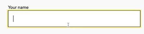
I’m trying to write code so that when I press an input field, it will highlight as yellow.

This is what I want:
(https://phpout.com/wp-content/uploads/2023/04/fR29c.png)

Here is my current html for the form:

<div class="form">
      <form>
        <h1 id="form-header"> Sign up for our mailing list!</h1>
        Your Name:<br>
        <input class="enter" type="text" name="fname"><br>
        Email:<br>
        <input class="enter" type="email" name="email" aria-required="true"/><br>
        <button type="submit" class="submit">Submit</button>
      </form>
    </div>

As you can see, when you highlight the field, it’s black, and not yellow.

I tried looking up the documentation for this, but for some reason could only find code that highlights the middle portion rather than the outline. I’m also only interested in using html and CSS. If anyone could tell me how to achieve the highlight it’ll be appreciated!

4

Answers


  1. <style>
      input:focus {
        outline: 3px solid #FFCC00;
        box-shadow: 0 0 10px #FFCC00;
      }
    </style>
    

    Try adding this.

    Login or Signup to reply.
  2. You can try the following CSS

    input[type=text], input[type=email]{
      -webkit-transition: all 0.30s ease-in-out;
      -moz-transition: all 0.30s ease-in-out;
      -ms-transition: all 0.30s ease-in-out;
      -o-transition: all 0.30s ease-in-out;
      outline: none;
      padding: 4px;
      margin: 6px 0px;
      border: 1px solid #DDDDDD;
    }
     
    input[type=text]:focus, input[type=email]:focus {
      border: 1px solid #FFFF00;
    } 
    

    :focus – Select & Style an input field when it gets focus

    In case you want all input fields to hightlight yellow on focus you can try this css

    input {
      -webkit-transition: all 0.30s ease-in-out;
      -moz-transition: all 0.30s ease-in-out;
      -ms-transition: all 0.30s ease-in-out;
      -o-transition: all 0.30s ease-in-out;
      outline: none;
      padding: 4px;
      margin: 6px 0px;
      border: 1px solid #DDDDDD;
    }
     
    input:focus {
      border: 1px solid #FFFF00;
    } 
    
    Login or Signup to reply.
  3. You can achieve the desired effect by styling the input fields with CSS. When the input fields are in focus, you can highlight them with a yellow outline as shown below:

    style for the input fields

    .enter {
      border: 2px solid #ccc;
      padding: 10px;
      font-size: 16px;
    }
    

    style for the focused input fields

    .enter:focus {
      border-color: yellow;
      outline: none;
    }
    

    This code changes the default border color of the input fields to light gray, adds padding, and changes the font size. When an input field is in focus, that is, when the user clicks or tabs to it, the border color changes to yellow and the default blue outline is removed.

    I hope this was helpful!

    Login or Signup to reply.
  4. I’d suggest the following approach, as demonstrated in the following Snippet:

    /* selecting <input> elements that are focused: */
    input:focus,
    /* selecting <input> elements that have their focus-state visible
       (this is important if you've removed default outlines for
       aesthetic reasons, but want to allow users that navigate with
       keyboards, or without a mouse, to see where the focus is, in the
       page): */
    input:focus-visible,
    /* selecting <button> elements that are focused: */
    button:focus,
    /* as above, setting the outline styles for <button> elements that
       are focused via non-mouse means: */
    button:focus-visible {
      outline: 2px solid yellow;
    }
    
    input:focus,
    input:focus-visible,
    button:focus,
    button:focus-visible {
      outline: 2px solid yellow;
    }
    <div class="form">
      <form>
        <h1 id="form-header"> Sign up for our mailing list!</h1>
        Your Name:<br>
        <input class="enter" type="text" name="fname"><br>
        Email:<br>
        <input class="enter" type="email" name="email" aria-required="true" /><br>
        <button type="submit" class="submit">Submit</button>
      </form>
    </div>

    It’s worth noting that I’d also strongly suggest that you take advantage of <label> elements for improving the accessibility of form inputs; as the <label> increase the touch-area, and also click-area. This has the benefit, also, of removing the <br> elements:

      
    /* arbitrary layout choices, irrelevant to the demo: */
    fieldset {
      display: grid;
      gap: 0.5rem;
    }
    
    label {
      display: grid;
    }
    button,
    input {
      padding-block: 0.5rem;
      padding-inline: 1rem;
    }
    
    /*
      here, we take advantage of the :is() CSS pseudo-class function to
      select all elements matching the supplied selectors, and set the
      outline of selected elements that match the :focus pseudo-class
      and are of a type that the browser determines should have their
      focus-state should be made evident:
    */
    :is(button,input):focus-visible {
      outline: 2px solid fuchsia;
    }
    <div class="form">
      <form>
        <h1 id="form-header"> Sign up for our mailing list!</h1>
        <!--
          using a <fieldset> to wrap the various related inputs
          together:
        -->
        <fieldset>
          <!--
            the <legend> serves to identify the purpose of this
            group of inputs:
          -->
          <legend>Your details</legend>
          <!--
            the label associates the text with the relevant
            <input> element; clicking the text will focus
            that element. The <input> can be outside of the
            <label>, but if so the label must have a "for"
            attribute equal to the "id" of the relevant
            <input>, for example:
              <input id="inputElement1" type="text">
              <label for="inputElement1">clickable label text</label>
          -->
          <label>Your Name:
            <input class="enter" type="text" name="fname">
          </label>
          <label>Email:
            <input class="enter" type="email" name="email" aria-required="true" />
          </label>
          <!-- I also set the button type to "button," in order to prevent
               the <button> trying to submit the form here in the demo -->
          <button type="button" class="submit">Submit</button>
        </fieldset>
      </form>
    </div>

    References:

    Login or Signup to reply.
Please signup or login to give your own answer.
Back To Top
Search