skip to Main Content

I have 2 parallel div and within each div there are one or more stacked tables.

I’m trying to center the tables in the page, so for the table in left <div> should be moved to the right and table in right <div> should be moved to the left. I’d like a fixed horizontal separation between tables of 50px.

With my current CSS code I´m able to move the table in right <div> to the left, but I’m stuck in how to move the table in left <div> to the right. Thanks for any help.
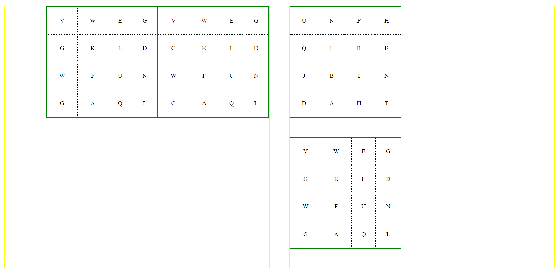
Current output
enter image description here

Output I’m looking for
enter image description here

This is my code:

<!DOCTYPE html>
<html>
  <head>
    <title>Table Generator</title>
    <style>
      body {
        text-align: center;
      }

      #inputContainer {
        margin-bottom: 20px;
      }

      #tableContainer {
        display: flex;
        justify-content: space-between;
        margin: 0 -25px;
        padding: 40px;
        box-sizing: border-box;
      }

      .tableWrapperLeft {
        width: 50%;
        margin: 0 25px;
        border: 2px solid yellow;
      }

      .tableWrapperRight {
        width: 50%;
        margin: 0 25px;
        border: 2px solid yellow;
      }

      table {
        border-collapse: collapse;
        margin-bottom: 50px;
        width: 288px;
        height: 288px;
      }

      td {
        border: 1px dotted black;
        text-align: center;
      }

      td:first-child {
        border-left: 1px dotted black;
      }

      tr:first-child td {
        border-top: 1px dotted black;
      }

      .tableWrapperRight table {
        border: 2px solid green;
      }

      .tableWrapperLeft table {
        border: 2px solid green;
      }
    </style>
  </head>
  <body>
    <div id="tableContainer">
      <div class="tableWrapperLeft">
        <table>
          <tr>
            <td>V</td><td>W</td><td>E</td><td>G </td>
          </tr>
          <tr>
            <td>G</td><td>K</td><td>L</td><td>D </td>
          </tr>
          <tr>
            <td>W</td><td>F</td><td>U</td><td>N </td>
          </tr>
          <tr>
            <td>G</td><td>A</td><td>Q</td><td>L </td>
          </tr>
        </table>
      </div>
      <div class="tableWrapperRight">
        <table>
          <tr>
            <td>U</td><td>N</td><td>P</td><td>H </td>
          </tr>
          <tr>
            <td>Q</td><td>L</td><td>R</td><td>B </td>
          </tr>
          <tr>
            <td>J</td><td>B</td><td>I</td><td>N </td>
          </tr>
          <tr>
            <td>D</td><td>A</td><td>H</td><td>T </td>
          </tr>
        </table>
      </div>
    </div>
    </div>
  </body>
</html>

UPDATE

With solution provided by @fatm, I have issues in left "div", if each "div" has more than one table and looks like this.

enter image description here

2

Answers


  1. body {
      text-align: center;
    }
    
    #inputContainer {
      margin-bottom: 20px;
    }
    
    #tableContainer {
      display: flex;
      justify-content: space-between;
      margin: 0 -25px;
      padding: 40px;
      box-sizing: border-box;
    }
    
    .tableWrapperLeft {
      width: 50%;
      margin: 0 25px;
      border: 2px solid yellow;
      display: flex;
      justify-content: end;
    }
    
    
    }
    .tableWrapperRight {
      width: 50%;
      margin: 0 25px;
      border: 2px solid yellow;
    }
    table {
      border-collapse: collapse;
      margin-bottom: 50px;
      width: 288px;
      height: 288px;
    }
    td {
      border: 1px dotted black;
      text-align: center;
    }
    td:first-child {
      border-left: 1px dotted black;
    }
    tr:first-child td {
      border-top: 1px dotted black;
    }
    .tableWrapperRight table {
      border: 2px solid green;
    }
    .tableWrapperLeft table {
      border: 2px solid green;
    }
    <div id="tableContainer">
      <div class="tableWrapperLeft">
        <table>
          <tr>
            <td>V</td>
            <td>W</td>
            <td>E</td>
            <td>G </td>
          </tr>
          <tr>
            <td>G</td>
            <td>K</td>
            <td>L</td>
            <td>D </td>
          </tr>
          <tr>
            <td>W</td>
            <td>F</td>
            <td>U</td>
            <td>N </td>
          </tr>
          <tr>
            <td>G</td>
            <td>A</td>
            <td>Q</td>
            <td>L </td>
          </tr>
        </table>
      </div>
      <div class="tableWrapperRight">
        <table>
          <tr>
            <td>U</td>
            <td>N</td>
            <td>P</td>
            <td>H </td>
          </tr>
          <tr>
            <td>Q</td>
            <td>L</td>
            <td>R</td>
            <td>B </td>
          </tr>
          <tr>
            <td>J</td>
            <td>B</td>
            <td>I</td>
            <td>N </td>
          </tr>
          <tr>
            <td>D</td>
            <td>A</td>
            <td>H</td>
            <td>T </td>
          </tr>
        </table>
      </div>
    </div>
    </div>
    Login or Signup to reply.
  2. try to change the flex-direction of a certain div then just use flex start or end for alignment to able to achieve.

    body {
            text-align: center;
          }
    
          #inputContainer {
            margin-bottom: 20px;
          }
    
          #tableContainer {
            display: flex;
            justify-content: space-between;
            margin: 0 -25px;
            padding: 40px;
            box-sizing: border-box;
          }
    
          .tableWrapperLeft {
            width: 50%;
            margin: 0 25px;
            border: 2px solid yellow;
            display: flex;
            flex-direction: column;
            align-items: flex-end;
          }
    
          .tableWrapperRight {
            width: 50%;
            margin: 0 25px;
            border: 2px solid yellow;
            display: flex;
            flex-direction: column;
            align-items: flex-start;
          }
    
          table {
            border-collapse: collapse;
            margin-bottom: 50px;
            width: 288px;
            height: 288px;
          }
    
          td {
            border: 1px dotted black;
            text-align: center;
          }
    
          td:first-child {
            border-left: 1px dotted black;
          }
    
          tr:first-child td {
            border-top: 1px dotted black;
          }
    
          .tableWrapperRight table {
            border: 2px solid green;
          }
    
          .tableWrapperLeft table {
            border: 2px solid green;
          }
     <body>
        <div id="tableContainer">
          <div class="tableWrapperLeft">
            <table>
              <tr>
                <td>V</td><td>W</td><td>E</td><td>G </td>
              </tr>
              <tr>
                <td>G</td><td>K</td><td>L</td><td>D </td>
              </tr>
              <tr>
                <td>W</td><td>F</td><td>U</td><td>N </td>
              </tr>
              <tr>
                <td>G</td><td>A</td><td>Q</td><td>L </td>
              </tr>
            </table>
          </div>
          <div class="tableWrapperRight">
            <table>
              <tr>
                <td>U</td><td>N</td><td>P</td><td>H </td>
              </tr>
              <tr>
                <td>Q</td><td>L</td><td>R</td><td>B </td>
              </tr>
              <tr>
                <td>J</td><td>B</td><td>I</td><td>N </td>
              </tr>
              <tr>
                <td>D</td><td>A</td><td>H</td><td>T </td>
              </tr>
            </table>
          </div>
        </div>
    Login or Signup to reply.
Please signup or login to give your own answer.
Back To Top
Search