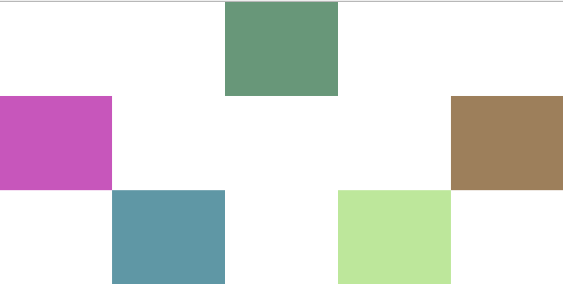
I have a grid, and basically I need to be able to define the positions of the items inside of the container code, to make it clearer, here’s how my current code looks like:
<style>
.angry-grid {
display: grid;
grid-template-rows: 1fr 1fr 1fr;
grid-template-columns: 1fr 1fr 1fr 1fr 1fr;
gap: 0px;
height: 100%;
}
#item-0 {
background-color: #689779;
grid-row-start: 1;
grid-column-start: 3;
grid-row-end: 2;
grid-column-end: 4;
}
#item-1 {
background-color: #9D7F5B;
grid-row-start: 2;
grid-column-start: 5;
grid-row-end: 3;
grid-column-end: 6;
}
#item-2 {
background-color: #C756BB;
grid-row-start: 2;
grid-column-start: 1;
grid-row-end: 3;
grid-column-end: 2;
}
#item-3 {
background-color: #BDE79B;
grid-row-start: 3;
grid-column-start: 4;
grid-row-end: 4;
grid-column-end: 5;
}
#item-4 {
background-color: #5F97A5;
grid-row-start: 3;
grid-column-start: 2;
grid-row-end: 4;
grid-column-end: 3;
}
</style>
<div class="angry-grid">
<div id="item-0"> </div>
<div id="item-1"> </div>
<div id="item-2"> </div>
<div id="item-3"> </div>
<div id="item-4"> </div>
</div>
I need to define the items’ positions inside the container code (myGrid {…}), I hope it’s clear enough.


2
Answers
You can’t. CSS uses selectors to select elements, and no part of CSS uses selectors are values inside a rule-set.
The closest you can come would be to use
grid-template-areasto name regions of the grid. You would still need to write a selector for each element to you want to place in those areas.As quentin stated, your best bet is to use grid-template-areas to define the positioning of the children inside the grid layout.
There are multiple resources online to help you create your desired layout.
It took me about 30 seconds to create this layout with this tool:
https://cssgrid-generator.netlify.app/
For more advanced layouts, I usually use this:
https://grid.layoutit.com/