skip to Main Content

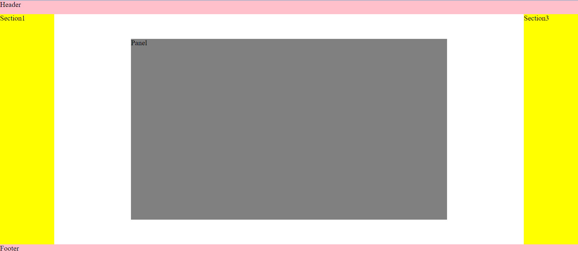
I am trying to create a layout as below:
enter image description here

This is the code I have to generate the layout:

body {
  margin: 0px;
  padding: 0px;
}

header,
footer {
  background-color: pink;
  height: 30px;
}

main {
  height: calc(100vh - 60px);
  display: flex;
}

#sec1,
#sec3 {
  flex: 0 0 120px;
  background-color: yellow;
}

#sec2 {
  flex: 1;
  display: flex;
  justify-content: center;
  align-items: center;
  overflow: auto;
}

.panel {
  position: relative;
  height: 400px;
  width: 700px;
  background-color: grey;
}
<header>Header</header>
<main>
  <section id="sec1">Section1</section>
  <section id="sec2">
    <div class="panel">
      Panel
    </div>
  </section>
  <section id="sec3">Section3</section>
</main>
<footer>Footer</footer>

The problem is that when the screensize reduces, I want the scroll bars to appear in section 2, so that I can scroll and look at the panel. Currently the scroll does not happen at all and only the vertical scroll bar appears. Why is this happening and how do I fix this?

2

Answers


  1. Because, by default flex item are able to shrink. so there with of 700px won’t apply exactly in section two.
    Use flex-shrink:0 to avoid this.

    DOC HERE

    body {
      margin: 0px;
      padding: 0px;
    }
    
    header,
    footer {
      background-color: pink;
      height: 30px;
    }
    
    main {
      height: calc(100vh - 60px);
      display: flex;
    }
    
    #sec1,
    #sec3 {
      flex: 0 0 120px;
      background-color: yellow;
    }
    
    #sec2 {
      flex: 1;
      display: flex;
      justify-content: center;
      align-items: center;
      overflow: auto;
    }
    
    .panel {
      position: relative;
      height: 400px;
      width: 700px;
      background-color: grey;
      flex-shrink:0 /* add this */
    }
    <header>Header</header>
    <main>
      <section id="sec1">Section1</section>
      <section id="sec2">
        <div class="panel">
          Panel
        </div>
      </section>
      <section id="sec3">Section3</section>
    </main>
    <footer>Footer</footer>
    Login or Signup to reply.
  2. Flex items shrink by default; since flex-direction is implicitly row, they will shrink their width.

    Also, you are setting both justify-content: center and align-items: center, which means half of both of its dimension will be cut. As the vertical and horizontal scrollbars start at the top and left, accordingly, you can only scroll to the bottom and the right part of .panel.

    Explanation in non-ASCII art:

    justify-content: center
       ◄───────│──────►
       ┌────.panel────┐ ▲
       │              │ │
       │   ┌#sec2─╖   │ │
       │   │      ║   │ │
       │   │      ║   │─── align-items: center
       │   │      ║   │ │
       │   ╘══════╝   │ │
       │              │ │
       └──────────────┘ ▼
    

    To prevent this, add flex-shrink: 0 and use margin: auto:

    .panel {
      flex-shrink: 0;
      margin: auto;
    }
    

    Try it:

    .panel {
      flex-shrink: 0;
      margin: auto;
    }
    
    /* Demo only */
    
    body {
      margin: 0px;
      padding: 0px;
    }
    
    header,
    footer {
      background-color: pink;
      height: 30px;
    }
    
    main {
      height: calc(100vh - 60px);
      display: flex;
    }
    
    #sec1,
    #sec3 {
      flex: 0 0 120px;
      background-color: yellow;
    }
    
    #sec2 {
      flex: 1;
      display: flex;
      overflow: auto;
    }
    
    .panel {
      position: relative;
      height: 400px;
      width: 700px;
      background-color: grey;
    }
    <header>Header</header>
    <main>
      <section id="sec1">Section1</section>
      <section id="sec2">
        <div class="panel">
          Panel
        </div>
      </section>
      <section id="sec3">Section3</section>
    </main>
    <footer>Footer</footer>
    Login or Signup to reply.
Please signup or login to give your own answer.
Back To Top
Search