skip to Main Content

solo linktree example picture

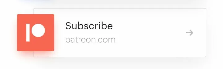
This is one of the examples in solo.to linktree. I would like to ask how I can use html and css to present it.

I originally planned to use

float:left;

to make the image float so that the border of the text can cut through the image, but in the end I found that the image would only be pushed out by the border. I also tried to find out if there is a similar one Looks like it, but can’t find it

4

Answers


  1. You can do somthing similar to this by using some nested divs like cards and layers

    @import url("https://fonts.googleapis.com/css2?family=Open+Sans:wght@300;400;700&display=swap");
    
    * {
      box-sizing: border-box;
      margin: 0;
      padding: 0;
    }
    
    body {
      height: 100vh;
      display: flex;
      justify-content: center;
      align-items: center;
      background-color: #3c3c44;
      font-family: "Open Sans", sans-serif;
    }
    
    .card {
      width: 40rem;
      display: flex;
      align-items: center;
      justify-content: space-between;
      border-radius: 1rem;
      background-color: #303037;
      box-shadow: 0 0 5px rgba(0, 0, 0, 0.7);
    }
    
    .image {
      width: 30%;
      display: flex;
      align-items: center;
    }
    
    .image img {
      width: 100%;
      height: 100% !important;
      border-top-left-radius: 1rem;
      border-bottom-left-radius: 1rem;
    }
    
    .subscribe {
      flex: 1;
      margin-left: 2rem;
      color: #fff;
    }
    
    .subscribe p {
      margin: 1rem 0;
      font-weight: 300;
      font-size: 14px;
      letter-spacing: 1px;
    }
    
    .subscribe form {
      display: flex;
      align-items: center;
    }
    
    .subscribe form input {
      padding: 0.75rem;
      border-radius: 0.25rem;
      outline: none;
      border: 1px solid #94949c;
      background: transparent;
      color: #94949c;
      font-weight: 300;
    }
    
    .subscribe form button {
      padding: 0.75rem;
      border-radius: 0.25rem;
      outline: none;
      margin-left: 0.5rem;
      border: 1px solid #93c814;
      background-color: #93c814;
      color: #303037;
      cursor: pointer;
      transition: 0.3s ease-in-out;
    }
    
    .subscribe form button:hover {
      background: transparent;
      color: #93c814;
    }
    <div class="card">
      <div class="image">
        <img src="https://cdn.pixabay.com/photo/2019/01/12/16/21/breakfast-3928800_960_720.jpg" alt="img">
      </div>
      <div class="subscribe">
        <h2>Get diet and fitness tips in your inbox</h2>
        <p>Eat better and exercise better. Sign up for the Diet&Fitness newsletter.</p>
        <form>
          <input type="email" name="email" id="email" placeholder="Enter your email address" autocomplete="off">
          <button type="button">Subscribe</button>
        </form>
      </div>
    </div>

    To make containers float above one another try this code

    <!DOCTYPE html>
    <html lang="en">
    <head>
    <meta charset="utf-8">
    <title>CSS Overlaying One DIV over Another DIV</title>
    <style> 
    .container{
        width: 200px;
        height: 200px;
        position: relative;
        margin: 20px;
    }
    .box{
        width: 100%;
        height: 100%;            
        position: absolute;
        top: 0;
        left: 0;
        opacity: 0.8;  /* for demo purpose  */
    }
    .stack-top{
        z-index: 9;
        margin: 20px; /* for demo purpose  */
    }
    </style>
    </head>
    <body>
    <div class="container">
        <div class="box" style="background: red;"></div>
        <div class="box stack-top" style="background: blue;"></div>
    </div>
    </body>
    </html>
    
    Login or Signup to reply.
  2. I found solution to your problem. Please go through the code.

    Add this code to your HTML & CSS File.
    Don’t Forget to run Code Snippet in full page.

    @import url('https://fonts.googleapis.com/css2?family=Poppins:wght@100;200;300;400;500;600;700;800;900&display=swap'); 
    *{
        margin: 0;
        padding: 0;
        box-sizing: border-box;
        font-family: 'Poppins', sans-serif;
      }
    
    body{
        display: flex;
        background: rgb(235, 235, 235);
        margin: 150px;
        
        
      }
      
      .card{
        position: absolute;
        width: 400px;
        height: 200px;
        background: #eaf5f0;
        border-radius: 5px;
        box-shadow: 0 35px 80px rgba(0,0,0,0.15);
        transition: 0.5s;
        margin: 50px;
        flex-wrap: wrap;
      }
    
      .imgBx img{
        position: absolute;
        top: 0;
        left: 0;
        width: 100%;
        height: 100%;
        object-fit: cover;
        border-radius: 5px;
      }
    
      .imgBx{
        position: absolute;
        top: 25px;
        transform: translateX(-50%);
        width: 150px;
        height: 150px;
        background: white;
        border-radius: 20px;
        box-shadow: 0 15px 50px rgba(112, 112, 112, 0.35);
        transition: 0.5s;
      }
    
      
    .card .content{
        position: absolute;
        width: 100%;
        height: 100%;
        display: flex;
        justify-content: center;
        align-items: center;
        overflow: hidden;
      }
      
      .card .content .details{
        margin-left: 20px;
        text-align: left;
      }
    
      #arrow{
        background-color: #eaf5f0;
        position: absolute;
        transform: translateX(160px);
        width: 25px;
        height: 25px;
        border-radius: 5px;
        box-shadow: 0 15px 50px rgba(0,0,0,0.35);
        
      }
     
    
    <!doctype html>
    <html class="no-js" lang="">
    
    <head>
      <meta charset="utf-8">
      <meta content="width=device-width, initial-scale=1" name="viewport">
      <title></title>
      <link href="q1.css" rel="stylesheet">
      <meta content="" name="description">
    
      <meta content="" property="og:title">
      <meta content="" property="og:type">
      <meta content="" property="og:url">
      <meta content="" property="og:image">
    
      <link href="/favicon.ico" rel="icon" sizes="any">
      <link href="/icon.svg" rel="icon" type="image/svg+xml">
      <link href="icon.png" rel="apple-touch-icon">
    
      <link href="site.webmanifest" rel="manifest">
      <meta content="#fafafa" name="theme-color">
    </head>
    
    <body>
    <div class="card">
      <div class="imgBx">
        <img src = "https://profilmmakerapps.com/images/patreon.jpg">
      </div>
    
      <div class="content">
        <div class="details">
          <h2>Subscribe<br><span>patreon.com</span></h2>
        </div>
        <button id="arrow">></button>
      </div>
    </div>
    
    
    <script src="js/app.js"></script>
    
    </body>
    
    </html>
    Login or Signup to reply.
  3. My try (with different font and arrow)

    • Pure HTML/CSS
    • Zero images
    div#main {
      position:relative;
      margin-left:calc(50% - 200px);
      margin-top:50px;
    }
    div#main div#orange-box {
      position: absolute;
      width: 80px;
      height: 80px;
      left: -40px;
      background-color: color(srgb 0.9694 0.4055 0.3275);
      box-shadow: 0px 5px 20px 5px color(srgb 0.9694 0.4055 0.3275 / 0.20);
      z-index: 3;
     }
     
     div#main div#orange-box div#rect {
      position:absolute;
      background-color:white;
      width: 8px;
      height: 40px;
      top: calc(50% - 20px);
      left:30%;
     }
      div#main div#orange-box div#circle {
      position:absolute;
      background-color:white;
      width: 35%;
      height: 35%;
      top: calc(50% - 20px);
      left:45%;
      border-radius: 50%;
     }
     
     
     div#main div#text-container {
      position: absolute;
      border:1.5px solid #EEEEEE;
      border-radius: 2px;
      box-shadow: 0px 5px 20px 5px #EEEEEE;
      width: 400px;
      height: 120px;
      top: -20px;
      z-index: 1;
     }
     
     div#main div#text-container span#arrow {
      position:absolute;
      right: 20px;
      top: calc(50% - 14px);
      color: #CCCCCC;
      font-family: Helvetica;
      font-size: 28px;
     }
     
     div#main div#text-container span#subscribe {
      position: absolute;
      left: 60px;
      top: calc(25%);
      font-family: Avenir Next, Serif;
      font-size: 24px;
      color: #565656;
     }
     
      div#main div#text-container span#patreon {
      position: absolute;
      left: 60px;
      top: calc(50%);
      font-family: Avenir Next, Serif;
      font-size: 20px;
      color: #CCCCCC;
     }
    <div id="main">
      <div id="orange-box">
        <div id="circle"></div>
        <div id="rect"></div>
      </div>
      <div id="text-container">
        <span id="subscribe">Subscribe</span>
        <span id="patreon">patreon.com</span>
        <span id="arrow">→</span>
      </div>
    </div>
    Login or Signup to reply.
  4. You can create an overlapping effect by employing position: relative and fine-tuning the image placement through adjustments to the top, bottom, left, or right properties.

    demo
    Stackblitz

    Login or Signup to reply.
Please signup or login to give your own answer.
Back To Top
Search