skip to Main Content

I have a box that contains ::after. The goal that I want to achieve is to prevent mixing the colors. Like in the picture, the color should not darken. Therefore, it should have only one color.

enter image description here

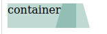
The parent div and the ::after has the same hex color.

.box {
  background: #2a816c4d;
  color: #000;
  cursor: pointer;
  min-width: 100px;
  height: 36px;
  flex: 1;
  flex-grow: 1;
  float: left;
  text-align: left;
  position: relative;
}

.box::after {
  top: 0;
  width: 50px;
  height: 0;
  content: " ";
  position: absolute;
  border-top: 19px solid transparent;
  border-bottom: 17px solid transparent;
  z-index: 2;
  right: -20px;
  background-color: #2a816c4d;
  clip-path: polygon(20% 0%, 80% 0%, 100% 100%, 0% 100%);
}
<div class="box">
  container
</div>

The color was initially written in rgba; I converted it to hex thinking that would fix it, but still no luck.


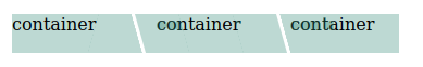
Just want to let you know the final output of this is,

enter image description here

3

Answers


  1. A valid hex value is only 6 characters but you are using 8.

    Try using a RGBA value and adjust the opacity as desired.

    .box {
      background: rgba(42, 129, 108, 1);
      color: #000;
      cursor: pointer;
      min-width: 100px;
      height: 36px;
      flex: 1;
      flex-grow: 1;
      float: left;
      text-align: left;
      position: relative;
    }
    
    .box::after {
      top: 0;
      width: 50px;
      height: 0;
      content: " ";
      position: absolute;
      border-top: 19px solid transparent;
      border-bottom: 17px solid transparent;
      z-index: 2;
      right: -20px;
      background-color: rgba(42, 129, 108, 1);
      clip-path: polygon(20% 0%, 80% 0%, 100% 100%, 0% 100%);
    }
    <div class="box">
      container
    </div>
    Login or Signup to reply.
  2. You can achieve your desired output by just finding the solid color equivalent of the opaque color.
    I changed it to this color:

    background-color: #b2d4cc;
    

    Let me know if it helped!

    Login or Signup to reply.
  3. I’d probably approach the problem as follows, with explanatory comments in the code:

    /* simple resetting, to remove default margins, and padding
       and also to force browsers to use the same sizing
       algorithm for all elements, including the padding and
       border-widths within the assigned sizes: */
    *,
    ::before,
    ::after {
      box-sizing: border-box;
      margin: 0;
      padding: 0;
    }
    
    body {
      padding-block: 1rem;
    }
    
    main {
      display: grid;
      gap: 0.5rem;
      inline-size: clamp(50rem, 80%, 1000px);
      margin-inline: auto;
    }
    /* the above is basically just for aesthetics, and
       largely irrelevant */
    
    /* here we define custom properties for use within
       the content styling: */
    section {
      --angle-inset: 1rem;
      --background-color: #2a816c4d;
      --box-height: 2rem;
      --inline-padding: 1rem;
      /* using display flex in order to place
         elements on the inline axis: */
      display: flex;
    }
    
    /* setting the shared properties of all .box elements: */
    .box {
      background-color: var(--background-color);
      block-size: var(--box-height);
      color: #000;
      cursor: pointer;
      /* the following two lines are a simple means of
         placing the content of an element both vertically,
         and horizontally, centered: */
      display: grid;
      place-content: center;
    }
    
    /* here we define the :first-child, as that has a slightly
       different appearance to its subsequent siblings: */
    .box:first-child {
      /* defining the clip-path, which is how we're creating
         the slope on the end of the element: */
      clip-path:
        polygon(
          /* lower-left vertex; I start with the lower-left
             purely as a matter of preference and custom (you
             can start at any vertex you prefer); here the
             XY coordinates are zero (X) and 100% (Y): */
          0 100%,
          /* upper-left vertex */
          0 0,
          /* upper-right vertex; here we use the calc function,
             and make use of the --angle-inset custom property
             to place the top of the angled slope at 100% (X)
             minus the size of the defined --angle-inset,
             and at zero on the Y axis: */
          calc(100% - var(--angle-inset)) 0,
          /* lower-right vertex */
          100% 100%
        );
      /* this is to ensure that the content isn't positioned against
         either edge of the element, to avoid clipping and ensure a
         balanced layout; because the :first-child only has an angle
         on one edge, we use just the --inline-padding for the first
         (non-angled) side (padding-inline-start), but for the second
         (padding-inline-end) we add the --inline-padding and
         --angle-inset properties together: */
      padding-inline: var(--inline-padding) calc(var(--inline-padding) + var(--angle-inset));
    }
    
    .box:first-child~.box {
      clip-path:
        polygon(
          /* lower-left vertex */
          var(--angle-inset) 100%,
          /* upper-left vertex */
          0 0,
          /* upper-right vertex */
          calc(100% - var(--angle-inset)) 0,
          /* lower-right vertex */
          100% 100%
        );
      padding-inline: calc(var(--inline-padding) + var(--angle-inset));
      margin-inline-start: -0.5rem;
    }
    <main>
      <section>
        <div class="box">Container 01</div>
        <div class="box">Container 02</div>
        <div class="box">Container 03</div>
        <div class="box">Container 04</div>
        <div class="box">Container 05</div>
      </section>
      <section>
        <div class="box">Container 01</div>
        <div class="box">Container 02</div>
      </section>
      <section>
        <div class="box">Container 01</div>
        <div class="box">Container 02</div>
        <div class="box">Container 03</div>
      </section>
    </main>

    JS Fiddle demo.

    Login or Signup to reply.
Please signup or login to give your own answer.
Back To Top
Search