skip to Main Content

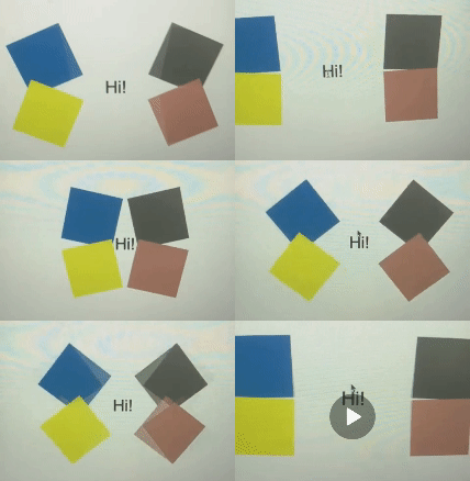
I am attempting to create this beautiful animation using html and css animations keyframes but I am stuck. I have tried changing rotation and transform but i cannot get it to turn out like the image below. You can see from the image below that the boxes fold inwards to hide the text "Hi" and then they unfold outwides which reveals the text again. The box colors is not an issue I’m having a problem with the animation.

Here is what I have done so far.

/* styles.css */
.container {
  display: flex;
  justify-content: center;
  align-items: center; 
  height: 400px; 
}

.group {
  display: flex;
  flex-direction: column;
  justify-content: center;
  width: 200px;
  margin: 0 15px; 
}

.topleft {
  width: 100px; 
  height: 75px; 
  border-radius: 10px;
  margin: 0 auto;
  transform-origin: bottom left;
}

.topright {
  width: 100px; 
  height: 75px; 
  border-radius: 10px;
  margin: 0 auto;
  transform-origin: bottom left;
}

.bottomleft {
  width: 100px; 
  height: 75px; 
  border-radius: 10px;
  margin: 0 auto;
  transform-origin: bottom right;
}

.bottomright {
  width: 100px; 
  height: 75px; 
  border-radius: 10px;
  margin: 0 auto;
  transform-origin: bottom left;
}

.topleft {
  background-color: steelblue;
  animation: rotateTopLeft 2s linear infinite; 
}

.topright {
  background-color: steelblue;
  animation: rotateTopRight 2s linear infinite; 
}

.bottomleft {
  background-color: steelblue;
  animation: rotateTopLeft 2s linear infinite; 
}

.bottomright {
  background-color: steelblue;
  animation: rotateTopRight 2s linear infinite; 
}

@keyframes rotateTopLeft {
  0% {
    transform: rotate(0deg);
  }
  100% {
    transform: rotate(-90deg);
  }
}

@keyframes rotateTopRight {
  0% {
    transform: rotate(0deg);
  }
  100% {
    transform: rotate(-90deg);
  }
}

@keyframes rotateBottomLeft {
  0% {
    transform: rotate(0deg);
  }
  100% {
    transform: rotate(90deg);
  }
}

@keyframes rotateBottomRight {
  0% {
    transform: rotate(0deg);
  }
  100% {
    transform: rotate(-90deg);
  }
}

.bottomleft {
  background-color: yellow;
}

.topright {
  background-color: rosybrown;
}

.topright {
  background-color: diegray;
}

.space {
  width: 100px; 
  height: 75px; 
  display: flex;
  justify-content: center;
  align-items: center;
  font-size: 24px;
}
  <div class="container">
    <div class="group left">
      <div class="box topleft steelblue"></div>
      <div class="box bottomleft yellow"></div>
    </div>
    <div class="space">Hi</div>
    <div class="group right">
      <div class="box topright diegray"></div>
      <div class="box bottomright rosybrown"></div>
    </div>
  </div>

Box unfold animation using html and css

3

Answers


  1. Relying on the transform origin for this animation is a bit of an issue, it confuses a bit. Just to simplify it I have made this snippet with the correct animation in it if you click. It basically relies on one transform statement for all your boxes, with the "direction" of the animation determined by a CSS variable set on each box separately (or combined):

    transform: translateX(calc(-100% * var(--xdir,1))) rotateZ(calc(90deg * var(--rdir,1)));
    

    By placing your boxes in a predictable position and using something like grid, you can make sure it always looks nicely balanced. Then you can use transforms to move them away. Don’t actually move the boxes though (with left or top), use transforms as they do not influence the layout of your page, only the visual appearance of it. That way you can ensure that they don’t start affecting each other. Anyways, try this:

    document.body.addEventListener( 'click', event => {
        
      document.querySelector( 'main' ).classList.toggle( 'expanded' );
      
    });
    main {
      display: grid;
      grid-template-columns: 1fr 1fr;
      grid-template-rows: 1fr 1fr;
    }
    main span {
      /* This is our text box style */
      grid-column: 1 / span 2;
      grid-row: 1 / span 2;
      margin: auto;
      display: block;
    }
    main span.box {
      /* This is our square boxes style */
      margin: 0;
      display: block;
      width: 100px;
      height: 100px;
      background: red;
      transition: transform .5s;
    }
    main span.box.tl,
    main span.box.bl {
      grid-column: 1;
      margin-left: auto;
    }
    main span.box.tr,
    main span.box.br {
      grid-column: 2;
      margin-right: auto;
      --xdir: -1;
    }
    main span.box.tl,
    main span.box.tr {
      grid-row: 1;
      margin-top: auto;
    }
    main span.box.bl,
    main span.box.br {
      grid-row: 2;
      margin-bottom: auto;
    }
    main span.box.bl,
    main span.box.tr {
      background: blue;
    }
    main span.box.tr,
    main span.box.bl {
      --rdir: -1;
    }
    
    main.expanded span.box {
      transform: translateX(calc(-100% * var(--xdir,1))) rotateZ(calc(90deg * var(--rdir,1)));
    }
    <main>
      <span>Hi!</span>
      <span class="box tl"></span>
      <span class="box tr"></span>
      <span class="box bl"></span>
      <span class="box br"></span>
    </main>

    Or, if you will, with a looping animation:

    document.body.addEventListener( 'click', event => {
        
      document.querySelector( 'main' ).classList.toggle( 'expanded' );
      
    });
    main {
      display: grid;
      grid-template-columns: 1fr 1fr;
      grid-template-rows: 1fr 1fr;
    }
    main span {
      /* This is our text box style */
      grid-column: 1 / span 2;
      grid-row: 1 / span 2;
      margin: auto;
      display: block;
    }
    main span.box {
      /* This is our square boxes style */
      margin: 0;
      display: block;
      width: 100px;
      height: 100px;
      background: red;
      transition: transform .5s;
    }
    main span.box.tl,
    main span.box.bl {
      grid-column: 1;
      margin-left: auto;
    }
    main span.box.tr,
    main span.box.br {
      grid-column: 2;
      margin-right: auto;
      --xdir: -1;
    }
    main span.box.tl,
    main span.box.tr {
      grid-row: 1;
      margin-top: auto;
    }
    main span.box.bl,
    main span.box.br {
      grid-row: 2;
      margin-bottom: auto;
    }
    main span.box.bl,
    main span.box.tr {
      background: blue;
    }
    main span.box.tr,
    main span.box.bl {
      --rdir: -1;
    }
    
    @keyframes flip {
      40% { transform: none; }
      80% { transform: var(--flip-transform); }
      to { transform: var(--flip-transform); }
    }
    
    main span.box {
      --flip-transform: translateX(calc(-100% * var(--xdir,1))) rotateZ(calc(90deg * var(--rdir,1)));
      animation: flip 1s 1s alternate infinite;
      animation-fill-mode: both;
    }
    <main>
      <span>Hi!</span>
      <span class="box tl"></span>
      <span class="box tr"></span>
      <span class="box bl"></span>
      <span class="box br"></span>
    </main>
    Login or Signup to reply.
  2. This is the closest I get:

    p, #boxes {
      margin: 0;
      position: absolute;
      top: 50%;
      left: 50%;
      transform: translate(-50%, -50%);
      width: 100px;
      text-align: center;
    }
    
    .box {
      width: 50px;
      height: 50px;
      float: left
    }
    
    .green {
      background-color: green
     }
     
     .red {
      background-color: red
     }
     
     .yellow {
      background-color: yellow
     }
     
     .blue {
      background-color: blue
     }
     
    @keyframes spinAndMoveToTheLeft {
      0% {
        transform: translateX(0) rotate(0deg);
      }
      100% {
        transform: translateX(-50px) rotate(90deg);
      }
    }
    
    
    .spin-animation-left {
      animation: spinAndMoveToTheLeft 1s linear infinite;
      animation-direction: alternate-reverse;
    }
    
    @keyframes spinAndMoveToTheRight {
      0% {
        transform: translateX(0) rotate(0deg);
      }
      100% {
        transform: translateX(50px) rotate(90deg);
      }
    }
    
    
    .spin-animation-right {
      animation: spinAndMoveToTheRight 1s linear infinite;
      animation-direction: alternate-reverse;
    }
    <p>Hi</p>
    <div id="boxes">
      <div class="box green spin-animation-left"></div>
      <div class="box red spin-animation-right"></div>
      <div class="box yellow spin-animation-left"></div>
      <div class="box blue spin-animation-right"></div>
    </div>
    Login or Signup to reply.
  3. Here is my idea. Hover to see the animation:

    .box {
      width: 200px;
      aspect-ratio:1;
      display: grid;
      place-content: center;
      margin: auto;
      font-size: 40px;
      position: relative;
    }
    .box:before,
    .box:after,
    .box span:before,
    .box span:after {
      content:"";
      position: absolute;
      width: 50%;
      height: 50%;
      transition: 1s;
    }
    .box:before {
      inset: 0 auto auto 0;
      transform-origin: 0 0;
      background: pink;
      rotate: var(--r,0deg);
    }
    .box:after {
      inset: 0 0 auto auto;
      transform-origin: 100% 0;
      background: lightblue;
      rotate: calc(-1*var(--r,0deg));
    }
    .box span:before {
      inset: auto auto 0 0;
      transform-origin: 0 100%;
      background: red;
      rotate: calc(-1*var(--r,0deg));
    }
    .box span:after {
      inset: auto 0 0 auto;
      transform-origin: 100% 100%;
      background: blue;
      rotate: var(--r,0deg);
    }
    
    .box:hover {
      --r: 90deg;
    }
    <div class="box">
      hi
      <span></span>
    </div>
    Login or Signup to reply.
Please signup or login to give your own answer.
Back To Top
Search