skip to Main Content

So, this is a tricky question, and I found no certain answer online.

Here is what I want:

Imagine this setup in the Html file:

<div class="main">
  <div class="holder holderA"></div>
  <div class="holder holderB"></div>
  <div class="holder holderC"></div>
  <button type="button">press me</button>
</div>

with the following styles:

.main {
  width: 100vw;
  min-height: 100vh;
  overflow: auto;
}

.holder {
  width: 100vw;
  height: 100vh;
}

.holderA {
  display: none;
}

button {
position: fixed;
top: 10px;
left: 10px;
}

what I’m trying to do is somehow have the button display the first holder, and when it does, only the first holder, causing any sense of overflow if required.

If you have ever worked with Bootstrap modals, you know how when the modal is over, the overflow is only caused by the modal and the rest of the content is static on the back? that’s the result that I’m looking for, but I have no idea how to implement it.

I looked up the source code for the css file on modals, but really nothing special seems to be going on … so can anyone explain?
also, here is the example:
...

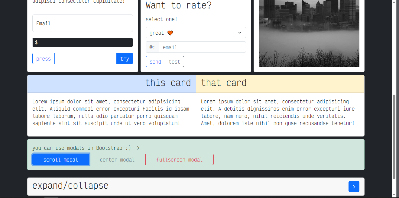
this is the page in bootstrap, without the modal open, and when you open the modal:
enter image description here

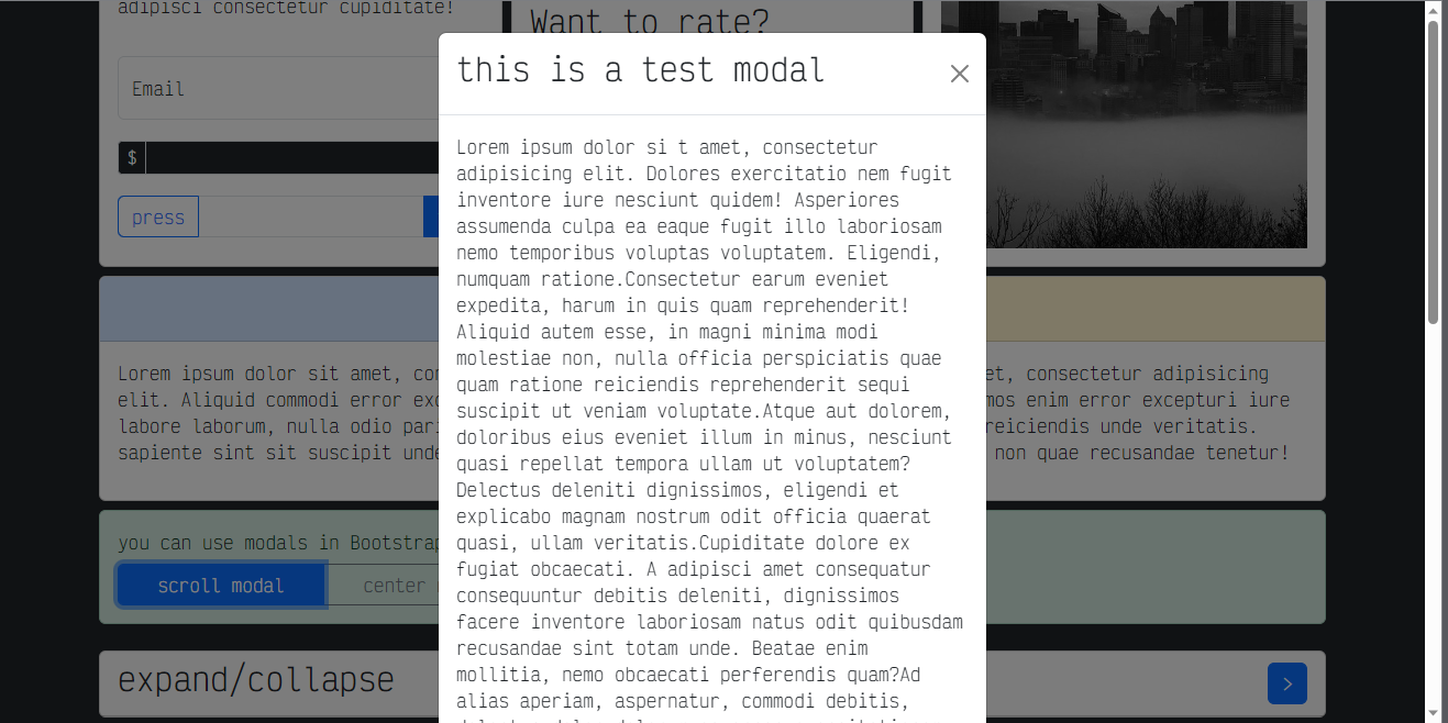
as you can see, the overflow is reset, and the content in the background is now static, the overflow is only and only caused by the the modal, and when you scroll:
enter image description here

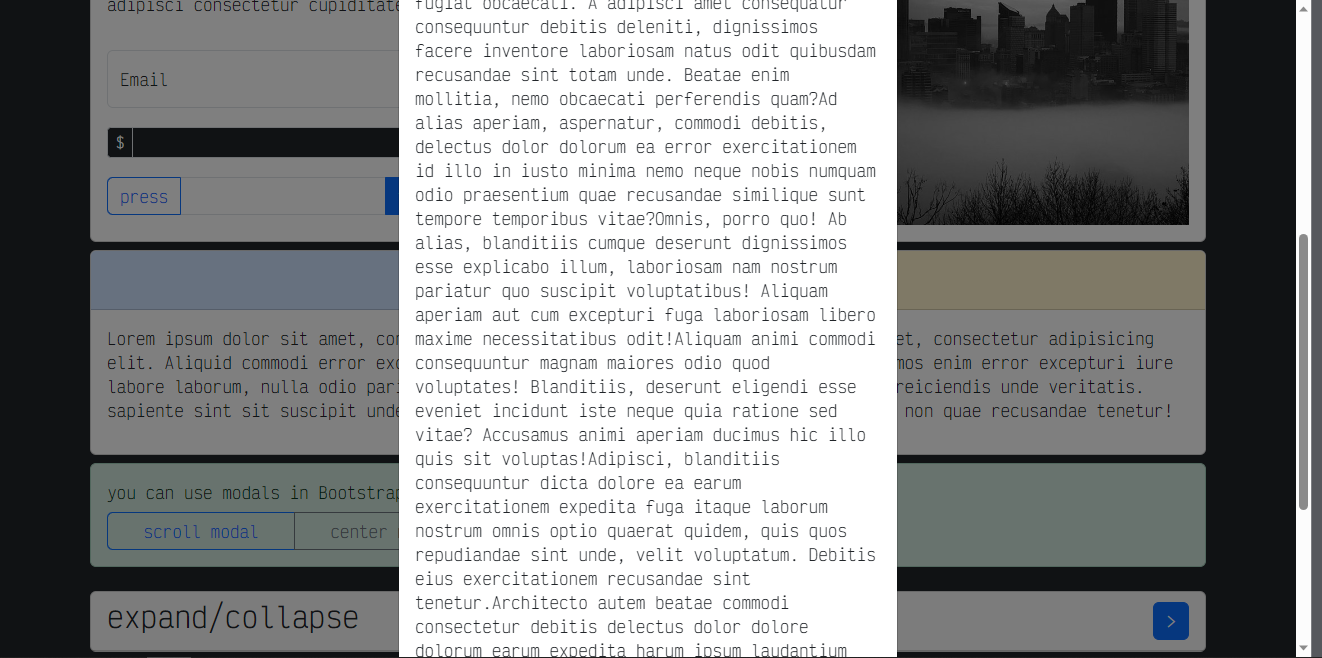
all that is scrolled is the modal, the rest being static!
how can I implement this on vanilla css, and or javascript?

Any answer or comment is appreciated 🙂

2

Answers


  1. This is typically referred to as creating a "modal overlay" or "modal dialog" effect. While Bootstrap provides a pre-built solution for this, you can implement it using vanilla CSS and JavaScript as well.

    HTML:

    <div class="main">
        <div class="holder holderA"></div>
        <div class="holder holderB"></div>
        <div class="holder holderC"></div>
        <button id="openModalButton" type="button">Open Modal</button>
        </div>
    
        <div id="modal" class="modal">
        <div class="modal-content">
            <!-- Your modal content goes here -->
            <button id="closeModalButton" type="button">Close Modal</button>
        </div>
    </div>
    

    CSS:

    .main {
        width: 100vw;
        min-height: 100vh;
        overflow: hidden;
        position: relative;
    }
    
    .holder {
        width: 100vw;
        height: 100vh;
    }
    
    .modal {
        display: none;
        position: fixed;
        top: 0;
        left: 0;
        width: 100vw;
        height: 100vh;
        background-color: rgba(0, 0, 0, 0.5); /* Semi-transparent background */
    }
    
    .modal-content {
        background-color: white;
        width: 80%;
        max-height: 80%;
        overflow: auto;
        position: absolute;
        top: 50%;
        left: 50%;
        transform: translate(-50%, -50%);
    }
    
    button {
        position: fixed;
        top: 10px;
        left: 10px;
    }
    

    Javascript :

    const openModalButton = document.getElementById('openModalButton');
    const closeModalButton = document.getElementById('closeModalButton');
    const modal = document.getElementById('modal');
    
    openModalButton.addEventListener('click', () => {
    modal.style.display = 'block';
    document.body.style.overflow = 'hidden'; // Prevent background scrolling
    });
    
    closeModalButton.addEventListener('click', () => {
    modal.style.display = 'none';
    document.body.style.overflow = 'auto'; // Restore background scrolling
    });
    
    Login or Signup to reply.
  2. To control the overflow behavior of specific HTML elements, you can use CSS properties such as overflow and overflow-x/overflow-y. These properties determine how content that exceeds the dimensions of an element is handled.

    Here’s how you can make certain HTML tags cause overflow while others don’t:

    <!DOCTYPE html>
    <html>
    <head>
    <style>
      /* Elements with overflow */
      .overflow-container {
        width: 200px;
        height: 100px;
        border: 1px solid black;
        overflow: auto; /* or 'scroll' */
      }
    
      /* Elements without overflow */
      .no-overflow {
        width: 200px;
        height: 100px;
        border: 1px solid black;
        overflow: hidden;
      }
    </style>
    </head>
    <body>
    
    <h2>Overflow Example</h2>
    
    <div class="overflow-container">
      <p>This is a paragraph with a lot of content. It will cause overflow inside the container.</p>
    </div>
    
    <div class="no-overflow">
      <p>This is a paragraph with a lot of content. However, it won't cause overflow as it's hidden.</p>
    </div>
    
    </body>
    </html>
    

    In this example:

    1. The overflow-container class uses overflow: auto; (or you can use overflow: scroll;) to make its content cause overflow when it exceeds the dimensions of the container. Scrollbars will appear to allow scrolling through the content.

    2. The no-overflow class uses overflow: hidden; to prevent its content from causing overflow. Any content that exceeds the dimensions of the container will be hidden.

    You can apply these styles to different HTML tags as needed. Just make sure to adjust the dimensions, border properties, and other styling rules according to your design requirements.

    Login or Signup to reply.
Please signup or login to give your own answer.
Back To Top
Search